About Dan: I'm a computational data journalist and programmer currently living in Chicago. Previously, I was a visiting professor at the Computational Journalism Lab at Stanford University. I advocate the use of programming and computational thinking to expand the scale and depth of storytelling and accountability journalism. Previously, I was a news application developer for the investigative newsroom, ProPublica, where I built ProPublica's first and, even to this day, some of its most popular data projects.
You can follow me on Twitter at @dancow and on Github at dannguyen. My old WordPress blog and homepage are at: http://danwin.com.
Using Python 3's pathlib module for common file operations
tl;dr
Check out the pathlib module – made standard in Python 3.4 – for an object-oriented approach to common file tasks:
Traditional way of downloading (well, with Requests), unzipping, and globbing through a file folder:
from glob import glob
from os import makedirs
from os.path import basename, join
from shutil import unpack_archive
import requests
# pretend DATA_URL could point to an archive file URL only known at runtime
# i.e. we don't know if it's a zip, gz, etc., which is why we use
# unpack_archive instead of ZipFile
DATA_URL = 'http://stash.compciv.org/ssa_baby_names/names.zip'
DATA_DIR = join('/', 'tmp', 'pathto', 'stuff')
ZIP_FNAME = join(DATA_DIR, basename(DATA_URL))
makedirs(DATA_DIR, exist_ok=True)
print('Downloading', DATA_URL)
resp = requests.get(DATA_URL)
with open(ZIP_FNAME, 'wb') as wf:
    print("Saving to", ZIP_FNAME)
    wf.write(resp.content)

unpack_archive(ZIP_FNAME, extract_dir=DATA_DIR)
for fname in glob(join(DATA_DIR,  '*.txt')):
    with open(fname, 'r') as rf:
        print(fname, rf.read())
Using pathlib, which provides a Path object that has basename, joinpath, glob, and read_text, and write_bytes methods.
from pathlib import Path
from shutil import unpack_archive
import requests

DATA_URL = 'http://stash.compciv.org/ssa_baby_names/names.zip'
DATA_DIR = Path('/', 'tmp', 'pathto', 'stuff')
DATA_DIR.mkdir(exist_ok=True, parents=True)
ZIP_FNAME = DATA_DIR.joinpath(Path(DATA_URL).name)

print('Downloading', DATA_URL)
resp = requests.get(DATA_URL)
print("Saving to", ZIP_FNAME)
ZIP_FNAME.write_bytes(resp.content)

unpack_archive(str(ZIP_FNAME), extract_dir=str(DATA_DIR))
for fpath in DATA_DIR.glob('*.txt'):
    print(fpath, fpath.read_text())
The importance of learning file operations
For my computational journalism courses at Stanford, I’ve made students work through the code needed to handle not just analyzing data files, but downloading and organizing them. This is based on my own experience of how widescale data collection can quickly go to shit if you can’t jigger together an automated, reproducible way of fetching and saving files. But I’m also motivated to show students that nothing magical happens when we enter Programming-Land: the file you download goes exactly where you tell your program to download it, whether your program is a web browser or a Python script you’ve written yourself.
(From my anecdotal observation, students seem to be increasingly ignorant of how file downloads in the browser even work – and who can blame them, with the way iOS has made the file system a magic black box? But that’s a whole other topic…)
Regardless of the value of being able to programmatically manage files, knowing how to do it is still good general practice for programming, as it involves all the fundamentals, including conditionals and control flow, as well as importing libraries.
I even wrote an 8-part lesson just on how to download, unzip, and read through a nested file list: Extracting and Reading Shakespeare - Practicing the ins-and-outs of managing files and reading through them, featuring the works of Shakespeare.
The first lesson is: How to create a directory idempotently with makedirs() – which simply asks the student to write a program that creates a directory.
In Python 3’s os module, there’s the makedirs method:
import os
os.makedirs("mynewdirectory")
To make this call not throw an error if the directory already exists, we specify True for the optional exists_ok argument:
import os
os.makedirs("mynewdirectory", exists_ok=True)
By the final lesson, Counting the non-blank-lines in Shakespeare’s tragedies, the student is expected to glob a list of filenames and iterate through them to open each file (as well as use PEP8-approved import syntax):
(…though at this early stage in the curriculum, I’ve avoided the introduction of file handling via context managers and its extra with syntax)
from os.path import join
from glob import glob
filepattern = join('tempdata', '**', '*')
filenames = glob(filepattern)

for fname in filenames:
    txtfile = open(fname, 'r')
    for line in txtfile:
        # ...etc
    txtfile.close()
Later on in the curriculum, this file management code can become quite verbose. The following code comes from an exercise titled, Download all of the baby names data from the Social Security Administration:
import requests
from os import makedirs
from os.path import join
from shutil import unpack_archive
from glob import glob
SOURCE_URL = 'https://www.ssa.gov/oact/babynames/names.zip'
DATA_DIR = 'tempdata'
DATA_ZIP_PATH = join(DATA_DIR, 'names.zip')
# make the directory
makedirs(DATA_DIR, exist_ok=True)

print("Downloading", SOURCE_URL)
resp = requests.get(SOURCE_URL)

with open(DATA_ZIP_PATH, 'wb') as f:
    f.write(resp.content)

unpack_archive(DATA_ZIP_PATH, extract_dir=DATA_DIR)
babynamefilenames = glob(join(DATA_DIR, '*.txt'))
print("There are", len(babyfilenames), 'txt files')
I don’t mind making students write lots of code, because that’s what they need the most practice with early on. But there’s a case to be made that that such code is so lengthy that it hinders cognitive understanding. Coming from Ruby-land, I have always longed for the elegance of its Pathname module.
But just recently, I discovered PEP 428: The pathlib module – object-oriented filesystem paths, which reduces the number of modules (particularly os and os.path) needed to do OS-agnostic file handling.
Here’s the traditional way of creating a new file (including its parent directory):
from os import makedirs
from os.path import join
mydir = join('myfiles', 'docs')
myfname = join(mydir, 'readme.txt')
makedirs(mydir, exist_ok=True)
with open(myfname, 'w') as wf:
    wf.write("Hello world")
Here’s the same process using the pathlib.Path type:
from pathlib import Path
mydir = Path('myfiles', 'docs')
mydir.mkdir(exist_ok=True, parents=True)
myfname = mydir.joinpath('readme.txt')
with myfname.open('w') as wf:
    wf.write("Hello world")
The Path type also has convenience methods for reading and writing for those many situations in which you don’t need to handle files via streaming I/O:
from pathlib import Path
myfname = Path('myfile.txt')
myfname.write_text("Hi there")
print(myfname.read_text())
And there are additional conveniences for path segment handling:
from pathlib import Path
URL = 'http://www.example.com/hello/world/stuff.html'
# save to /tmp/stuff.bak
fname = Path("/tmp").joinpath(Path(URL).stem + '.bak')
Compared to:
from os.path import basename, join, splitext
URL = 'http://www.example.com/hello/world/stuff.html'
fname =  join("/tmp", splitext(basename(URL))[0] + '.bak')
It’s not a huge change in number of lines of code, but you only have to look in the pathlib documentation to figure out what you need, rather than both os and os.path.
I’ll be using pathlib for all of my personal Python programming. That said, I’m not sure if I’ll use pathlib for teaching beginners. For example, what I like about os.path.join is that its arguments are strings and its return value is a string. Novice programmers struggle with realizing how straightforward a file path is – it’s just a string, and if you pass in a typo, your program isn’t going to magically know where you intended a file to be.
The Path type is a thin layer over filepath strings…but until you actually understand what object-oriented programming is, Path('hey', 'there').write_text('yo') is going to feel very magical. Having to define filenames as strings, then open them, and then read them – all as discrete operations – is perhaps verbose in comparison, but it helps to connect beginners to the realities of computing, i.e. a file isn’t just magically read into memory, instantaneously.
And there’s also the issue that high-level methods that expect a file path to be a string won’t know how to deal with Path-type objects – while delivering a cryptic error message to boot:
from shutil import unpack_archive
unpack_archive(Path('example.zip'))
    930     for name, info in _UNPACK_FORMATS.items():
    931         for extension in info[0]:
--> 932             if filename.endswith(extension):
    933                 return name
    934     return None

AttributeError: 'PosixPath' object has no attribute 'endswith'
Teaching tip: My use of os.path.join might seem like unnecessary overhead, as in, why write all of this:
from os.path import join
from glob import glob
my_datadir = join('mydata', 'cleaned')
my_filenames = glob(join('mydata', 'cleaned', '*.csv'))
– when we can write this:
from glob import glob
my_datadir = 'mydata/cleaned/'
my_filenames = glob(my_datadir + '*.csv'))
Well, the main reason is that being a OS X person, I’m not sure how those examples behave on Windows’s file system – and even if they do work, it’s still incredibly confusing to beginners who don’t understand the basics of OS filesystems (not everyone knows what a “directory “ is) and are wondering why my examples have 'my/path/to/file' when their OS has paths that look like 'my\\path\\to\\file'.
Also, creating paths via string concatenation is somewhat restricting when you’re dynamically generating paths in an automated loop.
And of course, when manually typing out paths, there’s the huge risk of human error. Spot the typo below:
from glob import glob
my_datadir = 'mydata/cleaned'
my_filenames = glob(my_datadir + '*.csv'))
The difficulties of moving from Python to R
This post is in response to: Python, Machine Learning, and Language Wars, by Sebastian Raschka
As someone who’s switched from Ruby to Python (because the latter is far easier to teach, IMO) and who has also put significant time into learning R just to use ggplot2, I was really surprised at the lack of relevant Google results for “switching from python to r” – or similarly phrased queries. In fact, that particular query will bring up more results for R to Python , e.g. “Python Displacing R as The Programming Language For Data”. The use of R is so ubiquitous in academia (and in the wild, ggplot2 tends to wow nearly on the same level as D3) that I had just assumed there were a fair number of Python/Ruby developers who have tried jumping into R. But there aren’t…minimaxir’s guides are the most and only comprehensive how-to-do-R-as-written-by-an-outsider guides I’ve seen on the web.
By and far, the most common shift seems to be that of Raschka’s – going from R to Python:
Well, I guess it’s no big secret that I was an R person once. I even wrote a book about it… So, how can I summarize my feelings about R? I am not exactly sure where this quote is comes from – I picked it up from someone somewhere some time ago – but it is great for explaining the difference between R and Python: “R is a programming language developed by statisticians for statisticians; Python was developed by a computer scientist, and it can be used by programmers to apply statistical techniques.” Part of the message is that both R and Python are similarly capable for “data science” tasks, however, the Python syntax simply feels more natural to me – it’s a personal taste.
That said, one of the things I’ve appreciated about R is how it “just works”…I usually install R through Homebrew, but installing RStudio via point and click is also straightforward. I can see why that’s a huge appeal for both beginners and people who want to do computation but not necessarily become developers. Hell, I’ve been struggling for what feels like months to do just the most rudimentary GIS work in Python 3. But in just a couple weeks of learning R – and leveraging however it manages to package GDAL and all its other geospatial dependencies with rgdal – been able to create some decent geospatial visualizations (and queries):
I’m actually enjoying plotting with Matplotlib and seaborn, but it’s hard to beat the elegance of ggplot2 – it’s worth learning R just to be able to read and better understand Wickham’s ggplot2 book and its explanation of the “Grammar of Graphics”. And there’s nothing else quite like ggmap in other languages.
Also, I used to hate how <- was used for assignment. Now, that’s one of the things I miss most about using R. I’ve grown up with single-equals-sign assignment in every other language I’ve learned, but after having to teach some programming…the difference between == and = is a common and often hugely stumping error for beginners. Not only that, they have trouble remembering how assignment even works, even for basic variable assignment…I’ve come to realize that I’ve programmed so long that I immediately recognize the pattern, but that can’t possibly be the case for novices, who if they’ve taken general math classes, have never seen the equals sign that way. The <- operator makes a lot more sense…though I would have never thought that if hadn’t read Hadley Wickham’s style guide.
Speaking of Wickham’s style guide, one thing I wish I had done at the very early stages of learning R is to have read Wickham’s Advanced R book – which is free online (and contains the style guide). Not only is it just a great read for any programmer, like everything Wickham writes, it is not at all an “advanced” book if you are coming from another language. It goes over the fundamentals of how the language is designed. For example, one major pain point for me was not realizing that R does not have scalars – things that appear to be scalars happen to be vectors of length one. This is something Wickham’s book mentions in its Data structures chapter.
Another vital and easy-to-read chapter: Wickham’s explanation of R’s non-standard evaluation has totally illuminated to me why a programmer of Wickham’s caliber enjoys building in R, but why I would find it infuriating to teach R versus Python to beginners.
(Here’s another negative take on non-standard evaluation, by an R-using statistician)
FWIW, Wickham has posted a repo attempting to chart and analyze various trends and metrics about R and Python usage. I won’t be that methodical; on Reddit, r/Python seems to be by far the biggest programming subreddit. At the time of writing, it has 122,690 readers. By comparison, r/ruby and r/javascript have 31,200 and 82,825 subscribers, respectively. The R-focused subreddit, r/rstats, currently has 8,500 subscribers.
The Python community is so active on Reddit that it has its own learners subreddit – r/learnpython – with 54,300 subscribers.
From anecdotal observations, I don’t think Python shows much sign of diminishing popularity on Hacker News, either. Not just because Python-language specific posts keep making the front page, but because of the general increased interest in artificial intelligence, coinciding with Google’s recent release of TensorFlow, which they’ve even quickly ported to Python 3.x.
(This is a partial repost of my comment in a HN discussion.)
Technology enables abusive "monsters", re: Jeff Atwood
re: They Have to Be Monsters, by Jeff Atwood.
This is a good essay, but I think Atwood overreaches here in trying to find the root psychological cause of online hostility. People can leave comments like “junkie” because the technology enables them to deliver such a comment effortless and with virtually zero- repercussion. In the “junkie” example, it turned out to be a father (as far as public Facebook searching can discern)…but as far as I can tell, there’s nothing that backs Atwood’s assertion here:
This man left the junkie comment because he is afraid. He is afraid his own children could become drug addicts. He is afraid his children, through no fault of his, through no fault of anyone at all, could die at 30. When presented with real, tangible evidence of the pain and grief a mother feels at the drug related death of her own child, and the reality that it could happen to anyone, it became so overwhelming that it was too much for him to bear.
It’d be nice if there really were deep and dramatic reasons for people’s seemingly inexplicable behavior. But the reason could just be that this guy – who happens to be a father (but correlation is not causation) – is just a bored and callous type who has access to the Internet. In a pre-internet era, this father would just be bored and callous in his own limited network. Just because he can now spread and amplify it worldwide with a few taps on a phone doesn’t amplify the root cause.
I worked at a newspaper in the years in which phone calls from readers were almost as common as emails. People who called in to complain were generally much nicer and calmer than they were when they were greeted with an answering machine – it’s much easier to rant off to a machine than it is to someone who greets you sincerely with “Hello”. With email, the sender is always interacting with a non-responsive/interactive recipient…moreover, it takes much less effort to to send an email than it does to look up and dial someone’s phone number from your (wired) phone. So the people who called in had greater reason and depth-of-reason to complain. Whereas with email, it could just be anyone who wanted to vent or troll.
On the other hand, I found that when I responded in length to people’s emails, even the rudest ones, I’d usually get a much lengthier email that included some measure of gratitude that I took the time to hear them out. With commenting forms, you now have even less effort required for people to leave feedback, and fewer personalized ways to respond. The kind of people who leave glib “junkie” comments would have never done that by phone, regardless of what deep-rooted psychological fears they may be harboring.
(This is a repost of a comment I made on the HN thread.)
Python 3 web-scraping examples with public data
Someone on the NICAR-L listserv asked for advice on the best Python libraries for web scraping. My advice below includes what I did for last spring’s Computational Journalism class, specifically, the Search-Script-Scrape project, which involved 101-web-scraping exercises in Python.
See the repo here: https://github.com/compjour/search-script-scrape
Best Python libraries for web scraping
For the remainder of this post, I assume you’re using Python 3.x, though the code examples will be virtually the same for 2.x. For my class last year, I had everyone install the Anaconda Python distribution, which comes with all the libraries needed to complete the Search-Script-Scrape exercises, including the ones mentioned specifically below:
The best package for general web requests, such as downloading a file or submitting a POST request to a form, is the simply-named requests library (“HTTP for Humans”).
Here’s an overly verbose example:
import requests
response = requests.get("https://en.wikipedia.org/robots.txt")
txt = response.text
print(txt)
#
# robots.txt for http://www.wikipedia.org/ and friends
#
# ...
The requests library even does JSON parsing if you use it to fetch JSON files. Here’s an example with the Google Geocoding API:
import requests
base_url = 'http://maps.googleapis.com/maps/api/geocode/json'
my_params = {'address': '100 Broadway, New York, NY, U.S.A',
             'language': 'ca'}
response = requests.get(base_url, params = my_params)
results = response.json()['results']
x_geo = results[0]['geometry']['location']
print(x_geo['lng'], x_geo['lat'])
# -74.01110299999999 40.7079445
For the parsing of HTML and XML, Beautiful Soup 4 seems to be the most frequently recommended. I never got around to using it because it was malfunctioning on my particular installation of Anaconda on OS X.
But I’ve found lxml to be perfectly fine. I believe both lxml and bs4 have similar capabilities – you can even specify lxml to be the parser for bs4. I think bs4 might have a friendlier syntax, but again, I don’t know, as I’ve gotten by with lxml just fine:
import requests
from lxml import html
page = requests.get("http://www.example.com").text
doc = html.fromstring(page)
link = doc.cssselect("a")[0]
print(link.text_content())
# More information...
print(link.attrib['href'])
# http://www.iana.org/domains/example
The standard urllib package also has a lot of useful utilities – I frequently use the methods from urllib.parse. Python 2 also has urllib but the methods are arranged differently.
Here’s an example of using the urljoin method to resolve the relative links on the California state data for high school test scores. The use of os.path.basename is simply for saving the each spreadsheet to your local hard drive:
from os.path import basename
from urllib.parse import urljoin
from lxml import html
import requests
base_url = 'http://www.cde.ca.gov/ds/sp/ai/'
page = requests.get(base_url).text
doc = html.fromstring(page)
hrefs = [a.attrib['href'] for a in doc.cssselect('a')]
xls_hrefs = [href for href in hrefs if 'xls' in href]
for href in xls_hrefs:
  print(href) # e.g. documents/sat02.xls
  url = urljoin(base_url, href)
  with open("/tmp/" + basename(url), 'wb') as f:
    print("Downloading", url)
    # Downloading http://www.cde.ca.gov/ds/sp/ai/documents/sat02.xls
    data = requests.get(url).content
    f.write(data)
And that’s about all you need for the majority of web-scraping work – at least the part that involves reading HTML and downloading files.
Examples of sites to scrape
The 101 scraping exercises didn’t go so great, as I didn’t give enough specifics about what the exact answers should be (e.g. round the numbers? Use complete sentences?) or even where the data files actually were – as it so happens, not everyone Googles things the same way I do. And I should’ve made them do it on a weekly basis, rather than waiting till the end of the quarter to try to cram them in before finals week.
The Github repo lists each exercise with the solution code, the relevant URL, and the number of lines in the solution code.
The exercises run the gamut of simple parsing of static HTML, to inspecting AJAX-heavy sites in which knowledge of the network panel is required to discover the JSON files to grab. In many of these exercises, the HTML-parsing is the trivial part – just a few lines to parse the HTML to dynamically find the URL for the zip or Excel file to download (via requests)…and then 40 to 50 lines of unzipping/reading/filtering to get the answer. That part is beyond what typically considered “web-scraping” and falls more into “data wrangling”.
I didn’t sort the exercises on the list by difficulty, and many of the solutions are not particulary great code. Sometimes I wrote the solution as if I were teaching it to a beginner. But other times I solved the problem using the style in the most randomly bizarre way relative to how I would normally solve it – hey, writing 100+ scrapers gets boring.
But here are a few representative exercises with some explanation:
1. Number of datasets currently listed on data.gov
I think data.gov actually has an API, but this script relies on finding the easiest tag to grab from the front page and extracting the text, i.e. the 186,569 from the text string, "186,569 datasets found". This is obviously not a very robust script, as it will break when data.gov is redesigned. But it serves as a quick and easy HTML-parsing example.
29. Number of days until Texas’s next scheduled execution
Texas’s death penalty site is probably one of the best places to practice web scraping, as the HTML is pretty straightforward on the main landing pages (there are several, for scheduled and past executions, and current inmate roster), which have enough interesting tabular data to collect. But you can make it more complex by traversing the links to collect inmate data, mugshots, and final words. This script just finds the first person on the scheduled list and does some math to print the number of days until the execution (I probably made the datetime handling more convoluted than it needs to be in the provided solution)
3. The number of people who visited a U.S. government website using Internet Explorer 6.0 in the last 90 days
The analytics.usa.gov site is a great place to practice AJAX-data scraping. It’s a very simple and robust site, but either you are aware of AJAX and know how to use the network panel (and in this case, locate ie.json, or you will have no clue how to scrape even a single number on this webpage. I think the difference between static HTML and AJAX sites is one of the tougher things to teach novices. But they pretty much have to learn the difference given how many of today’s websites use both static and dynamically-rendered pages.
6. From 2010 to 2013, the change in median cost of health, dental, and vision coverage for California city employees
There’s actually no HTML parsing if you assume the URLs for the data files can be hard coded. So besides the nominal use of the requests library, this ends up being a data-wrangling exercise: download two specific zip files, unzip them, read the CSV files, filter the dictionaries, then do some math.
90. The currently serving U.S. congressmember with the most Twitter followers
Another example with no HTML parsing, but probably the most complicated example. You have to download and parse Sunlight Foundation’s CSV of Congressmember data to get all the Twitter usernames. Then authenticate with Twitter’s API, then perform mulitple batch lookups to get the data for all 500+ of the Congressional Twitter usernames. Then join the sorted result with the actual Congressmember identity. I probably shouldn’t have assigned this one.
HTML is not necessary
I included no-HTML exercises because there are plenty of data programming exercises that don’t have to deal with the specific nitty-gritty of the Web, such as understanding HTTP and/or HTML. It’s not just that a lot of public data has moved to JSON (e.g. the FEC API) – but that much of the best public data is found in bulk CSV and database files. These files can be programmatically fetched with simple usage of the requests library.
It’s not that parsing HTML isn’t a whole boatload of fun – and being able to do so is a useful skill if you want to build websites. But I believe novices have more than enough to learn from in sorting/filtering dictionaries and lists without worrying about learning how a website works.
Besides analytics.usa.gov, the data.usajobs.gov API, which lists federal job openings, is a great one to explore, because its data structure is simple and the site is robust. Here’s a Python exercise with the USAJobs API; and here’s one in Bash.
There’s also the Google Maps geocoding API, which can be hit up for a bit before you run into rate limits, and you get the bonus of teaching geocoding concepts. The NYTimes API requires creating an account, but you not only get good APIs for some political data, but for content data (i.e. articles, bestselling books) that is interesting fodder for journalism-related analysis.
But if you want to scrape HTML, then the Texas death penalty pages are the way to go, because of the simplicity of the HTML and the numerous ways you can traverse the pages and collect interesting data points. Besides the previously mentioned Texas Python scraping exercise, here’s one for Florida’s list of executions. And here’s a Bash exercise that scrapes data from Texas, Florida, and California and does a simple demographic analysis.
If you want more interesting public datasets – most of which require only a minimal of HTML-parsing to fetch – check out the list I talked about in last week’s info session on Stanford’s Computational Journalism Lab.
A few places for news and chatter about data journalism
I’ve recently been asked by a few people how to find out more about the data journalism scene. Here’s a list of sites with active feeds and discussions, as well as a few links to examples of their content:
- NICAR-L: the mailing list for the National Institute of Computer Assisted Reporters and, as far as I know, the most active mailing list in journalism. The audience is a mix of old-school investigative journalists and data scientists and newsroom developers. Obviously, NICAR’s blog is also a great destination for data journalism inspiration
- Sunlight Foundation Blog - the work they do in open data and transparency is too hard to count. The blog is a great way to catch up on all that they do and find real-world examples of using data for government accountability.
- OpenFEC makes campaign finance data more accessible with new API: Here’s how to get started
- Why are states replacing email with flawed web forms for contacting lawmakers?
- Outside groups’ influence on 2016 election grows, super PAC filings show
- Much of Northrop Grumman’s Washington influence flies under the radar
- source.opennews.org - a partnership between Mozilla Foundation and the Knight Foundation focused on the “journalism code and the people who make it.” There’s countless great in-depth writeups about the process of data journalism.
- NewsNerdery - “An international meta organization to foster news nerd collaboration and knowledge sharing” – has a lot of the same audience from NICAR-L, butmore focused on the web development/engineering side. Its main participation is its Slack channel; just message one of the moderators on the homepage to get in.
- 18F.gsa.gov/blog - 18F is part of the U.S. Digital Service and is driving a lot of the federal government’s open source work, particularly in web development and data architecture.
- Hacks/Hackers - a worldwide group for journalists interested in hacking and hackers interested in journalism. Each chapter does its own thing while having the same mission.
- Hacker News - this started off as being a Reddit-like site focused on the Silicon Valley startup scene but because of the sheer size of its audience, has probably the most active discussion on data journalism projects. Even if the site didn’t have a such a wide variety of topics, it’s probably the best place to learn (and argue) about the latest development trends and technologies.
Big Data and making the Tehran Salami
When it comes to explaining the algorithms and implications of data, Google’s Peter Norvig is one of the most enlightening and entertaining. His 2011 lecture at the University of British Columbia, “The Unreasonable Effectiveness of Data”, is a must-watch no matter your technical level:
The phrase, “Tehran Salami” comes from a point in Norvig’s lecture in which he uses his colleague Mehran Sahami as an example of the limits of dictionary-based spell checkers.
This is also a fun way to explain n-gram sequences in the context of textual segmentation and the power of simple counting:

Check out Norvig’s homepage for a year’s worth of readings to study, including “How to Write a Spelling Corrector” and a much fuller explanation of ngrams.
1967 Tindallgram: 'A new spacecraft computer program development working philosophy is taking shape'
This morning I stumbled across this fantastic NASA history (Computers in Spaceflight: The NASA Experience) of the software and hardware development of the Apollo spacecraft. While the technology described is far outdated (“…the SUNDISK earth orbit program was complete, verified, and ready for core rope manufacture”), you could literally write a book of Medium posts arguing for/against agile/telecommuting/TDD/BDD/mythical-man-months/Node.js and back them up with direct quotes from the NASA writeup.
The following quote stuck out to me, near the end of the software writeup which describes how the tragic Apollo I accident gave programmers a chance to fix critically-flawed flight software that otherwise would have shipped:
[Bill] Tindall observed at the time, It is becoming evident that we are entering a new epoch regarding development of spacecraft computer programs. No longer would programs be declared complete in order to meet schedules, requiring the users to work around errors. Instead quality would be the primary consideration
Tindall, who was assigned as “NASA’s ‘watchdog’ for MIT software”, was famous for his “Tindallgrams”, “blunt memos regarding software development for Apollo.” The quote above comes from one titled: A new spacecraft computer program development working philosophy is taking shape.
You can find all of his memos at a site titled, “Tindallgrams: The snarky memos of Apollo’s unsung genius.” Having stumbled upon it just today, I’m amazed at what a historical resource it is, and apparently it’s a crowdsourced effort to convert the print memos to text, with its own Github repo.
Don't forget: The plural of anecdote is data
This purpose of this point is to preserve the true meaning of Raymond Wolfinger’s oft-misquoted aphorism.
Via the Internet Archive’s snapshot of this July 6, 2004 post on listserv.linguistlist.org:
Nelson W. Polsby PS, Vol. 17, No. 4. (Autumn, 1984), pp. 778-781. Pg. 779: Raymond Wolfinger’s brilliant aphorism “the plural of anecdote is data” never inspired a better or more skilled researcher.
I e-mailed Wolfinger last year and got the following response from him:
“I said ‘The plural of anecdote is data’ some time in the 1969-70 academic year while teaching a graduate seminar at Stanford. The occasion was a student’s dismissal of a simple factual statement–by another student or me–as a mere anecdote. The quotation was my rejoinder. Since then I have missed few opportunities to quote myself. The only appearance in print that I can remember is Nelson Polsby’s accurate quotation and attribution in an article in PS: Political Science and Politics in 1993; I believe it was in the first issue of the year.”
I also e-mailed Polsby, who didn’t know of any early printed occurrences.
What is interesting about this saying is that it seems to have morphed into its opposite – “Data is not the plural of anecdote” – in some people’s minds. Mark Mandel used it in this opposite sense in a private e-mail to me, for example.
Fred Shapiro
Hat tip: Revolutionary Analytics and Nate Silver/FiveThirtyEight.
I particularly like Silver’s riff on Wolfinger’s misunderstood quote:
You may have heard the phrase the plural of anecdote is not data. It turns out that this is a misquote. The original aphorism, by the political scientist Ray Wolfinger, was just the opposite: The plural of anecdote is data.
Wolfinger’s formulation makes sense: Data does not have a virgin birth. It comes to us from somewhere. Someone set up a procedure to collect and record it. Sometimes this person is a scientist, but she also could be a journalist.
And, conversely, I have to strongly disagree with RA’s David Smith:
So I’ve been using the quotation wrong all this time! I think I’m going to stick with “The plural of anecdote is not data”, though: the word “anecdote” to me suggests information surrendered, not collected, and it’s the implication of reporting bias that makes the quote so apposite for statisticians.
All data is information surrendered. Everything from the number of footsteps you take with a smartphone in your pocket, what you tell the Census taker, who you’ve chosen to vote for – the fact that you voted at all, to each tweet and Facebook post you create: the text, when you sent it, where you sent it from, and how long since the last time you sent one.
Knowing how data is implicitly and explicitly collected is fundamental to understanding its value and its limitations.
Investigating Oklahoma's earthquake surge with R and ggplot2
Quick summary: This is a four-part walkthrough on how to collect, clean, analyze, and visualize earthquake data. While there is a lot of R code and charts, that’s just a result of me wanting to practice ggplot2. The main focus of this guide is to practice purposeful research and numerical reasoning as a data journalist.
Quick nav:
- The chapter summaries
- The full table of contents.
- The repo containing the notebooks, code, and data
- The repo in a zip file.
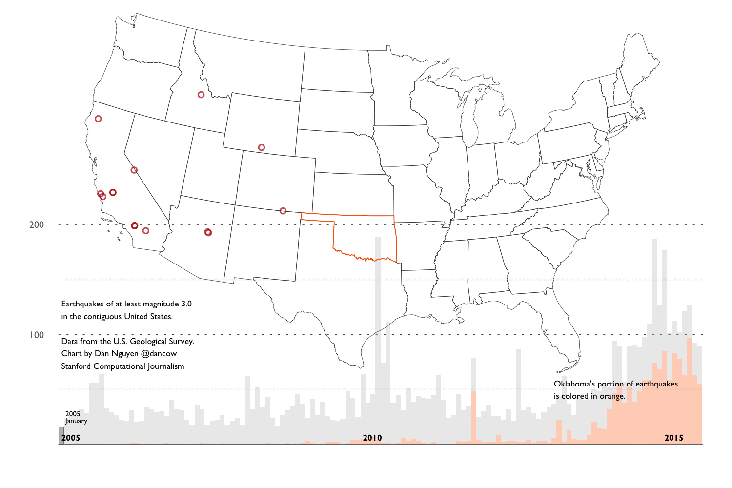
The main findings of this walkthrough summed up in an animated GIF composed of charts created with ggplot2:
- Meta stuff - A summary of what this walkthrough contains, the ideal intended audience, and technical details on how to configure your system and R setup similar to mine.
- Background into Oklahoma’s earthquakes - An overview of the scientific and political debates after Oklahoma’s earthquake activity reached a record high – in number and in magnitude – since 2010. And an overview of the main datasets we’ll use for our analysis.
- Basic R and ggplot2 concepts and examples - In this chapter, we’ll cover most of the basic R and ggplot2 conventions needed to do the necessary data-gathering/cleaning and visualizations in subsequent chapters.
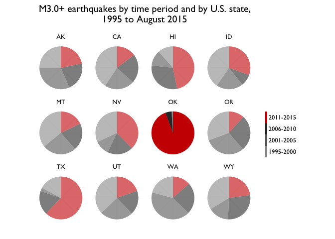
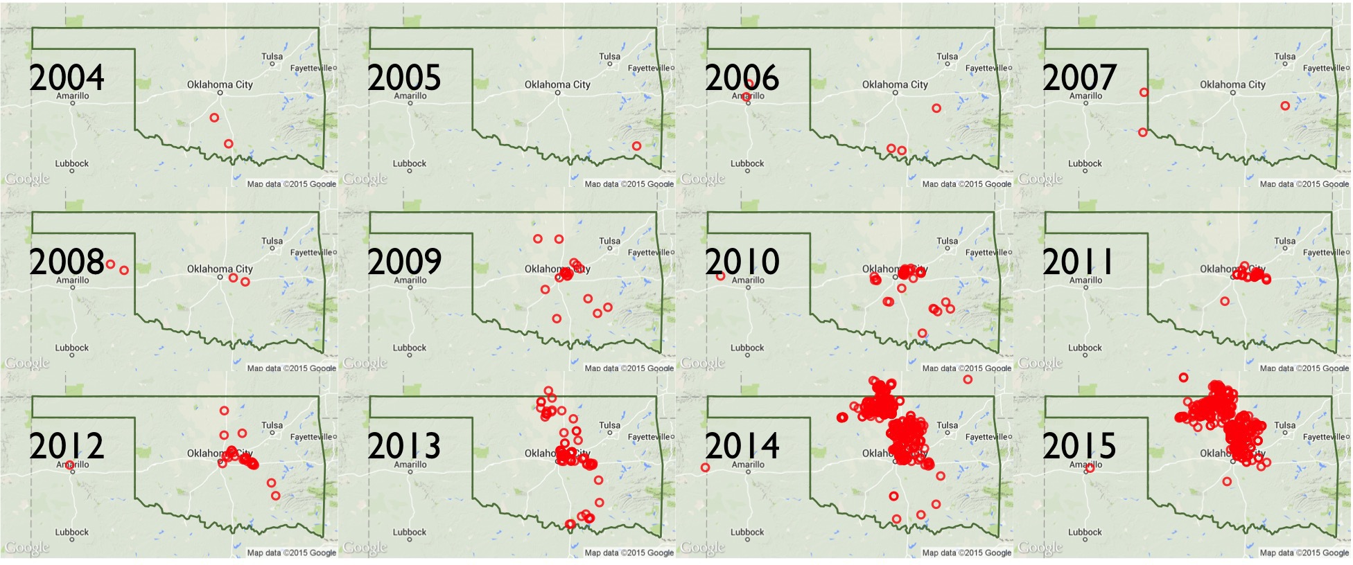
- Exploring the historical earthquake data since 1995 - We repeat the same techniques in chapter 2, except instead of one month’s worth of earthquakes, we look at 20 years of earthquake data. The volume and scope of data requires different approaches in visualization and analysis.
- The Data Cleaning - By far the most soul-suckingly tedious and frustrating yet most necessary chapter in every data journalism project.
Key charts


Full table of contents
- Key charts
- Chapter 0: Meta stuff
- Chapter 1: Reading up on Oklahoma’s Earthquakes
- Chapter 2: Basic R and Data Visualization Concepts
- Chapter 3: Exploring Earthquake Data from 1995 to 2015
- Chapter 4: The Data Cleaning
Chapter 0: Meta stuff
Long summary of this walkthrough
This extremely verbose writeup consists of a series of R notebooks and aggregation of journalism and research into the recent “swarm” of earthquake activity in Oklahoma. It is now (and by “now”, I mean very recently) generally accepted by academia, industry, and the politicians, that the earthquakes are the result of drilling operations. So this walkthrough won’t reveal anything new to those who have been following the news. But I created the walkthrough to provide a layperson’s guide of how to go about researching the issue and also, how to create reproducible data process, including how to collect, clean, analyze, and visualize the earthquake data.
These techniques and principles are general enough to apply to any investigative data process. I use the earthquake data as an example because it is about as clean and straightforward as datasets come. However, we’ll find soon enough that it contains the same caveats and complexities that are inherent to all real-world datasets.
Spoiler alert. Let’s be clear: 20 years of earthquake data is not remotely enough for amateurs nor scientists to make sweeping conclusions about the source of recent earthquake activity. So I’ve devoted a good part of Chapter 4 to explaining the limitations of the data (and my knowledge) and pointing to resources that you can pursue on your own.
Intended audience
About the code
I explain as much of the syntax as I can in Chapter 2, but it won’t make sense if you don’t have some experience with ggplot2. The easiest way to follow along is clone the Github repo here:
https://github.com/dannguyen/ok-earthquakes-RNotebook
Or, download it from Github as a zip archive. The data/ directory contains mirrors of the data files used in each of the notebooks.
The code I’ve written is at a beginner’s level of R (i.e. where I’m at), with a heavy reliance on the ggplot2 visualization library, plus some Python and Bash where I didn’t have the patience to figure out the R equivalents. If you understand how to work with data frames and have some familiarity with ggplot2, you should be able to follow along. Rather than organize and modularize my code, I’ve written it in an explicit, repetitive way, so it’s easier to see how to iteratively build and modify the visualizations. The drawback is that there’s the amount of code is more intimidating.
My recommendation is to not learn ggplot2 as I initially did: by copying and pasting ggplot2 snippets without understanding the theory of ggplot2’s “grammar of graphics.” Instead, read ggplot2 creator Hadley Wickham’s book: ggplot2: Elegant Graphics for Data Analysis. While the book seems stuffy and intimidating, it is by far the best way to get up to speed on ggplot2, both because of ggplot2’s nuanced underpinnings and Wickham’s excellent writing style. You can buy the slightly outdated (but still worthwhile) 2009 version or attempt to build the new edition that Wickham is currently working on.
X things you might learn how to do in R
Most of these things I learned during the process of writing this walkthrough:
- How to make a scatterplot
- How to reduce the effect of overplotting
- How to make a histogram
- How to customize the granularity of your histogram
- How to create a two-tone stacked chart
- How to reverse the stacking order of a two-tone chart
- How to plot a geographical shapefile as a polygon
- How to plot points on a shapefile
- How to specify the projection when plotting geographical data
- How to filter a data frame of coordinates using a shapefile
- How to highlight a single data point on a chart
- How to add value labels to a chart
- How to re-order the labels of a chart’s legend
- How to create a small multiples chart
- How to extract individual state boundaries from a U.S. shapefile
- How to use Google Maps and OpenStreetMap data in your map plots
- How to bin points with hexagons
- How to properly project hexbinned geographical data
- How to draw a trendline
- How to make a pie chart
- How to highlight a single chart within a small multiples chart
- How to use Gill Sans as your default chart font.
Chapter 1: Reading up on Oklahoma’s Earthquakes
http://www.newyorker.com/magazine/2015/04/13/weather-underground
NPR’s StateImpact project has been covering the issue for the past few years
For a 3-minute video primer on the issue, check out this clip by Reveal/The Center for Investigative Reporting:
The cause
In a 2013 article from Mother Jones:
Jean Antonides, vice president of exploration for New Dominion, which operates one of the wells near the Wilzetta Fault. He informed me that people claiming to know the true source of the Oklahoma quakes are “either lying to your face or they’re idiots.”
The industry’s general response is that, yes, earthquakes are happening. But that doesn’t mean it’s their fault. Until recently, they had the backing of the Oklahoma Geological Survey (OGS). In a position statement released in February 2014:
Overall, the majority, but not all, of the recent earthquakes appear to be the result of natural stresses, since they are consistent with the regional Oklahoma natural stress field.
Current drilling activity
The U.S. Geological Survey Earthquake Data
The U.S. Geological Survey (USGS) Earthquake Hazards Program is a comprehensive clearinghouse of earthquake data collected and processed by its vast network of seismic sensors. The Atlantic has a fine article about how (and how fast) the slippage of a fault line, 6 miles underground, is detected by USGS sensor stations and turned into data and news feeds.
The earthquake data that we will use is the most simplified version of USGS data: flat CSV files. While it contains the latitude and longitude of the earthquakes’ epicenters, it does not TKTK
Limitations of the data
The USGS earthquake data is as ideal of a dataset we could hope to work with. We’re not dealing with human voluntary reports of earthquakes, but automated readings from a network of sophisticated sensors. That said, sensors and computers aren’t perfect, as the Los Angeles Times and their Quakebot discovered in May. The USGS has a page devoted to errata in its reports.
Historical reliability of the data
It’s incorrect to think of the USGS data as deriving from a monolithic and unchanging network. For one thing, the USGS partners with universities and industry in operating and gathering data from seismographs. And obviously, technology, and sensors change, as does the funding for installing and operating them. From the USGS “Earthquake Facts and Statistics” page:
The USGS estimates that several million earthquakes occur in the world each year. Many go undetected because they hit remote areas or have very small magnitudes. The NEIC now locates about 50 earthquakes each day, or about 20,000 a year.
As more and more seismographs are installed in the world, more earthquakes can be and have been located. However, the number of large earthquakes (magnitude 6.0 and greater) has stayed relatively constant.
Is it possible that Oklahoma’s recent earthquake swarm in Oklahoma is just the result of the recent installation of a batch of seismographs in Oklahoma? Could be – though I think it’s likely the USGS would have mentioned this in its informational webpages and documentation about the Oklahoma earthquakes. In chapter 3, we’ll try to use some arithmetic and estimation to address the “Oh, it’s only because there’s more sensors” possibility. But to keep things relatively safe and simple, we’ll limit the scope of the historical data to about 20 years: from 1995 to August 2015. The number of sensors and technology may have changed in that span, but not as drastically as they have in even earlier decades. The USGS has a page devoted to describing the source and caveats of its earthquake data.
Getting the data
For quick access, the USGS provides real-time data feeds for time periods between an hour to the last 30 days. The Feeds & Notifications page shows a menu of data formats and services. For our purposes, the Spreadsheet Format option is good enough.
To access the entirety of the USGS data, visit their Archive page.
In Chapter 3, I briefly explain the relatively simple code for automating the collection of this data. The process isn’t that interesting though so if you just want the zipped up data, you can find it in the repo’s /data directory, in the file named usgs-quakes-dump.csv.zip. It weighs in at 27.1MB zipped, 105MB uncompressed.
Data attributes
The most relevant columns in the CSV version of the data:
- time
- latitude and longitude
- mag, i.e. magnitude
- type, as in, type of seismic event, which includes earthquakes, explosions, and quarry.
- place, a description of the geographical region of the seismic event.
Note: a non-trivial part of the USGS data is the measured magnitude of the earthquake. This is not an absolute, set-in-stone number (neither is time, for that matter), and the disparities in measurements of magnitude – including what state and federal agencies report – can be a major issue.
However, for our walkthrough, this disparity is minimized because we will be focused on the frequency and quantity of earthquakes, rather than their magnitude.
The U.S. Census Cartographic Boundary Shapefiles
The USGS data has a place column, but it’s not specific enough to be able to use in assigning earthquakes to U.S. states. So we need geospatial data, specifically, U.S. state boundaries. The U.S. Census has us covered with zipped-up simplified boundary data:
The cartographic boundary files are simplified representations of selected geographic areas from the Census Bureau’s MAF/TIGER geographic database. These boundary files are specifically designed for small scale thematic mapping.
Generalized boundary files are clipped to a simplified version of the U.S. outline. As a result, some off-shore areas may be excluded from the generalized files.
For more details about these files, please see our Cartographic Boundary File Description page.
There are shapefiles for various levels of political boundaries. We’ll use the ones found on the states page. The lowest resolution file – 1:20,000,000, i.e. 1 inch represents 20 million real inches – is adequate for our charting purposes.
The direct link to the Census’s 2014 1:20,000,000 shape file is here. I’ve also included it in this repo’s data/ directory.
The limits of state boundaries
The Census shapefiles are conveniently packaged for the analysis we want to do, though we’ll find out in Chapter 2 that there’s a good amount of complexity in preparing geospatial boundary data for visualization.
But the bigger question is: Are state boundaries really the best way to categorize earthquakes? These boundaries are political and have no correlation with the seismic lines that earthquakes occur along.
To use a quote from the New Yorker, attributed to Austin Holland, then-head seismologist of the Oklahoma Geological Survey:
Someone asked Holland about several earthquakes of greater than 4.0 magnitude which had occurred a few days earlier, across Oklahoma’s northern border, in Kansas. Holland joked, “Well, the earthquakes aren’t stopping at the state line, but my problems do.”
So, even if we assume something man-made is causing the earthquakes, it could very well be drilling in Texas, or any of Oklahoma’s other neighbors, that are causing Oklahoma’s earthquake swarm. And conversely, earthquakes caused by Oklahoma drilling but occur within other states’ borders will be uncounted when doing a strict state-by-state analysis.
Ideally, we would work with the fault map of Oklahoma. For example, the Oklahoma Geological Survey’s Preliminary Fault Map of Oklahoma:

The shapefile for the fault map can be downloaded as a zip file here, and other data files can be found posted at the OGS’s homepage. The reason why I’m not using it for this walkthrough is: it’s complicated. As in, it’s too complicated for me, though I might return to it when I have more time and to update this guide.
But like the lines of political boundaries, the lines of a fault map don’t just exist. They are discovered, often after an earthquake, and some of the data is voluntary reported by the drilling industry. Per the New Yorker’s April 2015 story:
“We know more about the East African Rift than we know about the faults in the basement in Oklahoma.” In seismically quiet places, such as the Midwest, which are distant from the well-known fault lines between tectonic plates, most faults are, instead, cracks within a plate, which are only discovered after an earthquake is triggered. The O.G.S.’s Austin Holland has long had plans to put together two updated fault maps, one using the available published literature on Oklahoma’s faults and another relying on data that, it was hoped, the industry would volunteer; but, to date, no updated maps have been released to the public.
As I’ll cover in chapter 4 of this walkthrough, things have obviously changed since the New Yorker’s story, including the release of updated fault maps.
About the Oklahoma Corporation Commission
The OCC has many relevant datasets from the drilling industry, in particular, spreadsheets of the locations of UIC (underground injection control) wells, i.e. where wastewater from drilling operations is injected into the earth for storage.
The data comes in several Excel files, all of which are mirrored in the data/ directory. The key fields are the locations of the wells and the volume of injection in barrels per month or year.
Unfortunately, the OCC doesn’t seem to have a lot of easily-found documentation for this data. Also unfortunate: this data is essential in attempting to make any useful conclusions about the cause of Oklahoma’s earthquakes. In Chapter 4, I go into significant detail about the OCC data’s limitations, but still fall very short of what’s needed to make the data usable..
Chapter 2: Basic R and Data Visualization Concepts
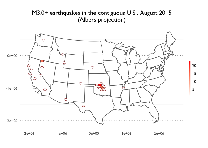
This chapter is focused on R syntax and concepts for working with data frames and generating visualizations via ggplot2. For demonstration purposes, I use a subset of the U.S. Geological Survey’s earthquake data (records for August 2015). Chapters 3 and 4 will repeat the same concepts except with earthquake data spanning back to 1995.
If you’re pretty comfortable with R, you can go ahead and skip to Chapter 3
Loading the libraries and themes
library(ggplot2)
library(scales)
library(grid)
library(dplyr)
library(lubridate)
library(rgdal)
library(hexbin)
library(ggmap)
- ggplot2 is the visualization framework.
- dplyr is a library for manipulating, transforming, and aggregating data frames. It also utilizes the nice piping from the magrittr package, which warms the Unix programmer inside me.
- lubridate - Greatly eases working with time values when generating time series and time-based filters. Think of it as moment.js for R.
- scales - Provides helpers for making scales for our ggplot2 charts.
- grid - contains some functionality that ggplot2 uses for chart styling and arrangement. including the unit() function.
- hexbin - Used with ggplot2 to make hexbin maps.
- rgdal - bindings for geospatial operations, including map projection and the reading of map shapefiles. Can be a bear to install due to a variety of dependencies. If you’re on OS X, I recommend installing Homebrew and running
brew install gdalbefore installing the rgdal package via R. - ggmap - Another ggplot2 plugin that allows the plotting of geospatial data on top of map imagery from Google Maps, OpenStreetMap, and Stamen Maps.
Customizing the themes
This is entirely optional, though it will likely add some annoying roadblocks for everyone trying to follow along. There’s not much to theming in ggplot2: just remember a shit-ton of syntax and have a lot of patience. You can view my ggplot theme script and copy it from here, and then make it locally available to your scripts (e.g. ./myslimthemes.R), so that you can source them as I do in each of my scripts:
source("./myslimthemes.R")
theme_set(theme_dan())
Or, just don’t use them when copying the rest of my code. All of the theme calls begin with theme_dan or dan. One dependency that might cause a few problems is the use of the extrafont package, which I use to set the default font to Gill Sans. I think I set it up so that systems without Gill Sans or extrafont will just throw a warning message. But I didn’t spend too much time testing that.
Downloading the data
For this chapter, we use two data files:
-
A feed of earthquake reports in CSV format from the U.S. Geological Survey. For this section, we’ll start by using the “Past 30 Days - All Earthquakes” feed, which can be downloaded at this URL:
http://earthquake.usgs.gov/earthquakes/feed/v1.0/summary/all_month.csv
-
Cartographic boundary shapefiles for U.S. state boundaries, via the U.S. Census. The listing of state boundaries can be found here. There are several levels of detail; the resolution of
1:20,000,000is good enough for our purposes:http://www2.census.gov/geo/tiger/GENZ2014/shp/cb_2014_us_state_20m.zip
If you’re following along many years from now and the above links no longer work, the Github repo for this walkthrough contains copies of the raw files for you to practice on. You can either just clone this repo to get the files. Or download them from Github’s raw file storage – these URLs are subject to the whims of Github’s framework and may change down the road:
- https://raw.githubusercontent.com/dannguyen/ok-earthquakes-RNotebook/master/data/all_month.csv
- https://raw.githubusercontent.com/dannguyen/ok-earthquakes-RNotebook/master/data/cb_2014_us_state_20m.zip
The easiest thing is to just clone the repo or download and unpack the zip file of this repo.
First we create a data directory to store our files:
dir.create('./data')
Download earthquake data into a data frame
Because the data files can get big, I’ve included an if statement so that if a file exists at ./data/all_month.csv, the download command won’t attempt to re-download the file.
url <- "http://earthquake.usgs.gov/earthquakes/feed/v1.0/summary/all_month.csv"
fname <- "./data/all_month.csv"
if (!file.exists(fname)){
  print(paste("Downloading: ", url))
  download.file(url, fname)
}
Alternatively, to download a specific interval of data, such as just the earthquakes for August 2015, use the USGS Archives endpoint:
base_url <- 'http://earthquake.usgs.gov/fdsnws/event/1/query.csv?'
starttimeparam <- 'starttime=2015-08-01 00:00:00'
endtime_param <- 'endtime=2015-08-31 23:59:59'
orderby_param <- 'orderby=time-asc'
url <- paste(base_url, starttimeparam, endtime_param, orderby_param, sep = "&")
print(paste("Downloading: ", url))
fname = 'data/2015-08.csv'
download.file(url, fname)
The standard read.csv() function can be used to convert the CSV file into a data frame, which I store into a variable named usgs_data:
usgs_data <- read.csv(fname, stringsAsFactors = FALSE)
Convert the time column to a Date-type object
The time column of usgs_data contains timestamps of the events:
head(usgs_data$time)
## [1] "2015-08-01T00:07:41.000Z" "2015-08-01T00:13:14.660Z"
## [3] "2015-08-01T00:23:01.590Z" "2015-08-01T00:30:14.000Z"
## [5] "2015-08-01T00:30:50.820Z" "2015-08-01T00:43:56.220Z"
However, these values are strings; to work with them as measurements of time, e.g. in creating a time series chart, we convert them to time objects (more specifically, objects of class POSIXct). The lubridate package provides the useful ymd_hms() function for fairly robust parsing of strings.
The standard way to transform a data frame column looks like this:
usgs_data$time <- ymd_hms(usgs_data$time)
However, I’ll more frequently use the mutate() function from the dplyr package:
usgs_data <- mutate(usgs_data, time = ymd_hms(time))
And because dplyr makes use of the piping convention from the magrittr package, I’ll often write the above snippet like this:
usgs_data <- usgs_data %>% mutate(time = ymd_hms(time))
Download and read the map data
Let’s download the U.S. state boundary data. This also comes in a zip file that we download and unpack:
url <- "http://www2.census.gov/geo/tiger/GENZ2014/shp/cb_2014_us_state_20m.zip"
fname <- "./data/cb_2014_us_state_20m.zip"
if (!file.exists(fname)){
  print(paste("Downloading: ", url))
  download.file(url, fname)
}
unzip(fname, exdir = "./data/shp")
The unzip command unpacks a list of files into the data/shp/ subdirectory. We only care about the one named cb_2014_us_state_20m.shp. To read that file into a SpatialPolygonsDataFrame-type object, we use the rgdal library’s readOGR() command and assign the result to the variable us_map:
us_map <- readOGR("./data/shp/cb_2014_us_state_20m.shp", "cb_2014_us_state_20m")
At this point, we’ve created two variables, usgs_data and us_map, which point to data frames for the earthquakes and the U.S. state boundaries, respectively. We’ll be building upon these data frames, or more specifically, creating subsets of their data for our analyses and visualizations.
Let’s count how many earthquake records there are in a month’s worth of USGS earthquake data:
nrow(usgs_data)
## [1] 8826
That’s a nice big number with almost no meaning. We want to know how big these earthquakes were, where they hit, and how many of the big ones hit. To go beyond this summary number, we turn to data visualization.
A quick introduction to simple charts in ggplot2
The earthquake data contains several interesting, independent dimensions: location (e.g. latitude and longitude), magnitude, and time. A scatterplot is frequently used to show the relationship between two or more of a dataset’s variables. In fact, we can think of geographic maps as a sort of scatterplot showing longitude and latitude along the x- and y-axis, though maps don’t imply that there’s a “relationship”, per se, between the two coordinates.
We’ll cover mapping later in this chapter, so let’s start off by plotting the earthquake data with time as the indepdendent variable, i.e. along the x-axis, and mag as the dependent variable, i.e. along the y-axis.
ggplot(usgs_data, aes(x = time, y = mag)) +
  geom_point() +
  scale_x_datetime() +
  ggtitle("Worldwide seismic events for August 2015")

First of all, from a conceptual standpoint, one might argue that a scatterplot doesn’t much sense here, because how big an earthquake is seems to be totally unrelated to when it happens. This is not quite true, as weaker earthquakes can presage or closely follow – i.e. aftershocks – a massive earthquake.
But such an insight is lost in our current attempt because we’re attempting to plot the entire world’s earthquakes on a single plot. This ends up being impractical. There are so many earthquake events that we run into the problem of overplotting: Dots representing earthquakes of similar magnitude and time will overlap and obscure each other.
One way to fix this is to change the shape of the dots and increase their transparency, i.e. decrease their alpha:
ggplot(usgs_data, aes(x = time, y = mag)) +
  geom_point(alpha = 0.2) +
  scale_x_datetime() +
  ggtitle("Worldwide seismic events for August 2015")
 That’s a little better, but there are just too many points for us to visually process. For example, we can vaguely tell that there seem to be more earthquakes of magnitudes between 0 and 2. But we can’t accurately quantify the difference.
Fun with histograms
Having too much data to sensibly plot is going to be a major and recurring theme for the entirety of this walkthrough. In chapter 3, our general strategy will be to divide and filter the earthquake records by location, so that not all of the points are plotted in a single chart.
However, sometimes it’s best to just change the story you want to tell. With a scatterplot, we attempted (and failed) to show intelligible patterns in a month’s worth of worldwide earthquake activity. Let’s go simpler. Let’s attempt to just show what kinds of earthquakes, and how many, have occurred around the world in a month’s timespan.
A bar chart (histogram) is the most straightforward way to show how many earthquakes fall within a magnitude range.
Below, I simply organize the earthquakes into “buckets” by rounding them to the nearest integer:
ggplot(usgs_data, aes(x = round(mag))) +
  geom_histogram(binwidth = 1)

The same chart, but with some polishing of its style. The color parameter for geom_histogram() allows us to create an outline to visually separate the bars:
ggplot(usgs_data, aes(x = round(mag))) +
  geom_histogram(binwidth = 1, color = "white") +
  # this removes the margin between the plot and the chart's bottom, and
  # formats the y-axis labels into something more human readable:
  scale_y_continuous(expand = c(0, 0), labels = comma) +
  ggtitle("Worldwide earthquakes by magnitude, rounded to nearest integer\nAugust 2015")

The tradeoff for the histogram’s clarity is a loss in granularity. In some situations, it’s important to see the characteristics of the data at a more granular level.
The geom_histogram()’s binwidth parameter can do the work of rounding and grouping the values. The following snippet groups earthquakes the nearest tenth of a magnitude number. The size parameter in geom_histogram() controls the width of each bar’s outline:
ggplot(usgs_data, aes(x = mag)) +
  geom_histogram(binwidth = 0.1, color = "white", size = 0.2) +
  scale_x_continuous(breaks = pretty_breaks()) +
  scale_y_continuous(expand = c(0, 0)) +
  ggtitle("Worldwide earthquakes grouped by tenths of magnitude number\nAugust 2015")

Time series
Another tradeoff between histogram and scatterplot is that the latter displayed two facets of the data: magnitude and time. With a histogram, we can only show one or the other.
A histogram in which the count of records is grouped according to their time element is more commonly known as a time series. Here’s how to chart the August 2015 earthquakes by day, which we derive from the time column using lubridate’s day() function:
ggplot(usgs_data, aes(x = day(time))) +
  geom_histogram(binwidth = 1, color = "white") +
  scale_x_continuous(breaks = pretty_breaks()) +
  scale_y_continuous(expand = c(0, 0)) +
  ggtitle("Worldwide earthquakes grouped by tenths of magnitude number\nAugust 2015")

Stacked charts
We do have several options for showing two or more characteristics of a dataset as a bar chart. By setting the fill aesthetic of the data – in this case, to the mag column – we can see the breakdown of earthquakes by magnitude for each day:
ggplot(usgs_data, aes(x = day(time), fill = factor(round(mag)))) +
  geom_histogram(binwidth = 1, color = "white") +
  scale_x_continuous(breaks = pretty_breaks()) +
  scale_y_continuous(expand = c(0, 0)) +
  ggtitle("Worldwide earthquakes grouped by day\nAugust 2015")

Let’s be a little nitpicky and rearrange the legend so that order of the labels follows the same order of how the bars are stacked:
ggplot(usgs_data, aes(x = day(time), fill = factor(round(mag)))) +
  geom_histogram(binwidth = 1, color = "white") +
  scale_x_continuous(breaks = pretty_breaks()) +
  scale_y_continuous(expand = c(0, 0)) +
  guides(fill = guide_legend(reverse = TRUE))

ggtitle("Worldwide earthquakes grouped by day and magnitude\nAugust 2015")
## $title
## [1] "Worldwide earthquakes grouped by day and magnitude\nAugust 2015"
##
## attr(,"class")
## [1] "labels"
Limit the color choices
Before we move on from the humble histogram/time series, let’s address how unnecessarily busy the previous chart is. There are 9 gradations of color. Most of them, particularly at the extremes of the scale, are barely even visible because of how few earthquakes are in that magnitude range.
Is it worthwhile to devote so much space on the legend to M6.0+ earthquakes when in reality, so few earthquakes are in that range? Sure, you might say: those are by far the deadliest of the earthquakes. While that is true, the purpose of this chart is not to notify readers how many times their lives may have been rocked by a huge earthquake in the past 30 days – a histogram a very poor way to convey such information, period. Furthermore, the reality of the chart’s visual constraints make it next to impossible to even see those earthquakes on the chart.
So let’s simplify the color range by making an editorial decision: earthquakes below M3.0 aren’t terribly interesting. At M3.0+, they have the possibility of being notable depending on where they happen. Since the histogram already completely fails at showing location of the earthquakes, we don’t need to feel too guilty that our simplified, two-color chart obscures the quantity of danger from August 2015’s earthquakes:
ggplot(usgs_data, aes(x = day(time), fill = mag > 3)) +
  geom_histogram(binwidth = 1, color = "black", size = 0.2) +
  scale_x_continuous(breaks = pretty_breaks()) +
  scale_y_continuous(expand = c(0, 0)) +
  scale_fill_manual(values = c("#fee5d9", "#de2d26"), labels = c("M3.0 >", "M3.0+")) +
  guides(fill = guide_legend(reverse = TRUE)) +
  ggtitle("Worldwide earthquakes grouped by day and magnitude\nAugust 2015")

You probably knew that the majority of earthquakes were below M3.0. But did you underestimate how much they were in the majority? The two-tone chart makes the disparity much clearer.
One more nitpicky design detail: the number of M3.0+ earthquakes, e.g. the red-colored bars, are more interesting than the number of weak earthquakes. But the jagged shape of the histogram makes it harder to count the M3.0+ earthquakes. So let’s reverse the order of the stacking (and the legend). The easieset way to do that is to change the “phrasing” of the conditional statement for the fill aesthetic, from mag > 3 to mag < 3:
ggplot(usgs_data, aes(x = day(time), fill = mag < 3)) +
  geom_histogram(binwidth = 1, color = "black", size = 0.2) +
  scale_x_continuous(breaks = pretty_breaks()) +
  scale_y_continuous(expand = c(0, 0)) +
  scale_fill_manual(values = c("#de2d26", "#fee5d9"), labels = c("M3.0+", "M3.0 >")) +
  guides(fill = guide_legend(reverse = TRUE)) +
  ggtitle("Worldwide earthquakes grouped by day and magnitude\nAugust 2015")

It’s the story, stupid
Though it’s easy to get caught up in the technical details of how to build and design a chart, remember the preeminent role of editorial insight and judgment. The details you choose to focus on and the story you choose to tell have the greatest impact on the success of your data visualizations.
Filtering the USGS data
TKTK
The USGS data feed contains more than just earthquakes, though. So we use dplyr’s group_by() function on the type column and then summarise() the record counts:
usgs_data %>% group_by(type) %>% summarise(count = n())
## Source: local data frame [3 x 2]
##
##           type count
## 1   earthquake  8675
## 2    explosion    43
## 3 quarry blast   108
For this particular journalstic endeavour, we don’t care about explosions and quarry blasts. We also only care about events of a reasonable magnitude – remember that magnitudes under 3.0 are often not even noticed by the average person. Likewise, most of the stories about Oklahoma’s earthquakes focus on earthquakes of magnitude of at least 3.0, so let’s filter usgs_data appropriately and store the result in a variable named quakes:
There are several ways to create a subset of a data frame:
-
Using bracket notation:
quakes <- usgs_data[usgs_data$mag >= 3.0 & usgs_data$type == 'earthquake',] -
Using
subset():quakes <- subset(usgs_data, usgs_data$mag >= 3.0 & usgs_data$type == 'earthquake') -
And my preferred convention: using dplyr’s
filter():
quakes <- usgs_data %>% filter(mag >= 3.0, type == 'earthquake')
The quakes dataframe is now about a tenth the size of the data we original downloaded, which will work just fine for our purposes:
nrow(quakes)
## [1] 976
Plotting the earthquake data without a map
A geographical map can be thought of a plain ol’ scatterplot. In this case, each dot is plotted using the longitude and latitude values, which serve as the x and y coordinates, respectively:
ggplot(quakes, aes(x = longitude, y = latitude)) + geom_point() +
  ggtitle("M3.0+ earthquakes worldwide, August 2015")

Even without the world map boundaries, we can see in the locations of the earthquakes a rough outline of the world’s fault lines. Compare the earthquakes plot to this Digital Tectonic Activity Map from NASA:

Even with just ~1,000 points – and, in the next chapter, 20,000+ points, we again run into a problem of overplotting, so I’ll increase the size and transparency of each point and change the point shape. And just to add some variety, I’ll change the color of the points from black to firebrick:
We can apply these styles in the geom_point() call:
ggplot(quakes, aes(x = longitude, y = latitude)) +
  geom_point(size = 3,
             alpha = 0.2,
             shape = 1,
             color = 'firebrick') +
  ggtitle("M3.0+ earthquakes worldwide, August 2015")

Varying the size by magnitude
Obviously, some earthquakes are more momentous than others. An easy way to show this would be to vary the size of the point by mag:
ggplot(quakes, aes(x = longitude, y = latitude)) +
  geom_point(aes(size = mag),
             shape = 1,
             color = 'firebrick')

However, this understates the difference between earthquakes, as their magnitudes are measured on a logarithmic scale; a M5.0 earthquake has 100 times the amplitude of a M3.0 earthquake. Scaling the circles accurately and fitting them on the map would be…a little awkward (and I also don’t know enough about ggplot to map the legend’s labels to the proper non-transformed values). In any case, for the purposes of this investigation, we mostly care about the frequency of earthquakes, rather than their actual magnitudes, so I’ll leave out the size aesthetic in my examples.
Let’s move on to plotting the boundaries of the United States.
Plotting the map boundaries
The data contained in the us_map variable is actually a kind of data frame, a SpatialPolygonsDataFrame, which is provided to us as part of the sp package, which was included via the rgdal package.
Since us_map is a data frame, it’s pretty easy to plop it right into ggplot():
ggplot() +
  geom_polygon(data = us_map, aes(x = long, y = lat, group = group)) +
   theme_dan_map()

By default, things look a little distorted because the longitude and latitude values are treated as values on a flat, 2-dimensional plane. As we’ve learned, the world is not flat. So to have the geographical points – in this case, the polygons that make up state boundaries – look more like we’re accustomed to on a globe, we have to project the longitude/latitude values to a different coordinate system.
This is a fundamental cartographic concept that is beyond my ability to concisely and intelligibly explain here, so I direct you to Michael Corey, of the Center for Investigative Reporting, and his explainer, “Choosing the Right Map Projection”. And Mike Bostock has a series of excellent interactive examples showing some of the complexities of map projection; I embed one of his D3 examples below:
Once you understand map projections, or at least are aware of their existence, applying them to ggplot() is straightforward. In the snippet below, I apply the Albers projection, which is the standard projection for the U.S. Census (and Geological Survey) using the coord_map() function. Projecting in Albers requires a couple of parameters that I’m just going to copy and modify from this r-bloggers example, though I assume it has something to do with specifying the parallels needed for accurate proportions:
ggplot() +
  geom_polygon(data = us_map, aes(x = long, y = lat, group = group)) +
  coord_map("albers", lat0 = 38, latl = 42) + theme_classic()

Filtering out Alaska and Hawaii
The U.S. Census boundaries only contains data for the United States. So why does our map span the entire globe? Because Alaska has the annoying property of being both the most western and eastern point of the United States, such that it wraps around to the other side of our coordinate system, i.e. from longitude -179 to 179.
There’s obviously a more graceful, mathematically-proper way of translating the coordinates so that everything fits nicely on our chart. But for now, to keep things simple, let’s just remove Alaska – and Hawaii, and all the non-states – as that gives us an opportunity to practice filtering SpatialPolygonsDataFrames.
First, we inspect the column names of us_map’s data to see which one corresponds to the name of each polygon, e.g. Iowa or CA:
colnames(us_map@data)
## [1] "STATEFP"  "STATENS"  "AFFGEOID" "GEOID"    "STUSPS"   "NAME"
## [7] "LSAD"     "ALAND"    "AWATER"
Both NAME and STUSPS (which I’m guessing stands for U.S. Postal Service) will work:
head(select(us_map@data, NAME, STUSPS))
##                   NAME STUSPS
## 0           California     CA
## 1 District of Columbia     DC
## 2              Florida     FL
## 3              Georgia     GA
## 4                Idaho     ID
## 5             Illinois     IL
To filter out the data that corresponds to Alaska, i.e. STUSPS == "AK":
byebye_alaska <- us_map[us_map$STUSPS != 'AK',]
To filter out Alaska, Hawaii, and the non-states, e.g. Guam and Washington D.C., and then assign the result to the variable usc_map:
x_states <- c('AK', 'HI', 'AS', 'DC', 'GU', 'MP', 'PR', 'VI')
usc_map <- subset(us_map, !(us_map$STUSPS %in% x_states))
Now let’s map the contiguous United States, and, while we’re here, let’s change the style of the map to be in dark outline with white fill:
ggplot() +
  geom_polygon(data = usc_map, aes(x = long, y = lat, group = group),
                 fill = "white", color = "#444444", size = 0.1) +
  coord_map("albers", lat0 = 38, latl = 42)

Plotting the quakes on the map
Plotting the earthquake data on top of the United States map is as easy as adding two layers together; notice how I plot the map boundaries before the points, or else the map (or rather, its white fill) will cover up the earthquake points:
ggplot(quakes, aes(x = longitude, y = latitude)) +
  geom_polygon(data = usc_map, aes(x = long, y = lat, group = group),
                   fill = "white", color = "#444444", size = 0.1) +
  geom_point(size = 3,
               alpha = 0.2,
               shape = 4,
               color = 'firebrick') +
  coord_map("albers", lat0 = 38, latl = 42) +
  theme_dan_map()

Well, that turned out poorly. The viewpoint reverts to showing the entire globe. The problem is easy to understand: the plot has to account for both the United States boundary data and the worldwide locations of the earthquakes.
In the next section, we’ll tackle this problem by converting the earthquakes data into its own spatial-aware data frame. Then we’ll cross-reference it with the data in usc_map to remove earthquakes that don’t originate from within the boundaries of the contiguous United States.
Working with and filtering spatial data points
To reiterate, usc_map is a SpatialPolygonsDataFrame, and quakes is a plain data frame. We want to use the geodata in usc_map to remove all earthquake records that don’t take place within the boundaries of the U.S. contiguous states.
The first question to ask is: why don’t we just filter quakes by one of its columns, like we did for mag and type? The problem is that while the USGS data has a place column, it is not U.S.-centric, i.e. there’s not an easy way to say, “Just show me records that take place within the United States”, because place doesn’t always mention the country:
head(quakes$place)
## [1] "56km SE of Ofunato, Japan"         "287km N of Ndoi Island, Fiji"
## [3] "56km NNE of Port-Olry, Vanuatu"    "112km NNE of Vieques, Puerto Rico"
## [5] "92km SSW of Nikolski, Alaska"      "53km NNW of Chongdui, China"
So instead, we use the latitude/longitude coordinates stored in usc_map to filter out earthquakes by their latitude/longitude values. The math to do this from scratch is quite…labor intensive. Luckily, the sp library can do this work for us, we just have to first convert the quakes data frame into one of sp’s special data frames: a SpatialPointsDataFrame.
sp_quakes <- SpatialPointsDataFrame(data = quakes,
                          coords = quakes[,c("longitude", "latitude")])
Then we assign it the same projection as us_map (note that usc_map also has this same projection). First let’s inspect the actual projection of us_map:
us_map@proj4string
## CRS arguments:
##  +proj=longlat +datum=NAD83 +no_defs +ellps=GRS80 +towgs84=0,0,0
Now assign that value to sp_quakes (which, by default, has a proj4string attribute of NA):
sp_quakes@proj4string <- us_map@proj4string
Let’s see what the map plot looks like. Note that in the snippet below, I don’t use sp_quakes as the data set, but as.data.frame(sp_quakes). This conversion is necessary as ggplot2 doesn’t know how to deal with the SpatialPointsDataFrame (and yet it does fine with SpatialPolygonsDataFrames…whatever…):
ggplot(as.data.frame(sp_quakes), aes(x = longitude, y = latitude)) +
  geom_polygon(data = usc_map, aes(x = long, y = lat, group = group),
                   fill = "white", color = "#444444", size = 0.1) +
  geom_point(size = 3,
               alpha = 0.2,
               shape = 4,
               color = 'firebrick') +
  coord_map("albers", lat0 = 38, latl = 42) +
  theme_dan_map()

No real change…we’ve only gone through the process of making a spatial points data frame. Creating that spatial data frame, then converting it back to a data frame to use in ggplot() has basically no effect – though it would if the geospatial data in usc_map had a projection that significantly transformed its lat/long coordinates.
How to subset a spatial points data frame
To see the change that we want – just earthquakes in the contiguous United States – we subset the spatial points data frame, i.e. sp_quakes, using usc_map. This is actually quite easy, and uses similar notation as when subsetting a plain data frame. I actually don’t know enough about basic R notation and S4 objects to know or explain why this works, but it does:
sp_usc_quakes <- sp_quakes[usc_map,]
usc_quakes <- as.data.frame(sp_usc_quakes)

ggplot(usc_quakes, aes(x = longitude, y = latitude)) +
  geom_polygon(data = usc_map, aes(x = long, y = lat, group = group),
                   fill = "white", color = "#444444", size = 0.1) +
  geom_point(size = 3,
               alpha = 0.5,
               shape = 4,
               color = 'firebrick')  +
  coord_map("albers", lat0 = 38, latl = 42) +
  ggtitle("M3.0+ earthquakes in the contiguous U.S. during August 2015") +
  theme_dan_map()

Subsetting points by state
What if we want to just show earthquakes in California? We first subset usc_map:
ca_map <- usc_map[usc_map$STUSPS == 'CA',]
Then we use ca_map to filter sp_quakes:
ca_quakes <- as.data.frame(sp_quakes[ca_map,])
Mapping California and its quakes:
ggplot(ca_quakes, aes(x = longitude, y = latitude)) +
  geom_polygon(data = ca_map, aes(x = long, y = lat, group = group),
                   fill = "white", color = "#444444", size = 0.3) +
  geom_point(size = 3,
               alpha = 0.8,
               shape = 4,
               color = 'firebrick')  +
  coord_map("albers", lat0 = 38, latl = 42) +
  theme_dan_map() +
  ggtitle("M3.0+ earthquakes in California during August 2015")

Joining shape file attributes to a data frame
The process of subsetting usc_map for each state, then subsetting the sp_quakes data frame, is a little cumbersome. Another approach is to add a new column to the earthquakes data frame that specifies which state the earthquake was in.
As I mentioned previously, the USGS data has a place column, but it doesn’t follow a structured taxonomy of geographical labels and serves primarily as a human-friendly label, e.g. "South of the Fiji Islands" and "Northern Mid-Atlantic Ridge".
So let’s add the STUSPS column to sp_quakes. First, since we’re done mapping just the contiguous United States, let’s create a map that includes all the 50 U.S. states and store it in the variable states_map:
x_states <- c('AS', 'DC', 'GU', 'MP', 'PR', 'VI')
states_map <- subset(us_map, !(us_map$STUSPS %in% x_states))
The sp package’s over() function can be used to join the rows of sp_quakes to the STUSPS column of states_map. In other words, the resulting data frame of earthquakes will have a STUSPS column, and the quakes in which the geospatial coordinates overlap with polygons in states_map will have a value in it, e.g. "OK", "CA":
xdf <- over(sp_quakes, states_map[, 'STUSPS'])
Most of the STUSPS values in xdf will be <NA> because, most of the earthquakes do not take place in the United States. Though we see of all the United States, Oklahoma (i.e. OK) has experienced the most M3.0+ earthquakes by far in August 2015, twice as many as Alaska:
xdf %>% group_by(STUSPS) %>%
        summarize(count = n()) %>%
        arrange(desc(count))
## Source: local data frame [15 x 2]
##
##    STUSPS count
## 1      NA   858
## 2      OK    55
## 3      AK    27
## 4      NV    14
## 5      CA     7
## 6      KS     4
## 7      HI     2
## 8      TX     2
## 9      AZ     1
## 10     CO     1
## 11     ID     1
## 12     MT     1
## 13     NE     1
## 14     TN     1
## 15     WA     1
To get a data frame of U.S.-only quakes, we combine xdf with sp_quakes. We then filter the resulting data frame by removing all rows in which STUSPS is <NA>:
ydf <- cbind(sp_quakes, xdf) %>% filter(!is.na(STUSPS))
states_quakes <- as.data.frame(ydf)
In later examples, I’ll plot just the contiguous United States, so I’m going to remake the usc_quakes data frame in the same fashion as states_quakes:
usc_map <- subset(states_map, !states_map$STUSPS %in% c('AK', 'HI'))
xdf <- over(sp_quakes, usc_map[, 'STUSPS'])
usc_quakes <- cbind(sp_quakes, xdf) %>% filter(!is.na(STUSPS))
usc_quakes <- as.data.frame(usc_quakes)
So how is this different than before, when we derived usc_quakes?
old_usc_quakes <- as.data.frame(sp_quakes[usc_map,])
Again, the difference in our latest approach is that the resulting data frame, in this case the new usc_quakes and states_quakes, has a STUSPS column:
head(select(states_quakes, place, STUSPS))
##                           place STUSPS
## 1   119km ENE of Circle, Alaska     AK
## 2  73km ESE of Lakeview, Oregon     NV
## 3  66km ESE of Lakeview, Oregon     NV
## 4 18km SSW of Medford, Oklahoma     OK
## 5  19km NW of Anchorage, Alaska     AK
## 6  67km ESE of Lakeview, Oregon     NV
The STUSPS column makes it possible to do aggregates of the earthquakes dataframe by STUSPS. Note that states with 0 earthquakes for August 2015 are omitted:
ggplot(states_quakes, aes(STUSPS)) + geom_histogram(binwidth = 1) +
  scale_y_continuous(expand = c(0, 0)) +
  ggtitle("M3.0+ earthquakes in the United States, August 2015")

Layering and arranging ggplot visuals
In successive examples, I’ll be using a few more ggplot tricks and features to add a little more narrative and clarity to the basic data visualizations.
Highlighting and annotating data
To highlight the Oklahoma data in orange, I simply add another layer via geom_histogram(), except with data filtered for just Oklahoma:
ok_quakes <- states_quakes[states_quakes$STUSPS == 'OK',]
ggplot(states_quakes, aes(STUSPS)) +
  geom_histogram(binwidth = 1) +
  geom_histogram(data = ok_quakes, binwidth = 1, fill = '#FF6600') +
  ggtitle("M3.0+ earthquakes in the United States, August 2015")

We can add labels to the bars with a stat_bin() call:
ggplot(states_quakes, aes(STUSPS)) +
  geom_histogram(binwidth = 1) +
  geom_histogram(data = ok_quakes, binwidth = 1, fill = '#FF6600') +
  stat_bin(binwidth=1, geom="text", aes(label = ..count..), vjust = -0.5) +
  scale_y_continuous(expand = c(0, 0), limits = c(0, 60)) +
  ggtitle("M3.0+ earthquakes in the United States, August 2015")

Highlighting Oklahoma in orange on the state map also involves just making another layer call:
ok_map <- usc_map[usc_map$STUSPS == 'OK',]
ggplot(usc_quakes, aes(x = longitude, y = latitude)) +
  geom_polygon(data = usc_map, aes(x = long, y = lat, group = group),
                   fill = "white", color = "#444444", size = 0.1) +
  geom_polygon(data = ok_map, aes(x = long, y = lat, group = group),
                   fill = "#FAF2EA", color = "#FF6600", size = 0.4) +
  geom_point(size = 2,
               alpha = 0.5,
               shape = 4,
               color = 'firebrick')  +
  coord_map("albers", lat0 = 38, latl = 42) +
  ggtitle("M3.0+ earthquakes in the United States, August 2015") +
  theme_dan_map()

Time series
These are not too different from the previous histogram examples, except that the x-aesthetic is set to some function of the earthquake data frame’s time column. We use the lubridate package, specifically floor_date() to bin the records to the nearest hour. Then we use scale_x_date() to scale the x-axis accordingly; the date_breaks() and date_format() functions come from the scales package.
For example, using the states_quakes data frame, here’s a time series showing earthquakes by day of the month-long earthquake activity in the United States:
ggplot(states_quakes, aes(x = floor_date(as.Date(time), 'day'))) +
  geom_histogram(binwidth = 1) +
  scale_x_date(breaks = date_breaks("week"), labels = date_format("%m/%d")) +
  scale_y_continuous(expand = c(0, 0), breaks = pretty_breaks()) +
  ggtitle("Daily counts of M3.0+ earthquakes in the United States, August 2015")

To create a stacked time series, in which Oklahoma’s portion of earthquakes is in orange, it’s just a matter of adding another layer as before:
ggplot(states_quakes, aes(x = floor_date(as.Date(time), 'day'))) +
  geom_histogram(binwidth = 1, fill = "gray") +
  geom_histogram(data = filter(states_quakes, STUSPS == 'OK'), fill = "#FF6600", binwidth = 1) +
  scale_y_continuous(expand = c(0, 0), breaks = pretty_breaks()) +
  scale_x_date(breaks = date_breaks("week"), labels = date_format("%m/%d")) +
  ggtitle("Daily counts of M3.0+ earthquakes, August 2015\nOklahoma vs. all other U.S.")

Or, alternatively, we can set the fill aesthetic to the STUSPS column; I use the guides() and scale_fill_manual() functions to order the colors and labels as I want them to be:
ggplot(states_quakes, aes(x = floor_date(as.Date(time), 'day'),
                       fill = STUSPS != 'OK')) +
  geom_histogram(binwidth = 1) +
  scale_x_date(breaks = date_breaks("week"), labels = date_format("%m/%d")) +
  scale_fill_manual(values = c("#FF6600", "gray"), labels = c("OK", "Not OK")) +
  guides(fill = guide_legend(reverse = TRUE)) +
  ggtitle("Daily counts of M3.0+ earthquakes, August 2015\nOklahoma vs. all other U.S.")

Small multiples
ggplot2’s facet_wrap() function provides a convenient way to generate a grid of visualizations, one for each value of a variable, i.e. Tufte’s “small multiples”, or, lattice/trellis charts:
  ggplot(data = mutate(usc_quakes, week = floor_date(time, "week")),
         aes(x = longitude, y = latitude)) +
  geom_polygon(data = usc_map, aes(x = long, y = lat, group = group),
                   fill = "white", color = "#444444", size = 0.1) +
  geom_point(size = 1,
               alpha = 0.5,
               shape = 1,
               color = 'firebrick')  +
  coord_map("albers", lat0 = 38, latl = 42) +
  facet_wrap(~ week, ncol = 2) +
  ggtitle("M3.0+ Earthquakes in the contiguous U.S. by week, August 2015") +
  theme_dan_map()

Hexbins
Dot map
ggplot() +
  geom_polygon(data = ok_map,
               aes(x = long, y = lat, group = group),
               fill = "white", color = "#666666", size = 0.5) +
  geom_point(data = ok_quakes,
              aes(x = longitude, y = latitude), color = "red", alpha = 0.4, shape = 4, size = 2.5) +
  coord_equal() +
  ggtitle("M3.0+ earthquakes in Oklahoma, August 2015") +
  theme_dan_map()

Hexbin without projection, Oklahoma
ggplot() +
  geom_polygon(data = ok_map,
               aes(x = long, y = lat, group = group),
               fill = "white", color = "#666666", size = 0.5) +
  stat_binhex(data = ok_quakes, bins = 20,
              aes(x = longitude, y = latitude), color = "#999999") +
  scale_fill_gradientn(colours = c("white", "red")) +
  coord_equal() +
  ggtitle("M3.0+ earthquakes in Oklahoma, August 2015 (Hexbin)") +
  theme_dan_map()

When viewing the entire contiguous U.S., the shortcomings of the standard projection are more obvious. I’ve left on the x- and y-axis so that you can see the actual values of the longitude and latitude columns and then compare them to the Albers-projected values in the next example:
ggplot() +
  geom_polygon(data = usc_map,
               aes(x = long, y = lat, group = group),
               fill = "white", color = "#666666", size = 0.5) +
  stat_binhex(data = usc_quakes, bins = 50,
              aes(x = longitude, y = latitude), color = "#999999") +
  scale_fill_gradientn(colours = c("white", "red")) +
  coord_equal() +
  ggtitle("M3.0+ earthquakes in the contiguous U.S., August 2015")

Projecting hexbins onto Albers
We can’t rely on the coord_map() function to neatly project the coordinate system to the Albers system, because stat_binhex() needs to do its binning on the non-translated longitude/latitude. If that poor explanation makes no sense to you, that’s OK, it barely makes sense to me.
The upshot is that if we want the visually-pleasing Albers projection for our hexbinned-map, we need to apply the projection to the data frames before we try to plot them.
We use the spTransform() function to apply the Albers coordinate system to usc_map and usc_quakes:
# store the Albers system in a variable as we need to apply it separately
# to usc_map and usc_quakes
albers_crs <- CRS("+proj=laea +lat_0=45 +lon_0=-100 +x_0=0 +y_0=0 +a=6370997 +b=6370997 +units=m +no_defs")

# turn usc_quakes into a SpatialPointsDataFrame
sp_usc <-  SpatialPointsDataFrame(data = usc_quakes,
                          coords = usc_quakes[,c("longitude", "latitude")])
# give it the same default projection as usc_map
sp_usc@proj4string <- usc_map@proj4string
# Apply the Albers projection to the spatial quakes data and convert it
# back to a data frame. Note that the Albers coordinates are stored in
# latitude.2 and longitude.2
albers_quakes <- as.data.frame(spTransform(sp_usc, albers_crs))

# Apply the Albers projection to usc_map
albers_map <- spTransform(usc_map, albers_crs)
Note: in the x and y aesthetic for the stat_binhex() call, we refer to longitude.2 and latitude.2. This is because albers_quakes is the result of two SpaitalPointsDataFrame conversions; each conversion creates a new longitude and latitude column.
After those extra steps, we can now hexbin our earthquake data on the Albers coordinate system; again, this is purely an aesthetic fix. As in the previous example, I’ve left on the x- and y-axis so you can see how the range of values that the Albers projection maps to:
ggplot() +
  geom_polygon(data = albers_map,
               aes(x = long, y = lat, group = group),
               fill = "white", color = "#666666", size = 0.5) +
  stat_binhex(data = as.data.frame(albers_quakes), bins = 50,
              aes(x = longitude.2, y = latitude.2), color = "#993333") +
  scale_fill_gradientn(colours = c("white", "red")) +
  coord_equal() +
  ggtitle("M3.0+ earthquakes in the contiguous U.S., August 2015\n(Albers projection)")
Google Satellite Maps
In lieu of using shapefiles that contain geological features:
goog_map <- get_googlemap(center = "Oklahoma", size = c(500,500), zoom = 6, scale = 2, maptype = 'terrain')
We use ggmap() to draw it as a plot:
ggmap(goog_map) + theme_dan_map()

Use Google feature styles to remove administrative labels:
goog_map2 <- get_googlemap(center = "Oklahoma",  size = c(500,500),
  zoom = 6, scale = 2, maptype = 'terrain',
  style = c(feature = "administrative.province", element = "labels", visibility = "off"))
# plot the map
ggmap(goog_map2) + theme_dan_map()

With points
ggmap(goog_map2, extent = 'panel') +
  geom_point(data = states_quakes, aes(x = longitude, y = latitude), alpha = 0.2, shape = 4, colour = "red") + theme_dan_map()

With hexbin and satellite:
With hexbin, note that we don’t use Albers projection:
hybrid_goog_map <-  get_googlemap(center = "Oklahoma",  size = c(640,640), zoom = 6, scale = 2, maptype = 'hybrid',
style = c(feature = "administrative.province", element = "labels", visibility = "off"))

ggmap(hybrid_goog_map, extent = 'panel') +
  stat_binhex(data = states_quakes, aes(x = longitude, y = latitude), bins = 30, alpha = 0.3 ) +
  scale_fill_gradientn(colours=c("pink","red")) +
  guides(alpha = FALSE) + theme_dan_map()

At this point, we’ve covered just the general range of the data-munging and visualization techniques we need to effectively analyze and visualize the historical earthquake data for the United States.
Chapter 3: Exploring Earthquake Data from 1995 to 2015
Questions to ask:
- What has Oklahoma’s earthquake activity been historically?
- Just how significant is the recent swarm of earthquakes compared to the rest of Oklahoma’s history?
- Are there any other states experiencing an upswing in earthquake activity?
Setup
# Load libraries
library(ggplot2)
library(scales)
library(grid)
library(dplyr)
library(lubridate)
library(rgdal)

# load my themes:
source("./myslimthemes.R")
theme_set(theme_dan())

# create a data directory
dir.create('./data')
## Warning in dir.create("./data"): './data' already exists
Download the map data as before:
fname <- "./data/cb_2014_us_state_20m.zip"
if (!file.exists(fname)){
  url <- "http://www2.census.gov/geo/tiger/GENZ2014/shp/cb_2014_us_state_20m.zip"
  print(paste("Downloading: ", url))
  download.file(url, fname)
}
unzip(fname, exdir = "./data/shp")
Load the map data and make two versions of it: - states_map removes all non-U.S. states, such as Washington D.C. and Guam: - cg_map removes all non-contiguous states, e.g. Alaska and Hawaii.
us_map <- readOGR("./data/shp/cb_2014_us_state_20m.shp", "cb_2014_us_state_20m")
## OGR data source with driver: ESRI Shapefile
## Source: "./data/shp/cb_2014_us_state_20m.shp", layer: "cb_2014_us_state_20m"
## with 52 features
## It has 9 fields

## Warning in readOGR("./data/shp/cb_2014_us_state_20m.shp",
## "cb_2014_us_state_20m"): Z-dimension discarded
states_map <- us_map[!us_map$STUSPS %in%
                        c('AS', 'DC', 'GU', 'MP', 'PR', 'VI'),]
We won’t be mapping Alaska but including it is critical for analysis.
Download the historical quake data
TK explanation.
fn <- './data/usgs-quakes-dump.csv'
zname <- paste(fn, 'zip', sep = '.')
if (!file.exists(zname) || file.size(zname) < 2048){
  url <- paste("https://github.com/dannguyen/ok-earthquakes-RNotebook",
    "raw/master/data", zname, sep = '/')
  print(paste("Downloading: ", url))
  # note: if you have problems downloading from https, you might need to include
  # RCurl
  download.file(url, zname, method = "libcurl")
}
unzip(zname, exdir="data")
# read the data into a dataframe
usgs_data <- read.csv(fn, stringsAsFactors = FALSE)
The number of records in this historical data set:
nrow(usgs_data)
## [1] 732580
Add some convenience columns. The date column can be derived with the standard as.Date() function. We use lubridate to convert the time column to a proper R time object, and then derive a year and era column:
# I know this could be done in one/two mutate() calls...but sometimes
#  that causes RStudio to crash, due to the size of the dataset...
usgs_data <- usgs_data %>%
                mutate(time = ymd_hms(time)) %>%
                mutate(date = as.Date(time)) %>%
                mutate(year = year(time)) %>%
                mutate(era = ifelse(year <= 2000, "1995-2000",
                  ifelse(year <= 2005, "2001-2005",
                  ifelse(year <= 2010, "2006-2010", "2011-2015"))))
Remove all non-earthquakes and events with magnitude less than 3.0:
quakes <- usgs_data %>% filter(mag >= 3.0) %>%
  filter(type == 'earthquake')
This leaves us with this about half as many records:
nrow(quakes)
## [1] 368440
# Create a spatial data frame----------------------------------
sp_quakes <- SpatialPointsDataFrame(data = quakes,
                          coords = quakes[,c("longitude", "latitude")])
sp_quakes@proj4string <- states_map@proj4string

# subset for earthquakes in the U.S.
xdf <- over(sp_quakes, states_map[, 'STUSPS'])
world_quakes <- cbind(sp_quakes, xdf)
states_quakes <- world_quakes %>% filter(!is.na(STUSPS))
Add a is_OK convenience column to states_quakes:
states_quakes$is_OK <- states_quakes$STUSPS == "OK"
Let’s make some (simple) maps
For mapping purposes, we’ll make a contiguous-states-only map, which again, I’m doing because I haven’t quite figured out how to project Alaska and Hawaii and their earthquakes in a practical way. So in these next few contiguous-states-only mapping exercise, we lose two of the most relatively active states. For now, that’s an acceptable simplification; remember that in the previous chapter, we saw how Oklahoma’s recent earthquake activity outpaced all of the U.S., including Alaska and Hawaii.
cg_map <- states_map[!states_map$STUSPS %in% c('AK', 'HI'), ]
cg_quakes <- states_quakes[!states_quakes$STUSPS  %in% c('AK', 'HI'), ]
Trying to map all the quakes leads to the unavoidable problem of overplotting:
ggplot() +
  geom_polygon(data = cg_map, aes(x = long, y = lat, group = group), fill = "white", color = "#777777") +
  geom_point(data = cg_quakes, aes(x = longitude, y = latitude), shape = 1, color = "red", alpha = 0.2) +
  coord_map("albers", lat0 = 38, latl = 42) +
  theme_dan_map() +
  ggtitle("M3.0+ earthquakes in U.S. since 1995")

So we want to break it down by era:
By era:
Legend hack: http://stackoverflow.com/questions/5290003/how-to-set-legend-alpha-with-ggplot2
ggplot() +
  geom_polygon(data = cg_map, aes(x = long, y = lat, group = group), fill = "white", color = "#777777") +
  geom_point(data = cg_quakes, aes(x = longitude, y = latitude, color = era), shape = 1,  alpha = 0.2) +
  coord_map("albers", lat0 = 38, latl = 42) +
  guides(colour = guide_legend(override.aes = list(alpha = 1))) +
  scale_colour_brewer(type = "qual", palette = "Accent") +
  theme_dan_map() +
  ggtitle("M3.0+ earthquakes in U.S. since 1995")

Small multiples
Again, we still have overplotting so break up the map into small multiples
ggplot() +
  geom_polygon(data = cg_map, aes(x = long, y = lat, group = group), fill = "white", color = "#777777") +
  geom_point(data = cg_quakes, aes(x = longitude, y = latitude), shape = 4,  alpha = 0.2, color = "red") +
  coord_map("albers", lat0 = 38, latl = 42) +
  guides(colour = guide_legend(override.aes = list(alpha = 1))) +
  theme_dan_map() +
  facet_wrap(~ era) +
  ggtitle("M3.0+ earthquakes in U.S. by time period")

Small multiples on Oklahoma
There’s definitely an uptick in Oklahoma, but there’s so much noise from the nationwide map that it’s prudent to focus our attention to only Oklahoma for now:
First, let’s make a data frame and spatial data frame of Oklahoma and its quakes:
# Dataframe of just Oklahoma quakes:
ok_quakes <- filter(states_quakes, is_OK)
# map of just Oklahoma state:
ok_map <- states_map[states_map$STUSPS == 'OK',]
Mapping earthquakes by era, for Oklahoma:
ggplot() +
  geom_polygon(data = ok_map, aes(x = long, y = lat, group = group), fill = "white", color = "#777777") +
  geom_point(data = ok_quakes, aes(x = longitude, y = latitude), shape = 4,  alpha = 0.5, color = "red") +
  coord_map("albers", lat0 = 38, latl = 42) +
  theme_dan_map() +
  facet_wrap(~ era) +
  ggtitle("Oklahoma M3.0+ earthquakes by time period")

Broadening things: Let’s not make a map
Within comparisons: OK year over year
It’s pretty clear that Oklahoma has a jump in earthquakes from 2011 to 2015.
But there’s no need to use a map for that.
TK histogram
Look at Oklahoma, year to year
Let’s focus our look at just Oklahoma:
ggplot(data = ok_quakes, aes(year)) +
  scale_y_continuous(expand = c(0, 0)) +
  geom_histogram(binwidth = 1, fill = "#DDCCCC") +
  geom_histogram(data = filter(ok_quakes, year >= 2012 & year < 2015), binwidth = 1,
                 fill="#990000") +
  geom_histogram(data = filter(ok_quakes, year == 2015), binwidth = 1, fill="#BB0000") +
  stat_bin( data = filter(ok_quakes, year >= 2012),
            aes(ymax = (..count..),
            # feels so wrong, but looks so right...
            label = ifelse(..count.. > 0, ..count.., "")),
            binwidth = 1, geom = "text", vjust = 1.5, size = 3.5,
            fontface = "bold", color = "white" ) +
  ggtitle("Oklahoma M3+ earthquakes, from 1995 to August 2015")
Let’s be more specific: by month
Oklahoma earthquakes by month, since 2008
# This manual creation of breaks is the least awkward way I know of creating a
# continuous scale from month-date and applying it to stat_bin for a more
# attractive graph
mbreaks = as.numeric(seq(as.Date('2008-01-01'), as.Date('2015-08-01'), '1 month'))
ok_1995_to_aug_2015_by_month <- ggplot(data = filter(ok_quakes, year >= 2008),
       aes(x = floor_date(date, 'month')), y = ..count..) +
  stat_bin(breaks = mbreaks, position = "identity") +
  stat_bin(data = filter(ok_quakes, floor_date(date, 'month') == as.Date('2011-11-01')),
          breaks = mbreaks, position = 'identity', fill = 'red') +
  scale_x_date(breaks = date_breaks("year"), labels = date_format("%Y")) +
  scale_y_continuous(expand = c(0, 0)) +
  annotate(geom = "text", x = as.Date("2011-11-01"), y = 50, size = rel(4.5), vjust = 0.0, color = "#DD6600", family = dan_base_font(),
           label = "November 2011, 10:53 PM\nRecord M5.6 earthquake near Prague, Okla.") +
  ggtitle("Oklahoma M3+ earthquakes since 2008, by month")
# plot the chart
ok_1995_to_aug_2015_by_month

Let’s go even more specific:
Focus on November 2011. I’ll also convert the time column to Central Time for these examples:
nov_2011_quakes <- ok_quakes %>%
  mutate(time = with_tz(time, 'America/Chicago')) %>%
  filter(year == 2011, month(date) == 11)
ggplot(data = nov_2011_quakes, aes(x = floor_date(date, 'day'))) +
  geom_histogram(binwidth = 1, color = "white") +
  scale_x_date(breaks = date_breaks('week'),
               labels = date_format("%b. %d"),
               expand = c(0, 0),
               limits = c(as.Date("2011-11-01"), as.Date("2011-11-30"))) +
  scale_y_continuous(expand = c(0, 0)) +
  theme(axis.text.x = element_text(angle = 45, hjust = 0.8)) +
  ggtitle("Oklahoma M3+ earthquakes during the month of November 2011")

We see that a majority of earthquakes happened on November 6, the day after the 5.6M quake in Prague on November 5th, 10:53 PM. Let’s filter the dataset for the first week of November 2011 for a closer look at the timeframe:
firstweek_nov_2011_quakes <- nov_2011_quakes %>%
             filter(date >= "2011-11-01", date <= "2011-11-07")
# calculate the percentage of first week quakes in November
nrow(firstweek_nov_2011_quakes) / nrow(nov_2011_quakes)
## [1] 0.625
Graph by time and magnitude:
big_q_time <- ymd_hms("2011-11-05 22:53:00", tz = "America/Chicago")
ggplot(data = firstweek_nov_2011_quakes, aes(x = time, y = mag)) +
  geom_vline(xintercept = as.numeric(big_q_time), color = "red", linetype = "dashed") +
  geom_point() +
  scale_x_datetime(breaks = date_breaks('12 hours'), labels = date_format('%b %d\n%H:%M'),
                   expand = c(0, 0),
                   limits = c(ymd_hms("2011-11-03 00:00:00"), ymd_hms("2011-11-08 00:00:00"))) +
  ylab("Magnitude") +
  ggtitle("M3.0+ earthquakes in Oklahoma, first week of November 2011") +
  annotate("text", x = big_q_time, y = 5.6, hjust = -0.1, size = 4,
           label = "M5.6 earthquake near Prague\n10:53 PM on Nov. 5, 2011", family = dan_base_font()) +
  theme(panel.grid.major.x = element_line(linetype = 'dotted', color = 'black'),
        axis.title = element_text(color = "black"), axis.title.x = element_blank())

As we saw in the previous chart, things quieted down after November 2011, up until mid-2013. So, again, it’s possible that maybe the general rise of Oklahoma earthquakes is due to a bunch of newer/better seismic sensors since 2013. However, this is only a possiblity if we were doing our analysis in a vaccum divorced from reality. Practically speaking, the USGS likely does not go on a state-specific sensor-installation spree, within a period of two years, in such a way that massively distorts the count of M3.0+ earthquakes. However, in the next section, we’ll step back and see how unusual Oklahoma’s spike in activity is compared to every other U.S. state.
But as a sidenote, the big M5.6 earthquake in November 2011, followed by a period of relative inactivity (at least compared to 2014) does not, on the face of it, support a theory of man-made earthquakes. After all, unless drilling operations just stopped in 2011, we might expect a general uptick in earthquakes through 2012 and 2013. But remember that we’re dealing with a very simplified subset of the earthquake data; in chapter 4, we address this “quiet” period in greater detail.
Where does Oklahoma figure among states?
We’ve shown that Oklahoma is most definitely experiencing an unprecedented (at least since 1995) number of earthquakes. So the next logical question to ask is: is the entire world experiencing an uptick in earthquakes?. Because if the answer is “yes”, then that would make it harder to prove that what Oklahoma is experiencing is man-made.
Earthquakes worldwide
First step is to do a histogram by year of the world_quakes data frame. In the figure below, I’ve emphasized years 2011 to 2015:
ggplot(data = world_quakes, aes(x = year, alpha = year >= 2011)) +
  geom_histogram(binwidth = 1) +
  scale_alpha_discrete(range = c(0.5, 1.0)) +
  scale_y_continuous(expand = c(0, 0)) +
  guides(alpha = FALSE) +
  ggtitle("M3.0+ earthquakes worldwide by year from 1995 to August 2015")

At a glance, it doesn’t appear that the world is facing a post-2011 surge, at least compared compared to what it’s seen in 2005 to 2007. I’ll leave it to you to research those years in seismic history. In any case, I’d argue that trying to quantify a worldwide trend for M3.0+ earthquakes might be futile. To reiterate what the USGS “Earthquake Facts and Statistics” page says, its earthquake records are based on its sensor network, and that network doesn’t provide a uniform level of coverage worldwide:
The USGS estimates that several million earthquakes occur in the world each year. Many go undetected because they hit remote areas or have very small magnitudes. The NEIC now locates about 50 earthquakes each day, or about 20,000 a year. As more and more seismographs are installed in the world, more earthquakes can be and have been located. However, the number of large earthquakes (magnitude 6.0 and greater) has stayed relatively constant.
USGS records for the U.S. compared to the world
Let’s take a detour into a bit of trivia: let’s assume (and this is obviously an incredibly naive assumption when it comes to Earth’s geological composition) that earthquakes occur uniformly across the Earth’s surface. How many earthquakes would we expect to be within the U.S.’s borders?
The U.S. land mass is roughly 9.1 million square km. The world’s surface area is roughly 510,000,000 square km:
9.1 / 510
## [1] 0.01784314
The percentage of U.S.-bounded earthquakes in our dataset can be calculated thusly:
nrow(states_quakes) / nrow(world_quakes)
## [1] 0.05483389
Again, it is basically just wrong to assume that earthquake activity can be averaged across all of Earth’s surface area. But I don’t think it’s far off to assume that the USGS has more comprehensive coverage within the United States.
Let’s look at the histogram of world_quakes, with a breakdown between U.S. and non-U.S. earthquakes:
U.S. vs Non US:
#p_alpha <- ifelse(world_quakes$year >= 2011, 1.0, 0.1)
ggplot(data = world_quakes, aes(x = year, fill = is.na(STUSPS))) +
  geom_histogram(binwidth = 1, aes(alpha = year >= 2011)) +
  scale_fill_manual(values = c("darkblue", "gray"), labels = c("Within U.S.", "Outside U.S.")) +
  scale_alpha_discrete(range = c(0.5, 1.0)) +
  scale_y_continuous(expand = c(0, 0)) +
  guides(fill = guide_legend(reverse = TRUE), alpha = FALSE) +
  ggtitle(expression(
    atop("M3.0+ earthquakes worldwide, 1995 to August 2015",
         atop("U.S. versus world")),
    ))

With U.S. making up only 5% of the data, it’s too difficult to visually discern a trend. So let’s just focus on the states_quakes data frame.
U.S. earthquakes only
Let’s make a histogram of U.S. earthquakes only:
ggplot(data = states_quakes, aes(x = year, alpha = year >= 2011)) +
  geom_histogram(binwidth = 1, fill = "darkblue") +
  scale_alpha_discrete(range = c(0.5, 1.0)) +
  scale_y_continuous(expand = c(0, 0)) +
  guides(alpha = F) +
  ggtitle("M3.0+ U.S. earthquakes by year, 1995 to August 2015")

The year-sized “buckets” may make it difficult to see the trend, so let’s move to a monthly histogram.
In a subsequent example, I want to use geom_smooth() to show a trendline. I know there’s probably a way to do the following aggregation within stat_bin(), but I don’t know it. So I’ll just make a data frame that aggregates the states_quakes data frame by month.
states_quakes_by_month <- states_quakes %>%
  mutate(year_month = strftime(date, '%Y-%m')) %>%
  group_by(year_month) %>%
  summarise(count = n())

# I'm only doing this to add prettier labels to the next chart...I'm sure
# there's a more conventional way to do this if only I better understood
# stat_bin...oh well, I need lapply practice...
c_breaks = lapply(seq(1995, 2015, 2), function(y){ paste(y, "01", sep = '-')})
c_labels = seq(1995, 2015, 2)
The monthly histogram without a trendline (note that I use geom_bar() instead of geom_histogram(), since states_quakes_by_month already has a count aggregation:
ggplot(data = states_quakes_by_month,
       aes(x = year_month, y = count, alpha = year_month >= "2011")) +
  geom_bar(stat = 'identity', fill = "lightblue") +
  scale_alpha_discrete(range = c(0.5, 1.0)) +
  scale_y_continuous(expand = c(0, 0)) +
  scale_x_discrete(breaks = c_breaks, labels = c_labels) +
  guides(alpha = F) +
  ggtitle("M3.0+ U.S. earthquakes by month, 1995 to August 2015")

Note: If you’re curious why there’s a spike in 2002, I direct you to the Wikipedia entry for the 2002 Denali earthquake.
Let’s apply a trendline to see the increase more clearly:
ggplot(data = states_quakes_by_month,
       aes(x = year_month, y = count, group = 1, alpha = year_month >= "2011")) +
  geom_bar(stat = 'identity', fill = "lightblue") +
  geom_smooth(color = "#990000", fill = 'yellow') +
  scale_alpha_discrete(range = c(0.6, 1.0)) +
  scale_x_discrete(breaks = c_breaks, labels = c_labels) +
  scale_y_continuous(expand = c(0, 0)) +
  guides(alpha = F) +
  ggtitle("Trend of M3.0+ U.S. earthquakes by month, 1995 to August 2015")

And to see the slope of the trendline more clearly, let’s use coord_cartesian() to cut the y-axis off at 400 (since only November 2002 exceeds that mark, which skews the visual scale)
ggplot(data = states_quakes_by_month,
       aes(x = year_month, y = count, group = 1, alpha = year_month >= "2011")) +
  geom_bar(stat = 'identity', fill = "lightblue") +
  geom_smooth(color = "#990000", fill = 'yellow') +
  scale_alpha_discrete(range = c(0.6, 1.0)) +
  scale_x_discrete(breaks = c_breaks, labels = c_labels) +
  scale_y_continuous(expand = c(0, 0)) +
  guides(alpha = F) +
  coord_cartesian(ylim = c(0, 400)) +
  annotate("text", x = "2002-11", y = 390, family = dan_base_font(), hjust = 0.3,
            size = 3, label = "Note: y-axis values truncated at 400.") +
  ggtitle("Trend of M3.0+ U.S. earthquakes by month, 1995 to August 2015")

It appears that the entire U.S. has experienced an uptick in earthquakes since 2011. This does not bode well for our hypothesis that Oklahoma’s surge is man-made, unless we can easily show that drilling activity across the United States has also uniformly increased. Of course, that’s not the way drilling for gas and oil works: only certain states are energy-rich enough to have substantial drilling activity.
So now we need to dig deeper into the numbers. Just as doing a histogram by year obscured the trend in earthquake activity, counting earthquakes at the national level obscures the localized characteristics of earthquakes.
Let’s go back to counting earthquakes within Oklahoma’s borders, but now we’ll apply the earthquake counting to all the other states.
Earthquakes by state
For now, let’s ignore the time element of the earthquakes and just do a breakdown of state_quakes by state. Below, the histogram highlights Oklahoma in orange:
ggplot(states_quakes, aes(STUSPS)) +
   geom_histogram(binwidth = 1, width = 0.5) +
   geom_histogram(data = filter(states_quakes, is_OK), binwidth = 1, fill="#FF6600", width = 0.5) +
   scale_y_continuous(expand = c(0, 0)) +
   theme(axis.text.x = element_text(angle = 90, vjust = 0.6)) +
   ggtitle("U.S. M3.0+ earthquakes from 1995 to August 2015, grouped by state")

Let’s re-order that histogram so that states are listed by number of earthquakes rather than in alphabetical order:
(This StackOverflow question was very helpful)
# Apparently there's a reorder() convention...rather than look that up, I've just decided to set the factor manually
qcounts <- states_quakes %>% group_by(STUSPS) %>% summarise(count = n()) %>%
    arrange(desc(count))
# create a vector
qcounts$st_order <- factor(qcounts$STUSPS, levels = qcounts$STUSPS)
ggplot(qcounts, aes(st_order, count)) +
  scale_y_continuous(expand = c(0, 0)) +
  geom_bar(width = 0.5, stat = "identity") +
  geom_bar(data = filter(qcounts, STUSPS == "OK"), stat = "identity", fill = "#FF6600", width = 0.5) +
  theme(axis.text.x = element_text(angle = 90, vjust = 0.6)) +
  ggtitle("M3.0+ earthquakes by state from 1995 to August 2015")

Only a few states have had a significant number of earthquakes. So let’s just pick the top 12 for further analysis:
top_states <- head(qcounts, 12)$STUSPS
top_quakes <- filter(states_quakes, states_quakes$STUSPS %in% top_states)
Earthquakes by state, before and after 2011
We already know that the vast majority of Oklahoma’s earthquakes are post-2011. But is this the case for the other states? Let’s bring back the time element of these earthquakes and split the histogram into two time periods:
- 1995 through 2010
- 2011 through August 2015
top_quakes$st_order <- factor(top_quakes$STUSPS, levels = top_states)
ggplot(top_quakes, aes(x = st_order, fill = year < 2011)) +
  geom_histogram(binwidth = 1) +
  scale_fill_manual(values = c("#990000", "#DDCCCC"), labels = c("2011 - Aug. 2015", "1995 - 2010"), guide = guide_legend(reverse = TRUE)) +
 theme(axis.text.x = element_text(
   face = ifelse(levels(top_quakes$st_order) =="OK","bold","plain"),
   color = ifelse(levels(top_quakes$st_order) =="OK","#FF6600","#444444"))
  ) +
  scale_y_continuous(expand = c(0, 0)) +
  ggtitle("Earthquakes (3.0+ mag) among top 12 U.S. states\nby overall earthquake activity.")

Note that this graph is a bit visually misleading: the 1995-2010 category spans 6 years, versus the 4+ years for 2011 - Aug. 2015. But that only underscores the unusual frequency of Oklahoma’s recent earthquakes.
While Oklahoma’s total number of M3.0+ earthquakes since 1995 is significantly fewer than Alaska’s and California’s, it is clearly making up for lost time in the past 4 years. Virtually all of Oklahoma’s earthquakes are in the 2011+ period, and it surpasses California by a wide margin when just looking at 2011+ quakes.
Earthquakes by year and by state
Let’s get a more specific breakdown of earthquake activity by state. Instead of dividing the histogram into two unequal eras, we’ll use small multiples to show the annual activity per state. In the following examples, I create the top_quakes_ge_2005 data frame to store earthquakes from 2005 on, as the visualization gets too cluttered if we include earthquakes since 1995:
top_quakes_ge_2005 <- filter(top_quakes, year >= 2005)
g <- ggplot(top_quakes_ge_2005, aes(factor(year))) +
    # draw orange box around oklahoma
    geom_rect(data = filter(top_quakes_ge_2005, is_OK), color = '#FF6600', fill = "#fDf2e9", xmin = -Inf, xmax = Inf, ymin = -Inf, ymax = Inf, size = 0.3, linetype = 'dashed') +
  geom_histogram(binwidth = 1, fill = "#999999", width = 0.8)  +
  geom_histogram(data = filter(top_quakes_ge_2005, year >= 2012), binwidth = 1, fill="#CC0000", width = 0.8) +
  scale_x_discrete(breaks = c(2006, 2010, 2014)) +
  scale_y_continuous(expand = c(0, 0), limits = c(0, 600))
g + facet_wrap(~ STUSPS, ncol = 4) + theme(panel.margin = unit(c(1, 1, 1, 1), "lines")) +
  ggtitle("U.S. M3.0+ earthquakes by year and by state.")

While Alaska had a peak in 2014, notice that it’s not a huge deviation from prior years. Oklahoma’s 2014, by contrast, is quite a few deviations from its median earthquake activity since 2005.
Small multi-pies of earthquakes by year and by state
While I agree with Edward Tufte that pie charts are generally a bad idea, pies actually works quite well in this specific situation because of just how dramatic Oklahoma’s earthquake activity has been. Below, I include the earthquake data since 1995 and break the time periods into equal divisions via the era column:
pct_quakes <- states_quakes %>%
  filter(STUSPS %in% top_states) %>%
  group_by(era, STUSPS) %>%
  summarise(count = length(STUSPS)) %>%
  group_by(STUSPS) %>% mutate(pct = count * 100/sum(count))

mygrid <- ggplot(pct_quakes, aes(x = factor(1), y = pct, fill = era)) +
  scale_fill_manual(values = c("#999999", "#666666", "#333333", "#CC0000"),  guide = guide_legend(reverse = TRUE)) +
  geom_bar(width = 1, alpha = 0.6, stat = "identity", size = 0.2 ,
           aes(order = desc(era))) +
  geom_bar(data = filter(pct_quakes, STUSPS == 'OK'),
           alpha = 1.0,
           width = 1, stat = "identity", size = 0.2 , aes(order = desc(era))) +
  coord_polar(theta = "y") +
  facet_wrap(~ STUSPS, ncol = 4) +
  ggtitle("M3.0+ earthquakes by time period and by U.S. state,\n1995 to August 2015")

mygrid + theme_dan_map()
Again, Oklahoma is a clear outlier in its activity. Also worth noting is how Texas comes in second when it comes to proportion of earthquakes in 2011 to 2015. This shouldn’t be surprising, as Texas is facing its own surge, albeit one that is currently smaller than Oklahoma’s. That surge has also been linked to drilling activities.
Nationwide quakes versus Oklahoma
So what we’ve shown so far is that not only has Oklahoma faced a post-2011 surge in earthquakes, its surge is unlike any other state. This helps address the counter-hypothesis that maybe Oklahoma is only seeing increased earthquake activity because the entire United States has increased activity. Even if there really were such a nationwide uptick, the sheer magnitude of Oklahoma’s increase allows for something special happening within Oklahoma’s borders.
But before moving on, let’s answer the question of: is there really an uptick of earthquake activity within the United States?
Since Oklahoma’s uptick has been so dramatic, it’s quite possible that the national uptick is purely composed of Oklahoma’s uptick. Let’s make a histogram, faceted on “Oklahoma” and “non-Oklahoma”:
ggplot(states_quakes, aes(x = factor(year))) +
  geom_histogram(aes(fill = !is_OK), binwidth = 1) +
  scale_fill_manual(values = c("#FF6600", "lightblue"),
                    labels = c('Oklahoma', 'All other U.S.')) +
  scale_x_discrete(breaks = pretty_breaks()) +
  scale_y_continuous(expand = c(0, 0)) +
  guides(fill = guide_legend(reverse = TRUE)) +
  ggtitle("M3.0+ U.S. earthquakes 1995 to August 2015\nOklahoma versus everyone else")

Just by eyeballing the chart, we can see that Oklahoma contributes a rather non-trivial number of reported earthquakes to the U.S. total. In 2015, through August, it appears to have about as many earthquakes as the other 49 states combined.
Let’s see the breakdown by month, since 2008:
# This manual creation of breaks is the least awkward way I know of creating a
# continuous scale from month-date and applying it to stat_bin for a more
# attractive graph
mbreaks <- as.numeric(seq(as.Date('2008-01-01'), as.Date('2015-08-01'), '1 month'))
states_quakes_ge_2008 <- filter(states_quakes, year >= 2008)

ggplot(data = states_quakes_ge_2008, aes(x = floor_date(date, 'month'), y = ..count..)) +
  stat_bin(aes(fill = !is_OK), breaks = mbreaks, position = "stack") +
  scale_x_date(breaks = date_breaks("year"), labels = date_format("%Y")) +
  scale_y_continuous(expand = c(0, 0)) +
  scale_fill_manual(values = c("#FF6600", "lightblue"), labels = c("Oklahoma", "All other states")) +
  guides(fill = guide_legend(reverse = TRUE)) +
  ggtitle("M3.0+ U.S. earthquakes by month, Oklahoma vs. other states combined")

A stacked chart with 100% height gives a clearer picture of the ratio of Oklahoma to U.S. earthquakes:
ggplot(states_quakes, aes(factor(year))) +
  geom_histogram(aes(fill = factor(ifelse(STUSPS == 'OK', 'OK', 'Other'))) , binwidth = 1, position = "fill") +
  scale_fill_manual(values = c("#FF6600", "lightblue"), labels = c("Oklahoma", "All other states")) +
  scale_x_discrete(breaks = pretty_breaks()) +
  scale_y_continuous(expand = c(0, 0), labels = percent) +
  guides(fill = guide_legend(reverse = TRUE)) +
  ggtitle("M3.0+ U.S. earthquakes 1995 to August 2015\nOklahoma versus everyone else")

Remember the trendline chart of U.S. monthly earthquakes showing a general uptick since 2011? What does that chart look like when we remove Oklahoma from the national picture?
Below, I re-aggregate states_quakes, except I group by is_OK and by year_month:
states_quakes_by_month_and_is_OK <- states_quakes %>%
  mutate(year_month = strftime(date, '%Y-%m'),
         ok_label = ifelse(is_OK, "Just Oklahoma", "Excluding Oklahoma")) %>%
  group_by(year_month, ok_label) %>%
  summarise(count = n())
# In order to get a third facet in my facet_grid that includes quakes for both OK
# *and* the other states, I do this hack where I essentially duplicate the
# data and create another value for is_OK. Yes, I realize that that is a terrible
# hack, but we're almost done here
states_quakes_by_month_plus_all <- bind_rows(
  states_quakes_by_month_and_is_OK,
  states_quakes %>%
    mutate(year_month = strftime(date, '%Y-%m'), ok_label = "All states") %>%
    group_by(year_month, ok_label) %>%
    summarise(count = n())
  ) # ugh I feel dirty

# I'm only doing this to add prettier labels to the next chart...I'm sure
# there's a more conventional way to do this if only I better understood
# stat_bin...oh well, I need lapply practice...
c_breaks = lapply(seq(1995, 2015, 2), function(y){ paste(y, "01", sep = '-')})
c_labels = seq(1995, 2015, 2)
Now, create a facet_wrap() using is_OK (thanks to StackOverflow for these tips on custom-labelling of facets). Note that as in the previous trendline example, I cut the y-axis off at 200 so that the trendline delta is easier to see:
ggplot(data = states_quakes_by_month_plus_all,
       aes(x = year_month, y = count, group = 1,
           fill = ok_label,
           alpha = year_month >= "2011")) +
  geom_bar(stat = 'identity') +
  geom_smooth(color = "black", fill = 'red', linetype = "dashed") +
  scale_alpha_discrete(range = c(0.4, 1.0)) +
  scale_x_discrete(breaks = c_breaks, labels = c_labels) +
  scale_fill_manual(values = c("darkblue", "lightblue", "#FF6600" )) +
  scale_y_continuous(expand = c(0, 0)) +
  coord_cartesian(ylim = c(0, 200)) +
  facet_wrap(~ ok_label, ncol = 1) +
  guides(fill = FALSE, alpha = FALSE) +
  ggtitle(expression(atop("Trendlines of M3.0+ U.S. earthquakes by month, 1995 to August 2015",
    atop(italic("Note: y-axis values truncated at 200"))))) +
  theme(panel.margin.y = unit(1, "lines"))

Chapter 3 conclusion
So what have we shown so far?
- Oklahoma recent surge of earthquakes is dramatic compared to its earthquake history since 1995
- Oklahoma’s surge of earthquakes is far greater than what any other state is currently experiencing.
- Despite being a historically seismically-inactive state, Oklahoma has now become one of the top states overall in earthquake activity, thanks solely to its post-2011 surge.
Despite all that work, we haven’t really shown anything compelling. That is, no one was seriously doubting the number of earthquakes hitting Oklahoma. The main question is: are the earthquakes caused by drilling activity? The analsyis we have performed thus far has said nothing on this issue.
In the final chapter, we will approach this question by attempting to correlate Oklahoma’s earthquake data with industry data on injection wells. And it will be messy.
Chapter 4: The Data Cleaning
This chapter was going to be focused on geographic statistical analysis but, like most real-world data projects, ended up getting mired in the data cleaning process.
Questions to answer: - What are the geospatial characteristics of the recent Earthquakes? - Is the recent spurt of earthquakes located in one area? - What is the correlation between well activity and earthquakes?
Don’t trust data you can’t clean yourself
Setup
- readxl - Later on we’ll need to read from Excel spreadsheets.
# Load libraries
library(ggplot2)
library(grid)
library(gridExtra)
library(dplyr)
library(lubridate)
library(rgdal)
library(readxl)
library(scales)
library(ggmap)
# load my themes:
source("./myslimthemes.R")
theme_set(theme_dan())

# create a data directory
dir.create('./data')
Download the map data as before:
fname <- "./data/cb_2014_us_state_20m.zip"
if (!file.exists(fname)){
  url <- "http://www2.census.gov/geo/tiger/GENZ2014/shp/cb_2014_us_state_20m.zip"
  print(paste("Downloading: ", url))
  download.file(url, fname)
}
unzip(fname, exdir = "./data/shp")
#
# Read the map data
us_map <- readOGR("./data/shp/cb_2014_us_state_20m.shp", "cb_2014_us_state_20m")
states_map <- us_map[!us_map$STUSPS %in%
                        c('AS', 'DC', 'GU', 'MP', 'PR', 'VI'),]
Download and read the quakes data as before:
fn <- './data/usgs-quakes-dump.csv'
zname <- paste(fn, 'zip', sep = '.')
if (!file.exists(zname) || file.size(zname) < 2048){
  url <- paste("https://github.com/dannguyen/ok-earthquakes-RNotebook",
    "raw/master/data", zname, sep = '/')
  print(paste("Downloading: ", url))
  # note: if you have problems downloading from https, you might need to include
  # RCurl
  download.file(url, zname, method = "libcurl")
}
unzip(zname, exdir="data")
# read the data into a dataframe
usgs_data <- read.csv(fn, stringsAsFactors = FALSE)
Filter and mutate the data
# Remove all non earthquakes and events with magnitude less than 3.0:
quakes <- usgs_data %>%
          filter(mag >= 3.0, type == 'earthquake') %>%
          mutate(time = ymd_hms(time)) %>%
          mutate(date = as.Date(time)) %>%
          mutate(year = year(time))
sp_quakes <- SpatialPointsDataFrame(data = quakes,
                coords = quakes[,c("longitude", "latitude")])
sp_quakes@proj4string <- states_map@proj4string
# subset for earthquakes in the U.S.
xdf <- over(sp_quakes, states_map[, 'STUSPS'])
states_quakes <- cbind(sp_quakes, xdf) %>% filter(!is.na(STUSPS))
# add a convenience column for Oklahoma:
states_quakes <- mutate(states_quakes, is_OK = STUSPS == 'OK')
Making data frames for just Oklahoma:
# Dataframe of just Oklahoma quakes:
ok_quakes <- filter(states_quakes, is_OK)
# map of just Oklahoma state:
ok_map <- states_map[states_map$STUSPS == 'OK',]
Location is everything
In chapter 3, we created a few national and Oklahoma maps before moving on to histograms, which were more effective for quantifying the frequency and number of earthquakes.
But now that we’re pretty well convinced that Oklahoma is facing unprecedented seismic activity, it’s necessary to focus on the earthquakes’ locations in order to make any kind of correlation between their occurrence and human activity.
Revisiting this small-multiples map from Chapter 3:

Let’s facet earthquakes by year, within the period of 2011 to 2015:
ok_quakes_2010_2015 <- filter(ok_quakes, year >= 2010)
ggplot() +
  geom_polygon(data = ok_map, aes(x = long, y = lat, group = group), fill = "white", color = "#777777") +
  geom_point(data = ok_quakes_2010_2015, aes(x = longitude, y = latitude), shape = 1,  alpha = 0.5, color = "red") +
  coord_map("albers", lat0 = 38, latl = 42) +
  theme_dan_map() +
  facet_wrap(~ year, ncol = 3) +
  ggtitle("Oklahoma M3.0+ earthquakes by time period")

Getting geographically oriented
The Census boundaries have worked nicely for our charting. But they lack geographical information, such as city and landmark location. Let’s use the ggmap library to bring in OpenStreetMap data, via the Stamen toner layers:
ok_bbox <- c( left = -103.3, right = -94.2, bottom = 33.5, top = 37.1)
ok_stamen_map <- get_stamenmap(bbox = ok_bbox, zoom = 7, maptype =  "toner", crop = T)
gg_ok_map <- ggmap(ok_stamen_map) +
             geom_polygon(data = ok_map, aes(x = long, y = lat, group = group),
                           fill = NA, color = "#222222")

gg_ok_map

Rather than overlaying the earthquakes as dots, let’s use hexbinning so that we don’t obscure the geographical labels:
gg_ok_map +
  stat_binhex(data = filter(ok_quakes_2010_2015, year == 2011 | year == 2015), aes(x = longitude, y = latitude, color = ..count..), bins = 40, fill = NA) +
  guides(fill = F) +
  scale_color_gradientn(colours=c("gray","red")) +
  facet_wrap(~ year, ncol = 1) +
  ggtitle("Oklahoma M3.0+ earthquake density, 2011 and 2015") +
  theme_dan_map()

Let’s define two areas of interest:
Enid area:
enid_bbox <- c(xmin = -99.2, xmax = -96.5, ymin = 36.2, ymax = 37)
enid_rect_layer <- annotate(geom = "rect", xmin = enid_bbox['xmin'],
                      xmax = enid_bbox['xmax'],
                      ymin = enid_bbox['ymin'],
                      ymax = enid_bbox['ymax'],
                      fill = "NA", color = "purple", linetype = "dashed", size = 1)
gg_ok_map + enid_rect_layer + ggtitle("Enid area")

OK City area:
okcity_bbox <- c(xmin = -98, xmax = -96.3, ymin = 35.3, ymax = 36.19)
okcity_rect_layer <- annotate(geom = "rect", xmin = okcity_bbox['xmin'],
                      xmax = okcity_bbox['xmax'],
                      ymin = okcity_bbox['ymin'],
                      ymax = okcity_bbox['ymax'],
                      fill = "NA", color = "forestgreen", linetype = "dashed", size = 1)
gg_ok_map + okcity_rect_layer + ggtitle("OK City area")

Let’s examine our bounding boxes:
ok_quakes_2010_2015 <- filter(ok_quakes, year >= 2010)
ggplot() +
  geom_polygon(data = ok_map, aes(x = long, y = lat, group = group), fill = "white", color = "#777777") +
  geom_point(data = ok_quakes_2010_2015, aes(x = longitude, y = latitude), shape = 1,  alpha = 0.5, color = "red") +
  okcity_rect_layer +
  enid_rect_layer +
  coord_map("albers", lat0 = 38, latl = 42) +
  theme_dan_map() +
  facet_wrap(~ year, ncol = 3) +
  ggtitle("Oklahoma M3.0+ earthquakes by time period\nEnid and OK City areas inset")

I know it’s bad to make judgments based on eye-balling a chart, but I think the specified areas encompass most of Oklahoma’s earthquake activity.
Let’s get the earthquakes for each bounding box into their own variables:
# Oklahoma City area quakes
ok_city_quakes <- ok_quakes %>%
                      filter(longitude >= okcity_bbox['xmin'],
                             longitude < okcity_bbox['xmax'],
                             latitude >= okcity_bbox['ymin'],
                             latitude < okcity_bbox['ymax'])

enid_quakes <- ok_quakes %>%
                      filter(longitude >= enid_bbox['xmin'],
                             longitude < enid_bbox['xmax'],
                             latitude >= enid_bbox['ymin'],
                             latitude < enid_bbox['ymax'])
Our hypothesis
Now that we’ve specified areas of interest, we can use them to test a hypothesis more geographically precise than “Drilling within the Oklahoma’s borders are the cause of earthquakes within the Oklahoma’s borders””
Specifically: if injection wells are the cause of Oklahoma’s recent earthquake surge, then we should expect to find increased injection well activity in the “Enid area” and “OK City area” bounding boxes.
Again, if we were real geologists, we would probably start with the fault maps, or any of the other geological-specific shape files found at the Oklahoma Geological Survey. But let’s see how far we can get with our ad-hoc defined regions.
Understanding the data on Oklahoma’s underground injection control (UIC) wells
We now turn our attention to the Oklahoma Corporation Commission. The OCC regulates the state of Oklahoma’s utilities, including oil and gas drilling. The OCC’s Oil and Gas Division maintains a variety of records and databases about drilling activity. The spreadsheets titled “UIC INJECTION VOLUMES” are the most relevant to our current work.
The spreadsheets cover 2006 to 2013. All of these files are mirrored in the data/ directory of the walkthrough repo. I’ll list the direct links to the OCC files here:
- All UIC 1012A Reports (2006-2010)
- UIC Injection Volumes 2011
- UIC Injection Volumes 2012
- UIC Injection Volumes 2013
What kind of data do these files contain and how often are they updated? How is the data collected? What is a “1012A” Report? These are all very important questions for which I do not have official answers. I did not do much research into the OCC’s operations beyond a cursory browsing of their website, which does not contain a lot of documentation. So just to be clear, as I’ll repeat many times over in the following sections, you are now reading my train of thoughts and speculations. Be careful not to interpret them as canonical facts.
If you visit the OCC data page, you’ll see that each of the files helpfully lists a contact person and their direct phone number. If we were actually intending to do a publishable report/paper, the first thing we would do is call those numbers and perhaps even visit the office. Just to reiterate, those steps have not been taken in the process of creating this walkthrough.
Working off of others’ work
Although whether you plan to call direct sources at the OCC or not, you should always attempt some research on your own, at least to spare people from having to answer your most basic questions, e.g. “What is a Form 1012A?”
__Pro-

Let’s now take advantage of other researchers and scientists who have used the data. Their papers’ methodology sections contain helpful insights about how they wrangled the data.
“Oklahoma’s recent earthquakes and saltwater disposal”, Stanford, 2015
I’ll start off with a recent paper funded by the Stanford Center for Induced and Triggered Seismicity:
Oklahoma’s recent earthquakes and saltwater disposal by F. Rall Walsh III and Mark D. Zoback, June 18, 2015, Science Advances: abstract pdf Stanford news article
Note that while I work at the same university as researcher Walsh and Professor Zoback, I’ve never met them personally, though I’ll happily declare that they are both far more authoritative than me on the topic at hand.
Here’s what Walsh et al. found in the OCC data:
Problems
A number of entries in the UIC database had obvious errors, either in the listed monthly injection rates or in the well locations. For example, some wells appeared multiple times in the database. In other cases, either the locations of the wells were not reported or the reported latitude and/or longitude placed the wells outside of Oklahoma. Fortunately, the cumulative volume of injection associated with these wells is only about 1% of the statewide injection in recent years.
Unreasonably large monthly injection volumes in the database were corrected by fixing obvious typographical errors or taking the median of five adjacent months of data. Fewer than 100 monthly injection volumes (out of more than 1.5 million) were corrected in this way.
In general, the most recent injection data are more reliable than the older data.
Key benchmarks from Walsh
The problems that Walsh et. al find in the data are pretty considerable, though not unusual compared to most real-world datasets. But cleaning it properly will take considerably more research and time than I’m going to devote right now.
That said, it’s always a good strategy to find clear benchmarks that we can compare our analysis against, just so that we have an idea of how far off we might be. Here’s a couple of numerical assertions by Walsh et al:
The locations of 5644 wells that injected more than 30,000 barrels (~4800 m3) in any month in 2011– 2013 are mapped in Fig. 1.
As can be seen in Fig. 2, the aggregate monthly injection volume in the state gradually doubled from about 80 million barrels/month in 1997 to about 160 million barrels/month in 2013, with nearly all of this increase coming from SWD not EOR
“A comparison of seismicity rates…in Oklahoma and California”, Caltech, 2015
A comparison of seismicity rates and fluid-injection operations in Oklahoma and California: Implications for crustal stresses by Thomas Göbel, June 2015, The Leading Edge: abstract pdf
I only skimmed this paper and am hoping to return to it later (if you’re not connected to an academic network, you may not be able to access the full-version). However, I read it far enough to get to these pertinent paragraphs:
In Oklahoma, cumulative annual injection volumes were determined by summing over all individual well records from the OCC database and comparing them with published values between 2009 and 2013 (Murray, 2014). Murray (2014) performs a detailed data-quality assessment and removes obvious outliers. Consequently, annual injection rates are lower compared with the OCC database, especially after 2010.
Nevertheless, both data sets indicate a systematic increase in annual injection rates between 2008 and 2013 (Figure 2b). OCC injection data prior to 2006 are incomplete but suggest a largely monotonic increase between 1998 and 2013, assuming that relative injection variations are depicted reliably even in the incomplete data set.
The “(Murray, 2014)” citation leads to this open-file report published by the OGS: Class II Underground Injection Control Well Data for 2010–2013 by Geologic Zones of Completion, Oklahoma (pdf) by Kyle E. Murray for the OGS.
“Class II Underground Injection Control Well Data for 2010–2013”, Oklahoma Geological Survey, 2014
The purpose of this report is stated as “an ongoing effort to compile Oklahoma’s Class II underground injection control (UIC) well data on county- and annual- scales by geologic zone of completion.”
There’s a lot of helpful background on how the UIC well data has been cobbled together. And there’s quite a few discouraging revelations about the nature of the data:
- The OCC data does not include Osage County, which consists of the Osage Indian Reservation. The UIC data comes from the EPA, who has authority over well operations in Osage.
- The Osage volume estimates are probably too high: Maximum monthly injection volumes per well were provided by EPA, so annual injection volumes were ‘overestimated’ by multiplying maximum monthly injection volume by 12 (months per year).
- Murray compared records in the UIC database to the original submitted forms and found that kinds of liquids were improperly categorized.
- Also, sometimes operators stated things as barrels per day instead of barrels per month. That might distort things.
- The submission process caused a few issues too: “Form 1012As for the year 2011 were unavailable for at least 280 UIC wells or 3.3% and 3.2% of those that were active in 2010 and 2012, respectively. This data gap is believed to be due to Form 1012A submittals changing from hard-copy in 2010 to electronic in 2011. Additional uncertainties and data gaps undoubtedly exist in the Oklahoma UIC database.”
- And older records are of dubious quality: Records of Class II UIC well volumes are believed to be unreliable and incomplete before the year 2009, so it is uncertain whether present Class II UIC volumes exceed historic Class II UIC volumes.
Key benchmarks from Murray
I’m uncertain if Murray’s manually-compiled-and-cleaned database is posted somewhere, or if his corrections made it into the OCC data.
Here’s a few data points for us to check our analysis against. Actually, I’m just going to screenshot this table of summed annual volumes of saltwater disposal:

Compiling Oklahoma’s UIC data
It should be clear now that without a substantial investment of time and diligence, we will not be producing a data set clean enough for professional publication. Which, again, is fine, since this is just an educational walkthrough. But it was helpful to do that research, so that we can at least know how far off we are in our amateur efforts.
Unfortunately, even going at this UIC data collection with the most simplistic brute force approach will be time-consuming and painfully tedious. I realize this next section may bore the absolute shit out of virtually everyone. But I leave it in just so that people have a realistic idea of what real-world data cleaning entails:
The 2013 data
Both Walsh et al. and Murray say that older data is unreliable. So it makes sense to work with the best data, i.e. the newest, in the hopes of bringing on the pain in a more gradual fashion.
# Download the data
fname <- "./data/2013_UIC_Injection_Volumes_Report.xlsx"
if (!file.exists(fname)){
  url <- "http://www.occeweb.com/og/2013%20UIC%20Injection%20Volumes%20Report.xlsx"
  print(paste("Downloading: ", url))
  download.file(url, fname)
}
The readxl library provides the very helpful read_excel() function for us to load spreadsheets into data frames.
xl_2013 <- read_excel(fname)
During the loading process, we’re going to get a ton of warnings that look like the following:
  1: In read_xlsx_(path, sheet, col_names = col_names, col_types = col_types,  ... :
    [1831, 11]: expecting numeric: got 'NULL'
Basically, fields that should have numbers have null values. In this spreadsheet, it’s the X and Y (i.e. longitude and latitude) that are frequently missing.
The 2013 sheet has a few columns that appear to be used to flag obsolete/irrelevant data. If you do a unique() check on the values for SALTWATER, STATUS, and ISDELETE, you’ll see that they all each contain just a single value. However, I leave in the filter call just in case the spreadsheet, on the OCC site, gets updated and those fields actually become relevant:
injections_2013 <-  xl_2013 %>%
    mutate(Volume = as.numeric(Volume),
           API = as.character(API), ReportYear = as.numeric(ReportYear)) %>%
    filter(ISDELETE == 0, SALTWATER == 1, STATUS == 'ACCEPTED',
           !is.na(Volume), !is.na(X))
Aggregate the injection data by year
So the 2013 sheet contains records for injection volumes per month. Generally, it’s best to keep the data as granular as possible so that, for instance, we can do monthly time series as well as yearly. But – spoiler alert! – not all the UIC data is monthly, and so year ends up being the common denominator.
We can aggregate the wells by their unique identifier: the API column, aka the American Petroleum Institute:
Being suspicious of the data
So, ideally, the API would be a straightforward way to sum each well’s monthly injection volumes. But given the many data quality issues pointed out by fellow researchers, I wouldn’t be surprised if the API column was not-so-straightforward.
Let’s get a count of unique API values:
length(unique(injections_2013$API))
## [1] 8820
Common sense says that the WellName value is inextricably a part of a well’s “identity”, and we shouldn’t expect a well with a given API to have multiple names. In other words, counting the unique combinations of WellName and API should yield the same result as counting the unqiue values of just API:
nrow(unique(select(injections_2013, API, WellName)))
## [1] 8820
The two counts are the same. That’s good news. Now, it also follows that the X and Y coordinate of a well is tied to its unique identity. Let’s repeat the above exercise:
unique_api_x_y_vals <- unique(select(injections_2013, API, X, Y))
nrow(unique_api_x_y_vals)
## [1] 8851
OK, that’s not right. Let’s try to isolate those unexpected variations of API, X and Y:
group_by(unique_api_x_y_vals, API) %>%
  summarise(count = n()) %>%
  filter(count > 1) %>%
  head(5)
## Source: local data frame [5 x 2]
##
##              API count
## 1 35019254730000     2
## 2 35019254810000     2
## 3 35019254960000     2
## 4 35019256300000     2
## 5 35037291010000     2
Let’s pick the first API to have more than 1 occurrence and find its corresponding records in injections_2013:
t_api <- '35019254730000'
t_rows <- filter(injections_2013, API == t_api)
unique(select(t_rows, API, X, Y))
## Source: local data frame [2 x 3]
##
##              API         X        Y
## 1 35019254730000 -97.40633 34.37625
## 2 35019254730000   0.00000  0.00000
For this particular API, some rows have X and Y and other’s dont. What does it mean? Is it a data entry error? Is this the internal convention for specifying that a well is now inoperative? That’s a question to ask the OCC if we were going to call them. For now, let’s just see how this impacts the Volume aggregation:
group_by(t_rows, API, X, Y) %>%
  summarise(count = n(), total = sum(Volume))
## Source: local data frame [2 x 5]
## Groups: API, X
##
##              API         X        Y count total
## 1 35019254730000 -97.40633 34.37625    12 78078
## 2 35019254730000   0.00000  0.00000    12 78078
Sigh. So the records for this API, at least when it comes to volume, were essentially just a dupe. Ignoring records with 0/null X and Y values is easy, but this is just an example of the WTFs that you have to deal with in a typical real-world database.
Moving on to the aggreation…
So let’s just aggregate the wells by their API and their X and Y, and create a raw_annual_volume column. I also add a count column which, theoretically, should always be 12 or less, i.e. 12 months, assuming that each well puts out, at most, one monthly record for its injection activity. (But of course, the count won’t max out at 12, as we’ve already seen):
wells_2013 <-  injections_2013 %>%
    group_by(ReportYear, API, X, Y) %>%
    summarise(count = n(), raw_annual_volume = sum(Volume))
Let’s see how many of the aggregate well rows have more than 12 records in their grouping:
nrow(filter(wells_2013, count > 12))
## [1] 422
Quite a few. Remember, these erroneous counts exist even after we’ve done a more combo-grouping of API, X, and Y.
If you remember Walsh et al’s paper, they give one example of how they compensated for these overcounts:
Unreasonably large monthly injection volumes in the database were corrected by fixing obvious typographical errors or taking the median of five adjacent months of data.
That sounds entirely doable but also, more work than I want to do right now. So I propose a simpler algorithm:
For wells that have a count greater than 12, divide their raw_annual_volume by the ratio of count/12.
For example: a well with a count of 24 would have its raw_annual_volume divided by 2, i.e. 24 / 2.
We’ll store this value in a new column, adjusted_annual_volume, so that we can always refer back and compare to the raw_annual_volume:
wells_2013 <- wells_2013 %>%
  mutate(adjusted_annual_volume =
           ifelse(count <= 12, raw_annual_volume, raw_annual_volume / (count / 12)))
The result of that aggregation and mutation:
wells_2013[wells_2013$API == '35003220190000', ]
## Source: local data frame [1 x 7]
## Groups: ReportYear, API, X
##
##   ReportYear            API        X       Y count raw_annual_volume
## 1       2013 35003220190000 -98.3661 36.9848    24           4262928
## Variables not shown: adjusted_annual_volume (dbl)
How far off from Walsh are we?
Walsh et. al asserted this benchmark:
The aggregate monthly injection volume in the state gradually doubled from about 80 million barrels/month in 1997 to about 160 million barrels/month in 2013, with nearly all of this increase coming from SWD not EOR.
Using the adjusted_annual_volume, and ignoring the fact that our data ostensibly only includes saltwater disposal volumes, how close are we to Walsh’s estimate of 160 million barrels a month?
Using the raw_annual_volume:
(100 / 160000000) * (160000000 - sum(wells_2013$raw_annual_volume) / 12)
## [1] -30.20662
Oof. 30 percent off is too much off the mark for my tastes. Let’s look at the adjusted_annual_volume:
(100 / 160000000) * (160000000 - sum(wells_2013$adjusted_annual_volume) / 12)
## [1] -10.76061
10 percent is much better than 30 percent – at least we’re in the same ballpark. The discrepancy seems reasonable given that we’ve given minimal effort to data cleaning.
Spatial filtering
But there is one more thing we can do: Not only do we know for a fact that some of the wells_2013 data contain rows with invalid X and Y values, but there likely are other kinds of typos in the X and Y columns. We could hand-inspect each instance and try to manually fix the data ourselves. But nah, let’s just use ok_map to filter out all wells that aren’t within the Oklahoma state boundaries – this would also filter out wells with X,Y coordinates of 0,0:
 # for some reason, grouped dataframes don't work when converting to SpatialPointsDF
gdf <- as.data.frame(wells_2013)
sp_wells_2013 <-  SpatialPointsDataFrame(data = gdf,
                          coords = gdf[, c("X", "Y")])
sp_wells_2013@proj4string <- ok_map@proj4string
# create a temp dataframe of the sp_wells_2013 rows and STUSPS, i.e. 'OK'
xdf <- over(sp_wells_2013, ok_map[, 'STUSPS'])
wells_2013$is_OK <- xdf$STUSPS == 'OK'
Now let’s calculate the average injection volume per month and find how much we’re off compared to Walsh’s estimation of 160 million barrels a month. The is_OK column provides a handy filter:
100 * (160000000 - (sum(filter(wells_2013, is_OK)$adjusted_annual_volume) / 12)) / 160000000
## [1] 1.624466
Only 1.6% off. Not bad for doing the most blunt and shallow kind of data cleaning.
However, there’s not much reason to be excited going forward. By excluding the non-mappable wells, we lose more than 11% of the total adjusted_annual_volume in the UIC database. It’s a little disconcerting that more than 11% of possibly relevant data is being ignored because their coordinates are gibberish. But that’s only the most obvious of data errors. We didn’t, for example, exclude any wells that had monthly volumes that were completely out-of-line with their history. And as I mentioned before, I’m not even sure we’re counting the same thing, i.e. just saltwater disposal volumes.
And for what it’s worth, our count and Walsh’s count are both way off of what the OGS’s Murray has as an estimate: 1.19 billion barrels in 2013, i.e. 99 million barrels monthly. And did I mention that on the OCC’s website, the 2013 UIC file is labeled: “(2013 data is incomplete and will be updated as new data becomes available)”. So we don’t even know if we’re counting the same number of records to begin with.
I bring up all of these caveats to drive home the mother of all caveats: just because we came close to Walsh’s estimate doesn’t mean that we’re on the right track. All of the other errors that we’ve swallowed could’ve skewed our numbers so that by sheer coincidence they end up near Walsh’s. We just don’t know unless we have Walsh’s (and Murray’s and anyone else’s) source data and steps.
But hey, as I cannot stress enough: this is only a walkthrough, not an actual research paper. So let’s move on.
2012 UIC data
We were warned that the datasets would become more unreliable the further back we go. As it turns out, just going back a single year to 2012 introduces a whole new set of problems.
First, let’s download and filter as before:
fname <- "./data/2012_UIC_Injection_Volumes_Report.xlsx"
if (!file.exists(fname)){
  url <- "http://www.occeweb.com/og/2012Injections20141029.xlsx"
  print(paste("Downloading: ", url))
  download.file(url, fname)
}
xl_2012  <- read_excel(fname)
# filter the data
injections_2012 <- xl_2012 %>%
    mutate(Volume = as.numeric(Volume),
          API = as.character(API), ReportYear = as.numeric(ReportYear)) %>%
    filter(ISDELETE == 0, SALTWATER == 1, STATUS == 'ACCEPTED',
           !is.na(Volume))
Among the main problems of 2012’s data is the total lack of X and Y column. Well, that means we’ll just aggregate by API to get the raw_annual_volume.
wells_2012 <-  injections_2012 %>%
    group_by(ReportYear, API) %>%
    summarise(count = n(), raw_annual_volume = sum(Volume))
Then we perform the cleaning/averaging for calculating adjusted_annual_volume:
wells_2012 <- wells_2012 %>%
  mutate(adjusted_annual_volume = ifelse(count <= 12, raw_annual_volume, raw_annual_volume / (count / 12)))
Left join for latitude/longitudes
So, not being able to map 2012 data would be a fatal blow to our analysis, since it means we couldn’t compare well activity year over year to see if an increase in UIC volume preceded the earthquake swarm. Luckily, we can augment wells_2012 by joining it to wells_2013, which does contain geospatial data. Both tables contain an API column, so we just assign wells_2013 X and Y columns to the corresponding API values in 2012. But let’s remember: it is a major assumption to think that the API values aren’t also filled with typos or nonsense data.
For SQL fans, the dplyr package has a conveniently named left_join() function. If you’re fuzzy on how left joins work, remember that it preserves all the records on the “left” side – in this case, wells_2012. For wells in wells_2012 that don’t have a corresponding match of API in wells_2013, the columns X, Y, and is_OK will be NA:
wells_2012 <- wells_2012 %>%
  left_join(select(as.data.frame(wells_2013), API, X, Y, is_OK), by = 'API') %>%
  mutate(is_OK = !is.na(is_OK))
Let’s calculate the monthly average for 2012 for the mappable wells:
sum(filter(wells_2012, is_OK)$adjusted_annual_volume) / 12
## [1] 138110923
I don’t see a 2012 volume estimate in Walsh et. al. So let’s just count how many 2012 wells ended up not being geolocated:
100 * nrow(filter(wells_2012, !is_OK)) / nrow(wells_2012)
## [1] 21.9059
About 22% of the wells. That’s going to end up being more than a rounding error when calculating the volumes…but let’s move on to 2011.
2011 data
And the data keeps getting quirkier:
fname <- "./data/2011_UIC_Injection_Volumes_Report.xlsx"
if (!file.exists(fname)){
  url <- "http://www.occeweb.com/og/2011INJECTIONVOLUMES.xlsx"
  print(paste("Downloading: ", url))
  download.file(url, fname)
}
xl_2011 <- read_excel(fname)
To see how ugly things are, check out the column names:
names(xl_2011)
##  [1] "API"                          "WellName"
##  [3] "WellNumber"                   "WellStatus"
##  [5] "WellType"                     "PM"
##  [7] "RangeDir"                     "Range"
##  [9] "TownshipDir"                  "Township"
## [11] "Sec"                          "Quarter"
## [13] "QuarterQuarter"               "QuarterQuarterQuarter"
## [15] "QuarterQuarterQuarterQuarter" "QuarterTownship"
## [17] "SaltWater"                    "IsDelete"
## [19] "OrderNumber"                  "Status"
## [21] "ModifyDate"                   "VolumeType"
## [23] "Volume"                       "Packer"
## [25] "ReportYear"                   "Month"
## [27] NA                             NA
## [29] NA                             NA
## [31] NA                             NA
## [33] NA                             NA
## [35] NA                             NA
## [37] NA                             NA
## [39] NA                             NA
## [41] NA                             NA
## [43] NA                             NA
## [45] NA                             NA
## [47] NA                             NA
## [49] NA                             NA
Columns 27 to 49 exist, but have null values. Usually this is the result of some sloppy mainframe-to-spreadsheet program that someone wrote decades ago. But now we have to deal with it because R does not like it when a data frame has duplicate values in the column names.
This turns out not to be too horrible, using standard R syntax to subset the selection by choosing only the first 27 columns. Then we apply the same mutations and filters as we did for the 2012 data set. We have to make a few changes because whoever maintains the 2011 dataset decided to use a whole different naming scheme, e.g. IsDelete instead of ISDELETE and datatype convention, e.g. "0" instead of 0:
injections_2011 <- xl_2011[, c(1:26)] %>%
    mutate(Volume = as.numeric(Volume),
          API = as.character(API), ReportYear = as.numeric(ReportYear)) %>%
    filter(IsDelete == "0", SaltWater == "1", Status == 'ACCEPTED',
           !is.na(Volume))
Like 2012, there are no X and Y columns. So we repeat 2012’s filtering and joining process:
# sum the wells
wells_2011 <-  injections_2011 %>%
    group_by(ReportYear, API) %>%
    summarise(count = n(), raw_annual_volume = sum(Volume))
# clean the wells
wells_2011 <- wells_2011 %>%
  mutate(adjusted_annual_volume = ifelse(count <= 12, raw_annual_volume, raw_annual_volume / (count / 12)))
# geo-join the wells
wells_2011 <- wells_2011 %>%
  left_join(select(as.data.frame(wells_2013), API, X, Y, is_OK), by = 'API') %>%
  mutate(is_OK = !is.na(is_OK))
Again, let’s calculate the percent difference between the mappable and non-mappable wells:
100 * nrow(filter(wells_2011, !is_OK)) / nrow(wells_2011)
## [1] 25.26456
It’s roughly the same difference as found in 2012. Meh, moving on.
2006 to 2010 UIC data
The next data file combines the years 2006 to 2010 into a single spreadsheet. That’s a strong cue that the data structure will likely be signficantly different than what we have so far:
fname <- "./data/all_2006-2010uic_1012a.xls"
if (!file.exists(fname)){
  url <- "http://www.occeweb.com/og/all_2006-2010uic_1012a.xls"
  print(paste("Downloading: ", url))
  download.file(url, fname)
}
xl_2006_2010 <- read_excel(fname)
You can run names(xl_2006_2010) yourself, but the upshot is that this data file is much simpler than what we have so far with only 10 columns. Each row represents an annual measurement of volume, which saves us the time of aggregating it ourselves.
Unlike the other datasets, there is a FLUID_TYPE column which very unhelpfully contains values such as "S" and "":
group_by(xl_2006_2010, FLUID_TYPE) %>% summarize(count = n())
## Source: local data frame [6 x 2]
##
##   FLUID_TYPE count
## 1             2310
## 2          B    19
## 3          F    10
## 4          G  1013
## 5          L   124
## 6          S 49933
Since saltwater injections make up the vast majority of UIC wells, I’m just going to assume that S stands for “saltwater”. As a bonus nusiance, the column name for "TOTAL VOLUME" is a bit jacked up with extra whitespace. So I’m just going to manually rename the columns as part of the initial data filtering step:
# rename the columns
names(xl_2006_2010) <- c('API_COUNTY', 'API', 'LEASE_NAME', 'WELL_NUMBER', 'Y', 'X', 'ReportYear', 'FLUID_TYPE', 'PACKERDPTH', 'sub_raw_annual_volume')
Since this data is already aggregated by year, we could skip the summarization step. But – surprise, surprise – it turns out there are multiple annual saltwater injection records per well. And it doesn’t appear that the records are just duplicates. So, we still have to aggregate. Rather than calculate an average, I set adjusted_annual_volume to be the biggest (i.e. max()) value of the duplicate records:
# filter the data
injections_2006_2010 <- xl_2006_2010 %>%
    mutate(sub_raw_annual_volume = as.numeric(sub_raw_annual_volume),
           API = paste(as.character(API_COUNTY), as.character(API), sep = ''), ReportYear = as.numeric(ReportYear))

wells_2006_2010 <- injections_2006_2010 %>%
    group_by(API, X, Y, ReportYear) %>%
    summarise(count = n(), raw_annual_volume = sum(sub_raw_annual_volume), adjusted_annual_volume = max(sub_raw_annual_volume))
Since the 2006-2010 data comes with X and Y, we don’t need to do a table join with wells_2013. But we do need to repeat the spatial filtering with ok_map:
gdf <- as.data.frame(wells_2006_2010)
sp_wells_2006_2010 <-  SpatialPointsDataFrame(data = gdf,
                          coords = gdf[, c("X", "Y")])
sp_wells_2006_2010@proj4string <- ok_map@proj4string
# create a temp dataframe of the sp_wells_2013 rows and STUSPS, i.e. 'OK'
xdf <- over(sp_wells_2006_2010, ok_map[, 'STUSPS'])
wells_2006_2010$is_OK <- xdf$STUSPS == 'OK'
Let’s calculate the difference between mapped and non-mappable wells:
100 * nrow(filter(wells_2006_2010, !is_OK)) / nrow(wells_2006_2010)
## [1] 0
Apparently, all the wells in the 2006 to 2009 dataset have valid geocoordinates. I wish that were a positive surprise, but it just doesn’t feel right for a dataset with substantial holes in some years to have no holes in other years.
But we’ve already marched past a host of other data quality issues, and now we’re to the (almost) fun part: putting it all together.
All the UIC data together now
We can now create a data frame of annual saltwater injection volumes for 2006 to 2013. All the grunt work we did makes this collation quite easy. I use dplyr’s bind_rows() function, which I believe is just a wrapper around rbind(). Some of the wells have typos in the ReportYear, so we apply a filter to remove all years greater than 2013:
all_wells <- bind_rows(wells_2013,
                              wells_2012,
                              wells_2011,
                              wells_2006_2010) %>%
                    filter(ReportYear <= 2013)
Now let’s make a histogram, starting with the sums of raw_annual_volume:
ggplot(data = group_by(all_wells, ReportYear)
                          %>% summarize(raw_annual_volume = sum(raw_annual_volume)),
        aes(x = ReportYear, y = raw_annual_volume)) +
  geom_bar(stat = 'identity') +
  ggtitle("Mappable wells")

Hey, that doesn’t look so bad: it follows the research we’ve seen that estimate a rise in UIC volumes into 2013. Oh but wait, raw_annual_volume is the error-filled aggregation.
Let’s make a somewhat-complicated histogram. For each year, we want to see a breakdown of:
- The raw volume
- The adjusted (i.e. corrected, kind of) volume
- The adjusted volume for maps that have valid geospatial data.
ggplot() +

  # mappable + non-mappable, non-adjusted volume
  geom_bar(
           data = all_wells %>%
                    group_by(ReportYear) %>%
                    summarize(total_volume = sum(raw_annual_volume)),
           aes(x = ReportYear, y = total_volume / 1000000),
           stat = 'identity', fill = "firebrick", color = "black") +

  # mappable + non-mappable, adjusted volume
  geom_bar(
           data = all_wells %>%
                    group_by(ReportYear) %>%
                    summarize(total_volume = sum(adjusted_annual_volume)),
           aes(x = ReportYear, y = total_volume / 1000000),
           stat = 'identity', fill = "darkorange", color = "black") +

  # mappable, adjusted volume
  geom_bar(
           data = filter(all_wells, is_OK) %>%
                  group_by(ReportYear) %>%
                  summarize(total_volume = sum(adjusted_annual_volume)),
           aes(x = ReportYear, y = total_volume / 1000000),
           stat = 'identity', fill = "#555555", color = "black") +

    scale_y_continuous(labels = comma, expand = c(0, 0)) +
    annotate("text", x = 2006, y = 2450, family = dan_base_font(), size = 4, hjust = 0,
             label = "Raw volume", color = "firebrick") +
    annotate("text", x = 2006, y = 2380, family = dan_base_font(), size = 4, hjust = 0,
             label = "Adjusted volume", color = "darkorange") +
    annotate("text", x = 2006, y = 2310, family = dan_base_font(), size = 4, hjust = 0,
             label = "Adjusted volume that is mappable", color = "#555555") +

    theme(axis.title = element_text(color = 'black')) +
    xlab("") + ylab("Barrels injected (millions)") +
    ggtitle("Difference in annual saltwater injection volumes between:\nraw values, adjusted values, and mappable adjusted values")

I’m not going to spend much time explaining or improving this meta-graph. Here’s a few of the main takeaways:
- For years 2006 through 2010, there is no data in which the wells were unmappable.
- For 2011 and 2012, there is a substantial amount of data that is unmappable.
- For 2013, there is a huge discrepancy between the raw sum of the annual volumes and the “corrected/adjusted” version.
So if we were to go only by mappable wells, there would not be a trend of generally increasing saltwater injection volume over the years. That’s kind of a big problem when reconciling our work with the current research.
Moving on despite the caveats
However, we didn’t end up with nothing; I’m just tabling the issue for the sake of actually finishing this walkthrough. As tedious as reading that past section may have been for you (try writing it), I have to point out that I covered only the most rudimentary of data-cleaning/integrity checks that could potentially add enough statistical confidence to do a worthwhile analysis.
But that’s a topic for another walkthrough (hopefully from someone else more qualified). For now, let’s just settle; we may have highly-questionable data, but at least we can make attractive maps from it!
(But going forward, all the charts in this section will have a “Preliminary data” warning in the title so as to not confuse any passersby)
Mapping the UIC well data
Let’s make the easiest, most worthless kind of map: plotting all the wells onto a single chart and differentating the year by color. And heck, let’s base the size aesthetic on the adjusted_annual_volume value.
First, let’s create a subset of all_wells that includes only the mappable records:
mappable_wells <- filter(all_wells, is_OK)
And now, a clusterf**k of a map, as a way to release all the pent up anger from cleaning that UIC data:
ggplot() +
  geom_polygon(data = ok_map, aes(x = long, y = lat, group = group),
               fill = "white", color = "black") +
  geom_point(data = mappable_wells, shape = 1, alpha = 1,
             aes(x = X, y = Y, color = factor(ReportYear),
                 size = adjusted_annual_volume)) +
  coord_map("albers", lat0 = 38, latl = 42) +
  theme_dan_map() +
  scale_color_brewer(type = 'qual', palette = "Set3") +
  ggtitle("Saltwater Disposal Wells in Oklahoma 2006 to 2013\n(Preliminary Data) (Whee!)")

OK, now let’s be a little more dilligent and use small multiples:
ggplot() +
  geom_polygon(data = ok_map, aes(x = long, y = lat, group = group),
               fill = "white", color = "black") +
  geom_point(data = mappable_wells, shape = 1, alpha = 1,
             aes(x = X, y = Y)) +
  coord_map("albers", lat0 = 38, latl = 42) +
  facet_wrap(~ ReportYear, ncol = 4) +
  ggtitle("Saltwater Disposal Wells in Oklahoma, from 2006 to 2013\n(Preliminary Data)") +
    theme_dan_map()

Hexbinning the UIC wells
With so many wells per year, we need to apply binning to make something remotely usable.
First, let’s hexbin by count of wells:
ggplot() +
  geom_polygon(data = ok_map, aes(x = long, y = lat, group = group),
               fill = "white", color = "black") +

  stat_binhex(data = mappable_wells, aes(x = X, y = Y), bins = 20,
              color = "white") +
  coord_equal() +
  scale_fill_gradientn(colours = c("lightblue3", "darkblue")) +
  theme_dan_map() +
  facet_wrap(~ ReportYear, ncol = 2) +
  ggtitle("Oklahoma saltwater disposal wells by count\n(Preliminary data)")

Now hexbin by adjusted_annual_volume:
ggplot() +
  geom_polygon(data = ok_map, aes(x = long, y = lat, group = group),
               fill = "white", color = "black") +

  stat_binhex(data = mappable_wells, aes(x = X, y = Y), bins = 20) +
  coord_equal() +
  scale_fill_gradientn(colours = c("lightblue3", "darkblue")) +
  theme_dan_map() +
  facet_wrap(~ ReportYear, ncol = 2) +
  ggtitle("Oklahoma saltwater disposal wells, annual volume\n(Preliminary data)")

q1 <- ggplot(data = mappable_wells %>%
         group_by(Y, ReportYear) %>% summarize(total = sum(raw_annual_volume)),
       aes(x = factor(ReportYear), y = total, order = desc(Y >= 36),
           fill = Y >= 36)) + geom_bar(stat = 'identity') +
        scale_fill_manual(values = c("#EEEEEE", "#FF6600"), labels = c("Below 36.5", "Above 36.5")) +
        scale_x_discrete(limits = c(2006:2015), labels = c("2012", "2013") )+
      guides(fill = guide_legend(reverse = F))
Histogram of quakes
q2 <- ggplot(data = filter(ok_quakes, year >= 2006),
       aes(x = factor(year), order = desc(latitude >= 36),
           fill = latitude >= 36)) + geom_histogram(binwidth = 1) +
        scale_fill_manual(values = c("#EEEEEE", "#FF6600"), labels = c("Below 36.5", "Above 36.5")) +
      guides(fill = guide_legend(reverse = F))
grid.arrange(
  q1 + theme(axis.text.y = element_blank()) + ggtitle("Annual injection volumes"),
  q2 + theme(axis.text.y = element_blank()) + ggtitle("Annual count of M3.0+ earthquakes")
)

Oil prices and politics
Download the oil price data from the St. Louis Federal Reserve
fname <- './data/stlouisfed-oil-prices.csv'
if (!file.exists(fname)){
  curlstr <- paste("curl -s --data 'form%5Bnative_frequency%5D=Daily&form%5Bunits%5D=lin&form%5Bfrequency%5D=Daily&form%5Baggregation%5D=Average&form%5Bobs_start_date%5D=1986-01-02&form%5Bobs_end_date%5D=2015-08-24&form%5Bfile_format%5D=csv&form%5Bdownload_data_2%5D='", '-o', fname)
  print(paste("Downloading: ", fname))
  system(curlstr)
}
gasdata <- read.csv("./data/stlouisfed-oil-prices.csv", stringsAsFactors = F) %>%
  filter(year(DATE) >= 2008, VALUE != '.')  %>%
  mutate(week = floor_date(as.Date(DATE), 'week'), VALUE = as.numeric(VALUE), panel = "GAS") %>%
  group_by(week) %>% summarize(avg_value = mean(VALUE))
Make the charts
okquakes_weekly <- mutate(ok_quakes, week = floor_date(date, 'week'), panel = 'Quakes') %>%
  filter(year >= 2008) %>%
  group_by(week) %>%
  summarize(count = n())

gp <- ggplot() + scale_x_date(breaks = pretty_breaks(),
                              limits = c(as.Date('2008-01-01'), as.Date('2015-08-31')))

quakesg <- gp + geom_bar(data = okquakes_weekly, aes(x = week, y = count), stat = "identity", position = 'identity', color = 'black') +
  scale_y_continuous(expand = c(0, 0)) +
  ggtitle("Weekly Counts of M3.0+ Earthquakes in Oklahoma")

gasg <- gp + geom_line(data = gasdata, aes(x = week, y = avg_value), size = 0.5, color = 'black') +
  scale_y_continuous(expand = c(0, 0), limits = c(0, 150)) +
  ggtitle("Weekly Average Oil Prices, Dollars per Barrel")
Add the annotations:
# http://stackoverflow.com/questions/10197738/add-a-footnote-citation-outside-of-plot-area-in-r

annotations <- list(
  list(date = "2011-11-05", label = "5.6M earthquake hits Oklahoma", letter = 'A'),
  list(date = "2014-02-18", label = 'OGS states that "Overall, the majority, but not all, of the recent earthquakes appear\nto be the result of natural stresses."', letter = 'B'),
  list(date = "2015-04-21", label = 'OGS reverses its opinion: "The rates and trends in seismicity are very unlikely\nto represent a naturally occurring process"', letter = 'C')
)


datelines <- lapply(annotations, function(a){
  wk <- as.numeric(floor_date(as.Date(a$date), 'week'))
  geom_vline(xintercept = wk, color = "red",
             linetype = 'dashed')
})

datelabels <- lapply(annotations, function(a){
  dt <- as.Date(a$date)
  annotate("text", x = dt, y = Inf, size = rel(4.0),  label = a$letter, vjust = 1.0, fontface = 'bold', color = "red", hjust = 1.5)
})

ttheme <- theme(plot.title = element_text(size = 12))

footnotes = paste(lapply(annotations, function(a){
              paste(a$letter,
              paste(strftime(a$date, '%b %d, %Y'), a$label, sep = ' - '),
              sep = '. ')
    }),
  collapse = '\n')

p <- arrangeGrob(quakesg + datelines + datelabels + ttheme,
                 gasg + datelines + datelabels + ttheme,
                 bottom = textGrob(label = footnotes, x = unit(1, 'cm'),
                                         hjust = 0.0, vjust = 0.3,
                                         gp = gpar(fontsize = rel(10), fontfamily = dan_base_font()))
                 )

plot.new()
grid.draw(p)

The study, titled “Oklahoma’s Recent Earthquakes and Saltwater Disposal,” was funded by the Stanford Center for Induced and Triggered Seismicity, an affiliate program at the School of Earth, Energy & Environmental Sciences.
Active faults in Oklahoma might trigger an earthquake every few thousand years. However, by increasing the fluid pressure through disposal of wastewater into the Arbuckle formation in the three areas of concentrated seismicity – from about 20 million barrels per year in 1997 to about 400 million barrels per year in 2013 – humans have sped up this process dramatically. “The earthquakes in Oklahoma would have happened eventually,” Walsh said. “But by injecting water into the faults and pressurizing them, we’ve advanced the clock and made them occur today.”
Things TODO
- Use USGS Geologic map data: https://mrdata.usgs.gov/geology/state/state.php?state=OK
Reference to disposal wells in OK gov:
http://earthquakes.ok.gov/what-we-know/earthquake-map/
On April 21, earthquakes.ok.gov was launched:
http://earthquakes.ok.gov/news/
The state of research
NPR’s Oklahoma StateImpact project has a nice reading list, and so does the state of Oklahoma on earthquakes.ok.gov. Much of what I include below is cribbed from those collections:
http://www.newyorker.com/magazine/2015/04/13/weather-underground
Holland had been clear about the connections between disposal wells and earthquakes, and during the socializing a researcher from Princeton observed that Holland’s position seemed to have shifted from that represented in O.G.S. statements. “Let me think how I can answer that while there’s a reporter standing right there,” Holland said, lightly. “The O.G.S. is a nonacademic department of a state university that, like many state universities, doesn’t get that much funding from the state.” The O.G.S. is part of O.U.’s Mewbourne College of Earth and Energy, which also includes the ConocoPhillips School of Geology and Geophysics. About seventeen per cent of O.U.’s budget comes from the state. “I prepare twenty pages for those statements and what comes out is one page. Those are not necessarily my words.”
In Science Magazine (“High-rate injection is associated with the increase in U.S. mid-continent seismicity”), USGS scientists assert that “the entire increase in earthquake rate is associated with fluid injection wells.”
High-rate injection is associated with the increase in U.S. mid-continent seismicity
Wastewater injection wells induce earthquakes that garner much attention, especially in tectonically inactive regions. Weingarten et al. combined information from public injection-well databases from the eastern and central United States with the best earthquake catalog available over the past 30 years. The rate of fluid injection into a well appeared to be the most likely decisive triggering factor in regions prone to induced earthquakes. Along these lines, Walsh III and Zoback found a clear correlation between areas in Oklahoma where waste saltwater is being injected on a large scale and areas experiencing increased earthquake activity.
Oklahoma’s recent earthquakes and saltwater disposal - F. Rall Walsh III and Mark D. Zoback
Over the past 5 years, parts of Oklahoma have experienced marked increases in the number of small- to moderate-sized earthquakes. In three study areas that encompass the vast majority of the recent seismicity, we show that the increases in seismicity follow 5- to 10-fold increases in the rates of saltwater disposal. Adjacent areas where there has been relatively little saltwater disposal have had comparatively few recent earthquakes. In the areas of seismic activity, the saltwater disposal principally comes from “produced” water, saline pore water that is coproduced with oil and then injected into deeper sedimentary formations. These formations appear to be in hydraulic communication with potentially active faults in crystalline basement, where nearly all the earthquakes are occurring. Although most of the recent earthquakes have posed little danger to the public, the possibility of triggering damaging earthquakes on potentially active basement faults cannot be discounted.
TK img: http://d3a5ak6v9sb99l.cloudfront.net/content/advances/1/5/e1500195/F1.large.jpg?download=true
Unconventional oil and gas production provides a rapidly growing energy source; however, high-production states in the United States, such as Oklahoma, face sharply rising numbers of earthquakes. Subsurface pressure data required to unequivocally link earthquakes to wastewater injection are rarely accessible. Here we use seismicity and hydrogeological models to show that fluid migration from high-rate disposal wells in Oklahoma is potentially responsible for the largest swarm. Earthquake hypocenters occur within disposal formations and upper basement, between 2- and 5-kilometer depth. The modeled fluid pressure perturbation propagates throughout the same depth range and tracks earthquakes to distances of 35 kilometers, with a triggering threshold of ~0.07 megapascals. Although thousands of disposal wells operate aseismically, four of the highest-rate wells are capable of inducing 20% of 2008 to 2013 central U.S. seismicity.
How to semi-automatically collect and parse LexisNexis articles without breaking the rules
A recent response, sans context, I posted to a mailing list asking about “mass downloading from LexisNexis”:
For *nix systems, I’ve found csplit to work well. With LexisNexis, you can do a bulk download of up to 500 articles in a single query and choose a given format, such as plain text. Some examples of output for June to July 2015 U.S. newspapers articles containing terms relating to police shootings can be found in this repo:
github.com/deadlyforcedb/lesson-planning
Note If you’re on OS X: the included version of csplit is junk so you’ll need to install GNU coreutils, after which, you can call that version of csplit with gcsplit.
To try it out, you can use this sample output text file from LexisNexis:
the_url=https://raw.githubusercontent.com/deadlyforcedb/lesson-planning/master/files/data/lexis-nexis/Newspaper_Stories%2C_Combined_Papers2015-07-11.TXT
curl $the_url -o /tmp/stories.txt
cd /tmp
gcsplit -f story stories.txt '/[0-9]* of [0-9]* DOCUMENTS/' {*}
This creates files named “storyxx” from 0 to 161 in the /tmp directory, one for each instance of “X of 161 DOCUMENTS”
You probably want better-zero-padded filenames:
gcsplit -f story -b %3d.txt stories.txt \
        '/[0-9]* of [0-9]* DOCUMENTS/' {*}
This kind of human-powered-faux-automated scraping is a technique that I’m hoping to teach in class this fall…it works well with services like Lexis-Nexis in which scraping is forbidden…but otherwise provide an easy way to bulk download documents. IIRC, Lexis-Nexis will return a max of 500 documents for a broad search, and won’t tell you exactly how many max results your query returned. So if you wanted to conduct a search with a lot of OR-type operators, e.g. "police AND (shooting OR killing)" and find yourself bumping into that 500-result ceiling, do two separate searches for:
"police AND killing"`"police AND shooting"
Assuming these both happen to fall under 500 results in this scenario, use csplit on both the files…then use diff (or whatever, I haven’t thought through the simplest non-programming way to do it) to find the unique stories from both files, as the two separate queries will obviously overlap. Then grep to your heart’s delight.
It’s more cumbersome than having a scraper, but in this case a scraper isn’t possible, and this is about 95% of the way there for most use-cases while still falling within LexisNexis’s terms of service.
subscribe via RSS