About Dan: I'm a computational data journalist and programmer currently living in Chicago. Previously, I was a visiting professor at the Computational Journalism Lab at Stanford University. I advocate the use of programming and computational thinking to expand the scale and depth of storytelling and accountability journalism. Previously, I was a news application developer for the investigative newsroom, ProPublica, where I built ProPublica's first and, even to this day, some of its most popular data projects.
You can follow me on Twitter at @dancow and on Github at dannguyen. My old WordPress blog and homepage are at: http://danwin.com.
San Jose police dump Geofeedia after ACLU investigation
After a summer of patiently and systematically filing records requests to 63 American law enforcement agencies, the ACLU of Northern California revealed how police have increased their surveillance of social media, without a matching increase in oversight or regulation.
The fallout of the ACLU’s report was immediate for Geofeedia, a venture-backed service that promised “the only patented, location-based social media monitoring, analysis and engagement platform for law enforcement.” In October, Facebook, Instagram, and Twitter announced that they had cut off Geofeedia from their feeds:
Based on information in the @ACLU’s report, we are immediately suspending @Geofeedia’s commercial access to Twitter data.
— Policy (@policy) October 11, 2016
In November, Geofeedia, which raised $17M in private equity in February 2016, announced layoffs for 31 of its approximately 60 employees.
In a statement obtained by the Chicago Tribune, Geofeedia CEO Phil Harris announced a pivot:
“Following these suspensions, we have decided to scale back our business and focus on a variety of innovations that will allow us to serve our customers and continue our rapid growth trajectory as a leading real-time analytics and alerting platform,” the statement said.
At the time, the Tribune reported that “Geofeedia would not say if it lost clients following the ACLU report”. So I sent a new public records request to the city of San Jose for:
All emails and other correspondence sent and received by the city of San Jose and the San Jose Police Department regarding the financial relationship and contract between the San Jose and Geofeedia, for the dates of October 13, 2016 through December 1st, 2016.
On October 12, the day after the major social media services announce that they would be cutting commercial access of their data to Geofeedia, the San Jose police were already asking whether it is a “viable” product:
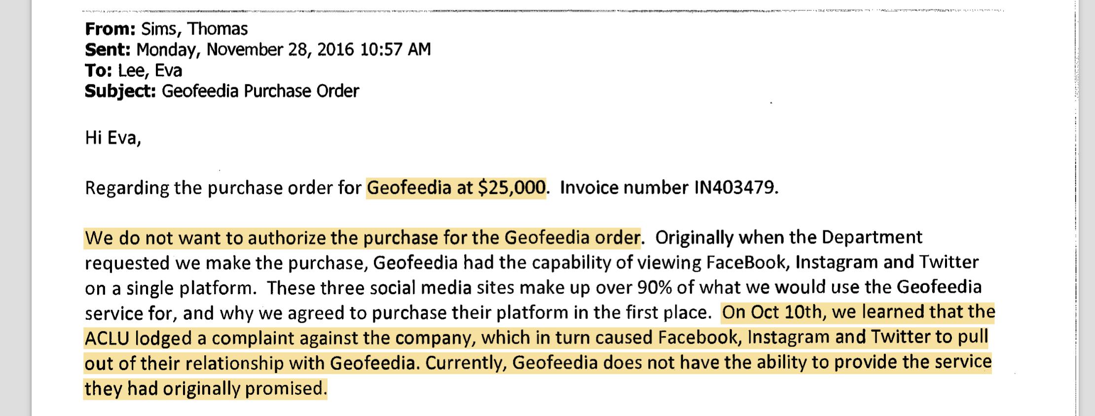
Apparently, that’s the end of discussion because the next thread of emails responsive to my request begins on December 8, which includes a series of emails from a poor Geofeedia sales rep trying, since October 23, to get the San Jose police to pay a $25,000 invoice for another year of Geofeedia access.
On Nov. 28, rejection: https://www.documentcloud.org/documents/3243193-City-of-San-Jose-correspondence-regarding.html#document/p6
One of the coolest things about the ACLU project was how it was done out in the open, with public records being filed
Here’s their request for San Jose: https://www.muckrock.com/foi/san-jose-336/san-jose-pd-social-media-surveillance-23633/
https://www.muckrock.com/foi/san-jose-336/geofeedia-inc-contracts-invoice-social-media-surveillance-policies-san-jose-police-department-28898/
Paul Newman's Empty FBI File
Last year, I filed my first FOIA request to the FBI, for their file on the late great Paul Newman. To make a long story short: the agency replied that they “were unable to identify main file records responsive to the FOIA”.
You can see my request and the FBI’s response on DocumentCloud.
Why might we expect the FBI to have compiled reports about Paul Newman, as it has for so many other famous movie stars, such as Elizabeth Taylor, Orson Welles, and Groucho Marx?
For starters, Newman was number 19 on Nixon’s enemies list - between S. Harrison Dogole, president of a private detective agency who donated heavily to Nixon’s opponent, and Mary McGrory, a Pulitzer Prize-winning political columnist.
Newman had supported Eugene McCarthy’s 1968 presidential campaign and would continue to be an outspoken political activist for liberal causes, including lobbying Nixon to “install a Department of Peace in the cabinet”. Here is a 1969 clip of Newman speaking out against the Vietnam War: “I don’t know what war is all about, if it isn’t to create pain”:
Just being on Nixon’s list seems like it would generate FBI records for Newman; journalist Daniel Schorr (No. 17), reportedly faced weeks of FBI questioning after Nixon ordered the FBI to perform a “background” check.
Sometimes nothin’…may not be nothing?
The FBI’s response to me says there was nothing about Newman in its “main file”. I haven’t followed Ryan Shapiro’s advice on how to compel the FBI to be more thorough in its search:
- Request any “cross-referenced” records relevant to your inquiry. The agency will not include them in a typical FOIA request unless the user explicitly references them.
- Request a search of “ELSUR” (Electronic Surveillance) records. These include the names of all people and/or locations for which the agency sought a court order for electronic surveillance.
The FBI files are presumably spread out over various legacy systems. Charlton Heston’s file, for example, was apparently part of a system in which relevant files were destroyed in 2007.
Note: Didn’t realize until now that MuckRock also filed a FOIA for Newman back in 2012 (which is ironic because one of the requirements for an assignment I give to my public affairs class is to make sure to request something that isn’t already online…) They got the same response.
Interested in filing your own FOIA?
I created a short list of resources here. The most relevant ones are:
- The FBI’s official guide on submitting FOIA (i.e. FOIPA) requests, including a template letter.
- MuckRock’s list of FOIAs to the FBI, which contain not only examples of how to write letters, but the responses and any intermediate messages – and how long all took. Here’s the MuckRock request for Washington Post editor Ben Bradley.
Two Spreadsheets, Microsoft Access, and a Pulitzer Prize for Public Service
When asked what data skills journalists need, I don’t hesitate to tout spreadsheets as the single, must-have day-to-day skill for every journalist at every organization in every mission. For those with a bit more time or motivation to experiment, I might recommend an acquaintanceship with database JOIN statements – it doesn’t matter if it’s in Access or SQLite or Postgres. This may not sound fancy, but even as a computer engineer, I rarely need anything fancier.
My go-to anecdote is Seattle Times reporter Daniel Gilbert, founder of The Fund for Rural Computer-Assisted Reporting, by way of a small-town newspaper – the Bristol Herald Courier – where he was awarded the Pulitzer Prizes’ most prestigious award for “illuminating the murky mismanagement of natural-gas royalties owed to thousands of land owners in southwest Virginia.”
I’ve never met Gilbert, and while I can’t say I particularly care about natural gas royalties in Virginia, I believe Gilbert is an exemplar of how and why we do computer-assisted reporting.
In an article titled, “Serious Fun With Numbers: We’re drowning in data, but few reporters know how to use them”, Gilbert spoke with Janet Paskin from the Columbia Journalism Review about how the investigation came to light:
The story was already great, even before Daniel Gilbert opened his first spreadsheet. Thousands of citizens in the southern Virginia area Gilbert covered for the Bristol Herald Courier (daily circulation: 30,000) had leased their mineral rights to oil and gas companies in exchange for royalties. Twenty years later, they alleged, the companies had not paid, adding up to potentially millions of dollars owed. As Gilbert learned, the complaint was complicated.
…Gilbert requested the information he needed and received spreadsheets with thousands of rows of information. In Excel, a typical computer monitor displays less than a hundred rows and ten wide columns. Gilbert’s data was much too massive to cram into this relatively modest template.
So he started with one month’s worth of information, using the program’s “find” function to match wells and their corresponding accounts. One by one. Control-f, control-f, control-f. It was tedious and time-consuming. There was a story there, he was certain. But control-f would not find it.
Gilbert convinced his cash-strapped publisher to send him to a weeklong workshop held by the Investigative Reporters and Editors. In that short time, Gilbert picked up enough SQL to write the database query that would launch his eight-part investigative series. Via CJR):
Show me the accounts that correspond to wells where oil or gas has been produced, but royalties have not been paid.
Last year, the Investigative Reporters and Editors Journal published a 40th Anniversary issue (hopefully a digital copy gets uploaded, but the journal alone is worth the price of membership) and invited members to share testimonials.
This is what Gilbert wrote:
In 2009 I was working with two spreadsheets. One showed natural gas production in Virginia. The other showed royalties collected for thousands of wells. I could see there were discrepancies, but I didn’t know how to systematically identify them.
I learned how to query data after a week at IRE. The spreadsheets spoke. They helped show how Virginia’s system of paying natural gas royalties was broken. The reporting prompted changes in state law to pay landowners their due. Today I’m honored to partner with IRE to provide the same kind of training to other journalists.
There’s more to Gilbert’s success than just a couple of spreadsheets that became database tables, of course. As Gilbert said in interviews to Poynter and the Washington Post after the Pulitzer ceremony, there were the public records requests and the months it took to research the arcane laws and the narrative skill to “weave together enough of a narrative to carry people through the complicated, boring aspects of it.”
But as Gilbert told CJR, the scandal of energy companies cheating landowners had been known for years. Previous editors had even spiked past stories, ostensibly because escrow accounts and methane gas don’t a sexy story make.
Gilbert says he knew early on that he had a “pretty good story…But the data changed it.
“Instead of just asking the question, I was able to answer it.”
A data journalist's guide to IRS Form 990s and investigating non-profit organizations
I personally haven’t done much reporting in this area, but I aspire to follow the work done by other investigative journalists. There are plenty of resources and examples to follow, so I’ve curated some of my favorites here.
Investigation: America’s Worst Charities, via the Tampa Bay Times and the Center for Investigative Reporting. This 2013 data investigation looked at how much charities spent on raising money as a metric for deciding “worst charity”. The innocent-sounding Kids Wish Network made the top of the list for funneling $110 million of its donations to corporate fundraisers, leaving sick children with less than 3 cents of every dollar raised. The first story, America’s 50 worst charities rake in nearly $1 billion for corporate fundraisers, was published on June 6, 2013, after a yearlong investigation tallying “the cost of this parasitic segment of the nonprofit industry.”
Guide: Kids Wish Network Annotated Form 990, via the Center for Investigative Reporting - Reporter Kendall Taggart helpfully published this list of red flags to spot on a charity’s Form 990, such as where professional fundraising fees are itemized and how an organization might inflate their financial efficiency.
Data: Nonprofit Explorer, via ProPublica. An interactive database that allows users to “search over 1.8 million tax returns from tax-exempt organizations and see financial details such as their executive compensation and revenue and expenses. You can browse raw IRS data released since 2013 and access over 8.3 million tax filing documents going back as far as 2001.” The database can also be accessed via an API.
Data: IRS 990 Filings on AWS via Amazon Web Services. Electronically-filed Form 990 data since 2011 as XML, stored on a public Amazon S3 server. Carl Malamud, an open-government advocate who sued the IRS to provide Form 990s in machine-readable format, called the release “a huge victory.”
Guide: How to dig deeper into a nonprofit’s finances via the Center for Investigative Reporting.
Data: IRS 990 Forms, via the Internet Archive. Interested in the 990s as actual documents? The Chronicle of Philanthropy and Public.Resource.Org DVDs of the 990 forms as TIFF images. Carl Malamud said that the DVDs needed to store the filings from 2002 to 2012 weighed more than 98 pounds.
Guide: For Checking Out a Charity, Remember the Number 990, via the New York Times. This 2000 article describes the fun of 990s just as organizations began uploading them to the World Wide Web.
Data: Charity Navigator. An interactive database of ratings that can be useful for cross-referencing your own research and analysis.
Guide: Many Types of Nonprofits, via ProPublica. A helpful list of descriptions for all the kinds of 501(c) organizations, besides the well-known 501(c)(3) category.
Articles: Articles tagged “nonprofit” on the Investigative Reporters & Editors blog.
A collection of data journalism syllabuses
Before joining Stanford to teach data journalism, I wanted to get good picture of what else out there was being taught. I started a YAML file and serialized all the data journalism courses and syllabuses that I knew, even what textbooks and topics they taught. I gave it up as soon as I got to Stanford to teach, but last week uploaded the list to Github and added all the courses I could find via Google and looking up individual data journalism instructors.
The list so far is up to 150: you can find the collection here and add your own:
Mapping the U.S. Census population estimates for incorporated places with CartoDB and geopandas
tl;dr: This post contains an interactive CartoDB choropleth map of the latest Census population estimates data (and a top 20 list of fastest-shrinking cities), as well as the process of how I used Python 3.x and geopandas to wrangle Census data and shapefiles.
Last week, the U.S. Census Bureau released its 2015 population estimates. The Census’s press release focuses on just a few of the top cities ranked by growth, but you can download the raw data to analyze yourself.
For example, embedded below is an interactive CartoDB choropleth map I’ve created (see it fullscreen) showing the population change of incorporated places (i.e. cities and towns, but not counties) from 2010 to 2015, for places that had an estimated population of at least 30,000 in 2015:
See this map fullscreen on CartoDB: https://dansn.cartodb.com/viz/f61abdf4-2075-11e6-b3a5-0e3ff518bd15/public_map
The top 20 cities >= 100,000 pop, ranked by biggest losses from 2010 to 2015
Since so many of the other Census data news releases focuses on the fastest growing cities, here’s the list of the fast shrinking cities:
| State | Place | 2015 estimated pop. | % change 2010-2015 |
|---|---|---|---|
| Michigan | Detroit city | 677116 | -4.8 |
| Illinois | Rockford city | 148278 | -3.0 |
| Alabama | Montgomery city | 200602 | -2.6 |
| Ohio | Toledo city | 279789 | -2.5 |
| Ohio | Cleveland city | 388072 | -2.0 |
| Louisiana | Shreveport city | 197204 | -1.9 |
| Mississippi | Jackson city | 170674 | -1.8 |
| Connecticut | Waterbury city | 108802 | -1.4 |
| Georgia | Macon-Bibb County | 153515 | -1.2 |
| New York | Buffalo city | 258071 | -1.2 |
| Ohio | Dayton city | 140599 | -1.2 |
| Missouri | St. Louis city | 315685 | -1.1 |
| Connecticut | Hartford city | 124006 | -1.1 |
| New York | Syracuse city | 144142 | -0.8 |
| Ohio | Akron city | 197542 | -0.7 |
| Virginia | Hampton city | 136454 | -0.7 |
| Alabama | Mobile city | 194288 | -0.5 |
| New York | Rochester city | 209802 | -0.4 |
| Kansas | Topeka city | 127265 | -0.4 |
| Louisiana | Baton Rouge city | 228590 | -0.4 |
The rest of this post explains where I got the data and how I wrangled it:
Getting the population estimates data
The Census press release links to its data site, and if you poke around, you’ll eventually land on this page, which packages the data in easy-to-download CSVs:
Direct link: https://www.census.gov/popest/data/cities/totals/2015/files/SUB-EST2015_ALL.csv
Getting the boundary shapefiles for incorporated places
The Census also maintains shapefiles for the many levels of geography that aggregates data across, including incorporated places. The landing page for the data is here:
Cartographic Boundary Shapefiles - Places (Incorporated Places and Census Designated Places)
While there’s a lot of incorporated places in the U.S., the shapefile data for such places is not larger than the shapefile data needed to show all of America’s zipcodes. But unfortunately, unlike the zip code data, the Census doesn’t seem to provide a bulk download of incorporated places nationwide in addition to the individual state files. Which means you’ll have to download all 50+ files individually and somehow concatenate them. I don’t know how to do that manually, but I do know how to do that programmatically.
Geospatial data wrangling with Python 3.x and geopandas
Getting geopandas (the equivalent of R’s rgdal) to run on Python 3.x and my OS X machine was a long enough journey that I wrote a separate iPython notebook about it.
Assuming you have geopandas installed, here are the steps to bulk download and combine the Census shapefiles into a single GeoJSON file – which you can download here if you’re impatient: stash.compjour.org/samples/census/cbf_places_2015_500k.json
First, a little warmup: downloading the CSV of population estimates and saving it locally. Yes, it’s a lot of boilerplate for downloading a single file, but it’ll make the next chunk of code a little more palatable.
from os import makedirs
from os.path import basename, exists, join
import requests
DATA_DIR = 'data'
DEST_FNAME = join(DATA_DIR, 'SUB-EST2015_ALL.csv')
SRC_URL = 'https://www.census.gov/popest/data/cities/totals/2015/files/SUB-EST2015_ALL.csv'

makedirs(DATA_DIR, exist_ok=True)
with open(DEST_FNAME, 'w') as wf:
    print("Downloading", SRC_URL)
    resp = requests.get(SRC_URL)
    print("Saving to", DEST_FNAME)
    wf.write(resp.text)
Batch scraping the Census shapefiles
This next chunk of code assumes you’re running it in a new session, hence the reinitialization of the file directories. But it uses a regex to pick out the 50+ zip files that are in the webform’s HTML code and then downloads and saves each zip file (renamed to the corresponding state FIPS code).
Here’s what the HTML for each zipfile URL looks like – I’ve added the newline characters for easier reading, but that value= "..." weirdness is in the Census site’s sourcecode:
<option value= "http://www2.census.gov/geo/tiger/GENZ2015/shp/cb_2015_01_place_500k.zip">
   Alabama
</option>
from os import makedirs
from os.path import exists, join
import re
import requests
SHPFILE_DIR = join('data', 'cbf_places_2015_500k')
makedirs(SHPFILE_DIR, exist_ok=True)
URLS_PATTERN = r'(?<=value= ").+?cb_2015_.+?place_500k.zip(?=")'
SOURCE_URL = 'https://www.census.gov/geo/maps-data/data/cbf/cbf_place.html'
resp = requests.get(SOURCE_URL)

# perform lazy person's html parsing:
for url in re.findall(URLS_PATTERN, resp.text):
    # filename is just state code + '.zip'
    statecode = re.search(r'(?<=2015_)\d{2}(?=_place)', url).group()
    fname = join(SHPFILE_DIR, statecode + '.zip')
    if not exists(fname):
       print("Downloading", url)
       zresp = requests.get(url)
       with open(fname, 'wb') as w:
          print("\tWriting", fname)
          w.write(zresp.content)
    else:
        print("Already have", fname)
Combining all shapefiles into one GeoJSON
This script leverages the power of geopandas and the (normal) pandas method, concat() to combine the Census shapefiles. Notice in the second to last line we have to typecast the concatenated dataframe as a GeoDataFrame in order to save it properly as GeoJSON:
from glob import glob
import geopandas as gp
SHPFILE_DIR = join('data', 'cbf_places_2015_500k')
DEST_FNAME = join('data', 'cbf_places_2015_500k.json')
dfs = []
for fname in glob(join(SHPFILE_DIR, '*.zip')):
    d = gp.read_file('zip://' + fname)
    print("Opened ", fname, " -- ", len(d), 'records.')
    dfs.append(d)
alldf = gp.GeoDataFrame(gp.pd.concat(dfs))
alldf.to_file(DEST_FNAME, driver='GeoJSON')
Again, here’s the GeoJSON file if you want to see what it turned out as:
http://stash.compjour.org/samples/census/cbf_places_2015_500k.json
PostGIS query
While we can do data-wrangling with geopandas, I prefer to upload the datasets straight to CartoDB and do the rest in PostGIS. Here are the datasets hosted on CartoDB:
- The population estimates data, as provided by the U.S. Census: census_places_popest_2015
- The combined places shapefile that we created with geopandas: cbf_places_2015_500k
Covering PostGIS and CartoDB is a topic too broad for this tutorial, but I’ve written a separate one for the Stanford Journalism curriculum that you can follow: Using PostGIS, SQL, and CartoDB to identify schools at risk from Oklahoma’s earthquakes
The join between the two Census tables involves using the corresponding state and place FIPS codes. We also narrow the resultset by restricting the summary level: sumlev='162' because '162' represents an “Incorporated place”, according to the Census documentation for the population estimate file.
And finally, to keep small places with proportionately huge booms from skewing the map, we restrict the selection to places that have an estimated population of at least 30,000 in 2015:
(pardon the excessive SELECT statement; it’s not possible to use select * as we have to use only one of the table’s special CartoDB fields)
SELECT
  pop.stname AS state_name,
  places.name AS place_name,
  places.statefp, places.placefp,
  places.the_geom, places.affgeoid,
  places.aland, places.awater, places.geoid, places.lsad,
  places.the_geom_webmercator, places.cartodb_id,
  census2010pop, estimatesbase2010, popestimate2010,
  popestimate2011, popestimate2012, popestimate2013,
  popestimate2014, popestimate2015,
  (popestimate2015 - popestimate2010) AS delta_2010_2015,
  (popestimate2015 - popestimate2014) AS delta_2014_2015,
  round(100.0 * (popestimate2015 - popestimate2010) / popestimate2010, 1)
    AS delta_2010_2015_pct,
  round(100.0 * (popestimate2015 - popestimate2014) / popestimate2014, 1)
    AS delta_2014_2015_pct
FROM census_places_popest_2015 AS pop
INNER JOIN cbf_places_2015_500k AS places
  ON pop.state = places.statefp
     AND pop.place = places.placefp
WHERE pop.sumlev = '162'
  AND pop.popestimate2015 >= 30000
  AND pop.popestimate2010 > 0
  AND pop.popestimate2014 > 0
ORDER BY popestimate2015 DESC
The resulting joined dataset is here: census_2015_places_and_popest_deltas
And here’s the link to the map on CartoDB: https://dansn.cartodb.com/viz/f61abdf4-2075-11e6-b3a5-0e3ff518bd15/public_map
Calculating the top 20 population losses
This doesn’t require geopandas, just regular pandas with its regular DataFrames and querying/sorting functionality
from os.path import join
import pandas as pd
df = pd.read_csv(join('data', 'SUB-EST2015_ALL.csv'))
df = df[df.SUMLEV == 162]
df['delta_2010_2015'] = df['POPESTIMATE2015'] - df['POPESTIMATE2010']
df['delta_2010_2015_pct'] = (df['delta_2010_2015'] * 100 / df['POPESTIMATE2010']).round(1)
Filter the list for POPESTIMATE2015 >= 100000 and format at a tab-delimited string:
xf = df[df.POPESTIMATE2015 >= 100000].sort_values('delta_2010_2015_pct').head(20)
# print out in tab-delimited format:
xf.to_csv(sep='\t', index=False,
          columns=['STNAME', 'NAME', 'POPESTIMATE2015', 'delta_2010_2015_pct'])
Data tables and FOIL requests in the New York Times, circa 1850
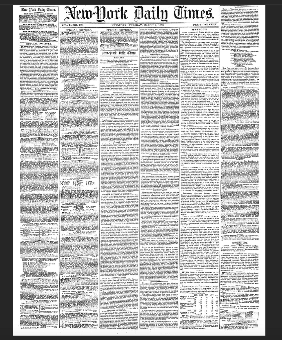
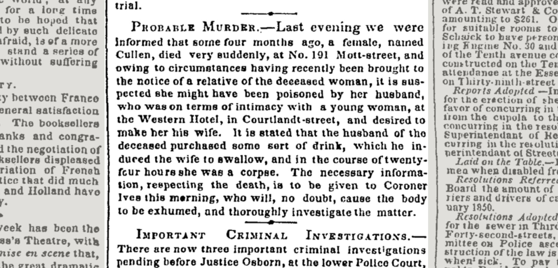
While looking for ancient examples of data tables, I came across a couple of wonderful examples from the New York Times Archive, in an edition with an abstract titled: NEWS GATHERINGS. PROBABLE MURDER. IMPORTANT CRIMINAL INVESTIGATIONS EFFECTS OF THE GALE. THE COURTS. STATISTICS OF THE CITY PRISON. BOARD OF SUPERVISORS, from March 2, 1852.
The titles of the two data tables of interest:
- Statistics of the City Prison
- Weekly Report of Deaths and interments in the city of Brooklyn, for the week ending Feb. 28, 1852.
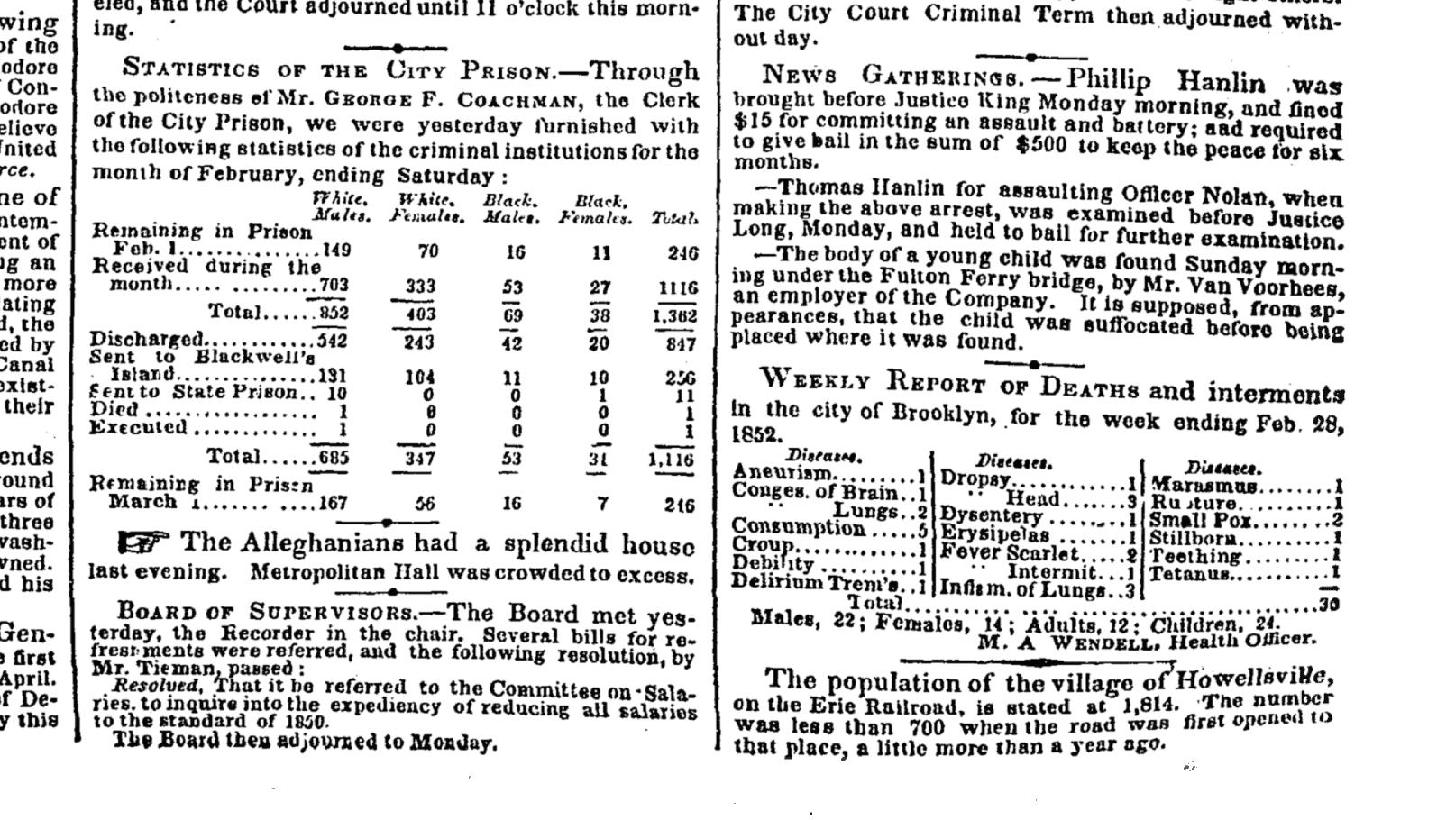
The preface to the prison statistics gives some insight to the practice of New York’s Freedom of Information Law back then:
Through the politeness of Mr. GEORGE F. COACHMAN, the Clerk of the City Prison, we were yesterday furnished with the following statistics of the criminal institutions for the month of February, ending Saturday:
These data tables were on the front page, in the bottom-right corner:
Death data is also included as an agate list, above the fold, same column as the prison data:
And while we’re fixated on that particular column of text, it’s worth pointing out how much more fun crime briefs were back then:
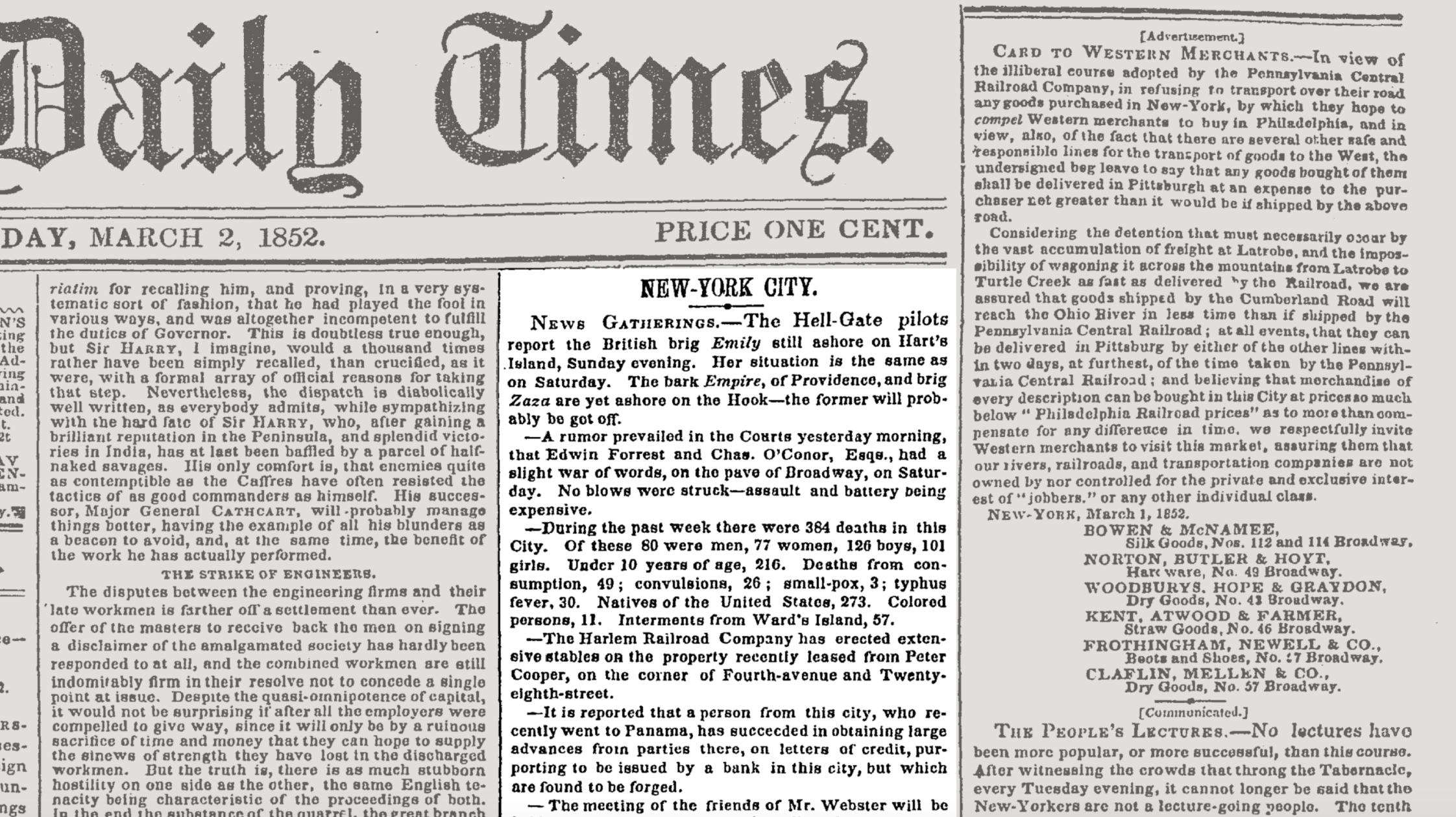
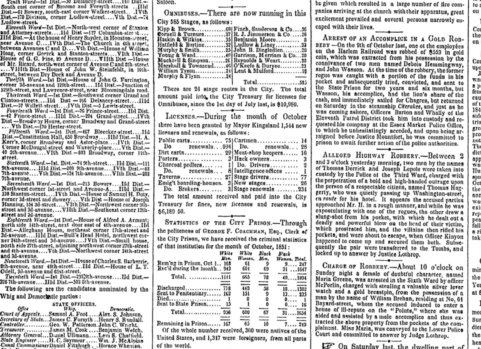
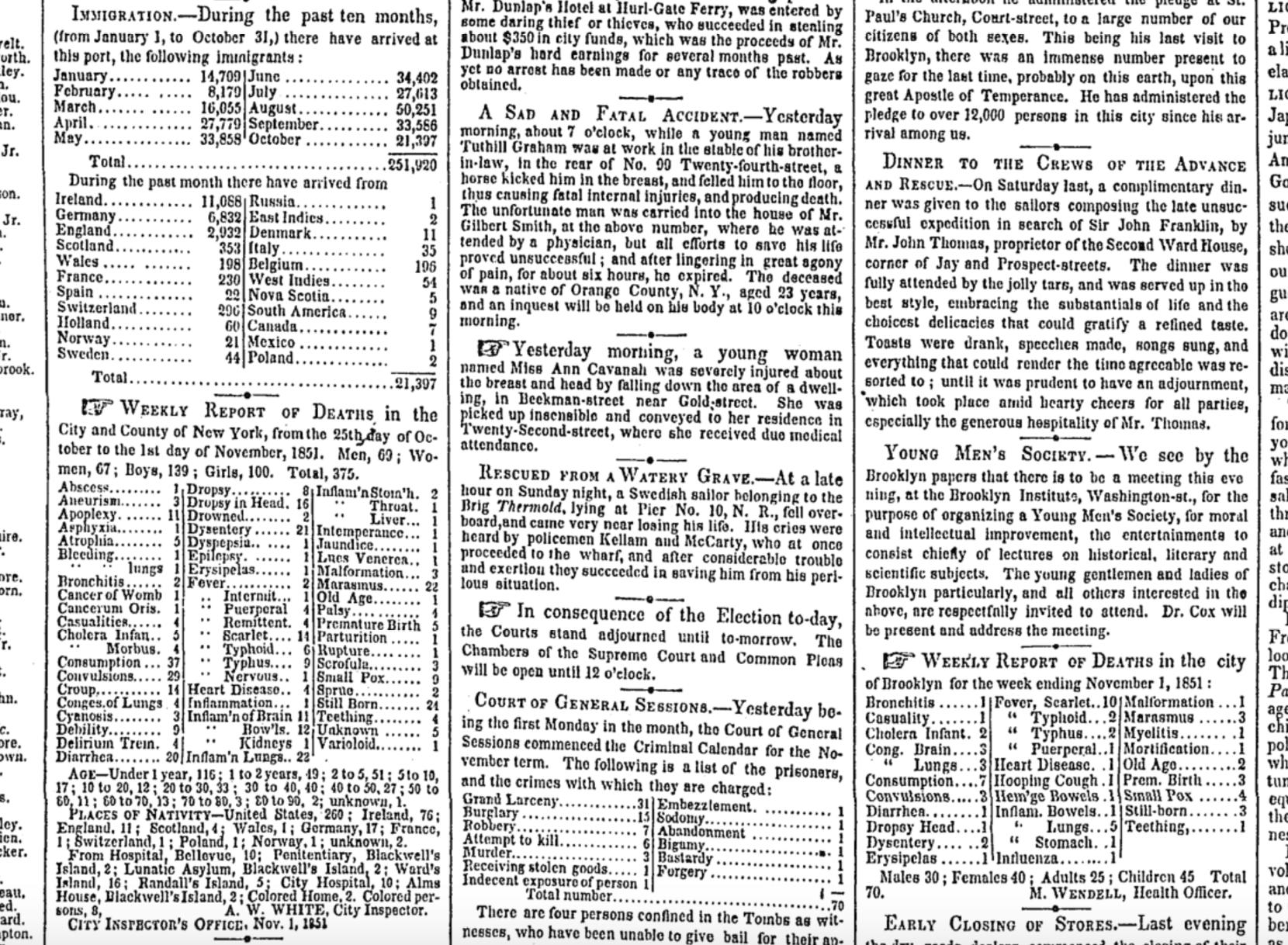
Doing a search for the quoted string, "Statistics of the City Prison", returns 4 other occurrences of the prison statistics, all from 1851 or 1852. Here’s a nice example from November 4, 1851 of a cluster of front page data tables for not just prison statistics, but business licenses, omnibus routes, immigration (250,000 for year-to-date), deaths for New York City, County, and Brooklyn, and a weekly inventory of the criminal accusations against the prisoners on this month’s criminal calendar (only one count of indecent exposure?)
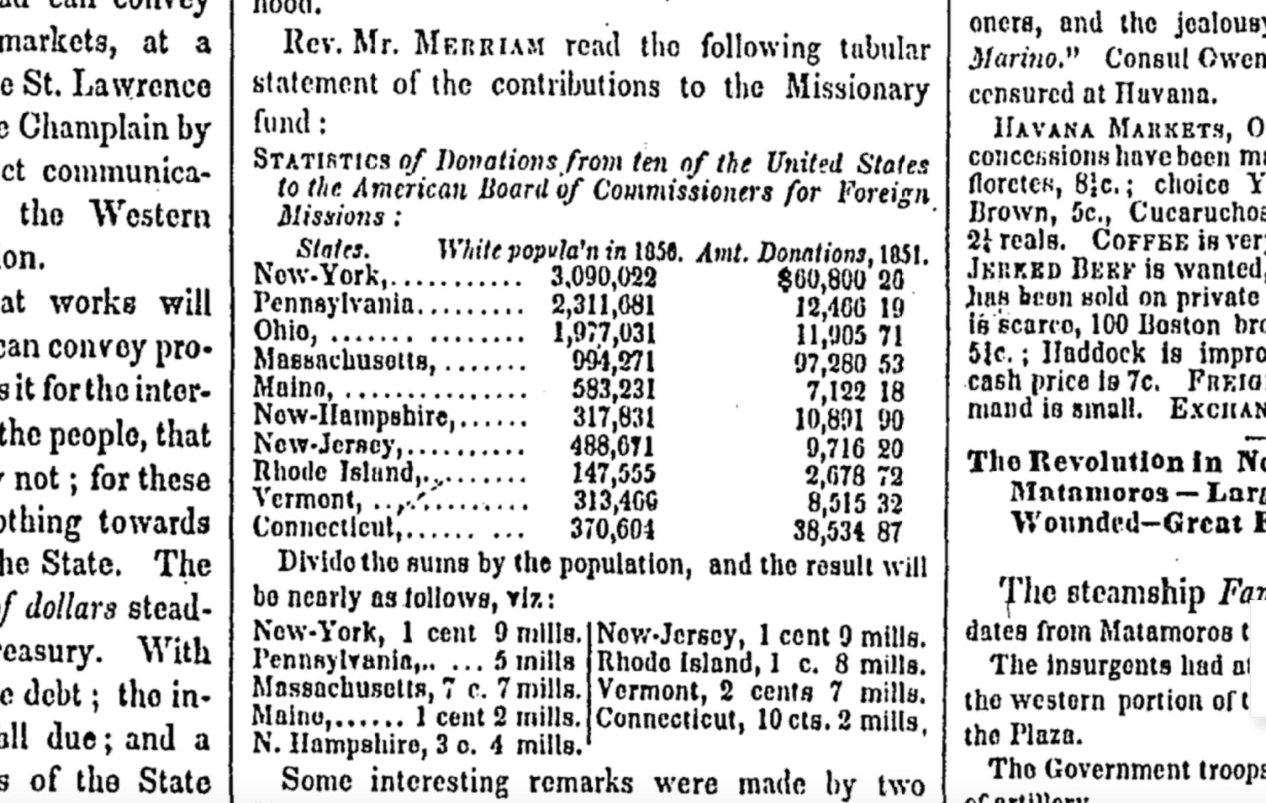
More tangents: On the second page of the issue, there’s a data table titled “Statistics of Donations from ten of the United States to the American Board of Commissioners for Foreign Missions” – apparently, newspaper readers back then were expected to understand the concept of averages:
Facebook Research contemplates the user experience for dead users.
Even if you don’t consider yourself an academic or scientist, Facebook’s research papers are generally great reading if you’re interested in the design decisions behind massive social networks – and their consequences.
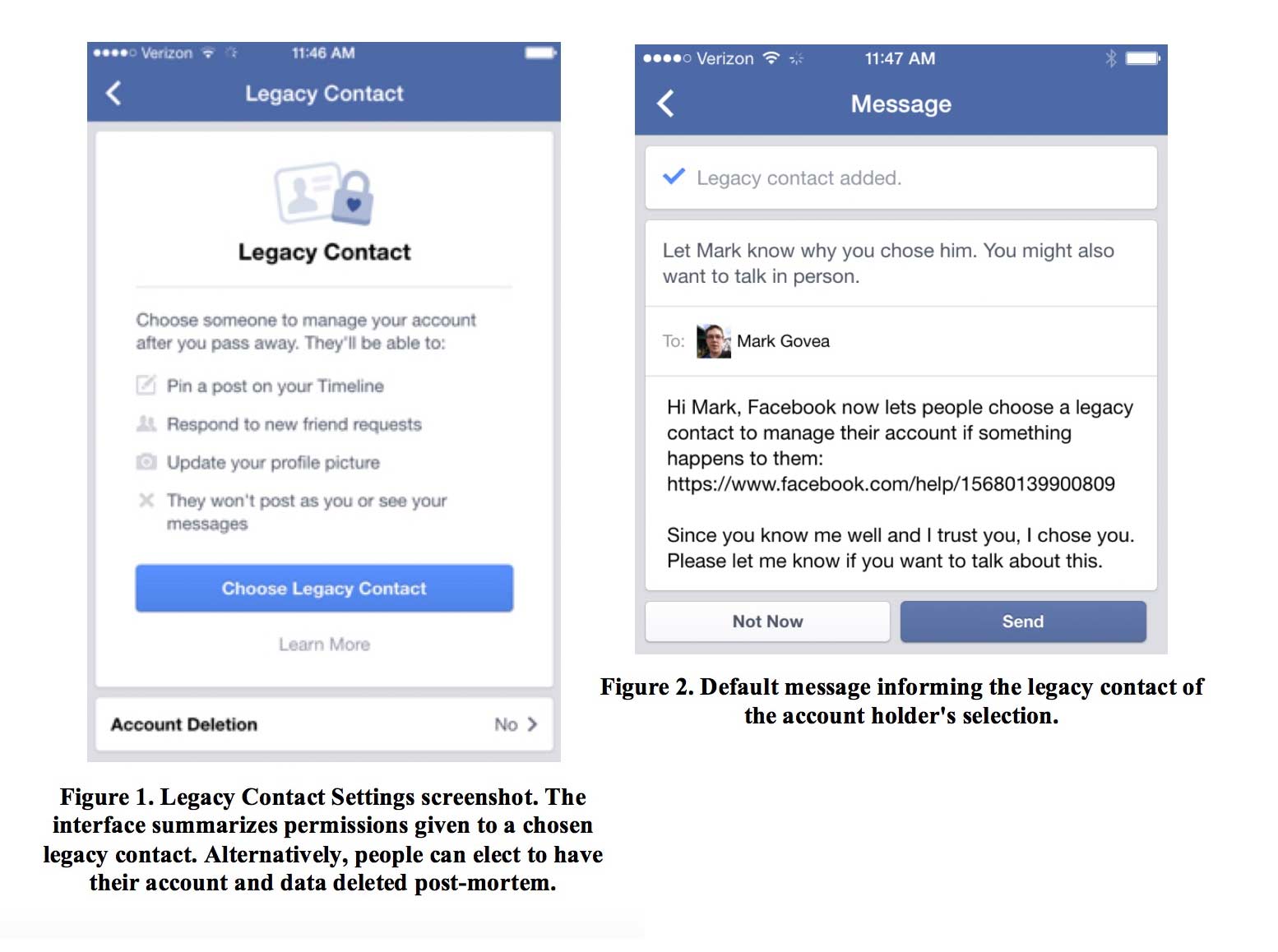
Here’s one of Facebook Research’s more universally relevant papers: Legacy Contact: Designing and Implementing Post-mortem Stewardship at Facebook, authored by University of Colorado’s Jed R. Brubaker and Facebook’s Vanessa Callison-Burch, and published last week at ACM CHI 2016.
The paper examines the design decisions (and precedents) for Facebook’s Legacy Contact feature, which was introduced on February 12, 2015. A “Legacy Contact” is someone you designate to be the caretaker for your Facebook account in the event of your death. Like writing a will, how your account is maintained is a decision you have to make before you die – but Facebook’s implementation is more complex and nuanced than the analogue of real-world inheritance.
Back in 2007, Facebook introduced the ability to “memorialize” an account after its holder’s death, which would essentially lock down the account’s content and privacy settings as they were before the user died.
But what if you died before really thinking about how your Facebook profile would appear for perpetuity? Facebook claims its Community Operations team has responded to “every request about memorialization”, but there were apparently a few fairly common but “surprisingly complex” situations that had no easy answer. For example, if you avoided friending your parents because that’s just not cool to do, then in the event of your unexpected death, your parents would be forever blocked from sharing (and even viewing) memories on your Wall.
Despite Facebook’s massive amount of data on its users, it admits it can’t (or at least, would rather not) predict a user’s preferences after death, such as whether or not a user’s non-friending of their parents was for trivial reasons or actual reasons:
While it might intuitively seem like Facebook should fulfill these kinds of requests, Facebook has no way of knowing what a deceased person would have wanted. Did that son want to be friends with his father on Facebook? And who gets to decide if a profile photo is or is not “appropriate?”
These are choices that are made by account holders while they are alive, and Facebook respects those choices. In the absence of the deceased account holder, and given the changing needs around profiles post-mortem, we looked for ways to improve how Facebook supports grieving communities.
Further down in the paper, under a subhead of “Privilege human interaction over automation”, the paper’s authors point out that the maintenance of these deceased accounts is one situation in which automation is not desirable:
Earlier research found that automated content and notifications can result in confusion and concern for the well-being of the account holder. Moreover, end-of-life preferences are often nuanced and contextual. As such, we sought to reduce automation where possible and encourage interpersonal communication rather than rely on Facebook notifications and configuration.
(Automation has previously caused problems when it comes to death; see Eric Meyer’s essay on “Inadvertent Algorithmic Cruelty”.)
Because of their scale and the digital infrastructure on which they operate, social networks have challenges and complications that don’t apply in the physical world. I imagine that Facebook’s relatively young demographic – particularly its general unawareness and non-anticipation of death – also exacerbates the issues in deciding the access control for a dead user’s account.
The authors of the paper write that Facebook considered three approaches on how to handle post-mortem data. I’ve summarized them as:
| Approach | Description | Disadvantages |
|---|---|---|
| Configuration | Define what the system should do when you die, such as posting a final Wall post that you’ve (hopefully) written. | When’s the last time you updated your “Final Wall Post” to include all the people and things you truly care about? When’s the last time you did do while being sober? |
| Inheritance | Designate an “heir” to login and take over your account. | Your “heir” gets to see all the private data you hadn’t realized would be included in the “inheritance”. |
| Stewardship | Designate someone to take care of the account, but not “own” it or its data | Trust Facebook to design the right balance between features and limitations. |
Facebook went with the stewardship-based route, which requires more thought and work from them. On the other hand, it ultimately provides more flexibility and granular access control than the other two approaches.
Even as an avid, considerate Facebook user, you might be surprised at all the design decisions that have to be made in creating an effective “stewardship” role for Facebook accounts, such as: how do you (the account holder) explain to your Legacy Contact why you chose them to be your Legacy Contact? And: should a dead user’s friends get notifications when a Legacy Contact makes changes to the dead user’s profile?
One interesting design nuance that I hadn’t considered: While a Legacy Contact is allowed to add friends to the deceased’s account, the Legacy Contact cannot remove the friends that the deceased had added during their lifetime, “in the name of preserving the profile as created by the deceased.” So, defriend people as if it were your last day to defriend…
The full paper (10 pages, not including its list of references), which was accepted at the Proceedings of the 2016 CHI Conference on Human Factors in Computing Systems, can be found at Facebook Research:
Or on ACM:
http://dl.acm.org/citation.cfm?id=2858254&CFID=613872472&CFTOKEN=61242498&preflayout=flat
Sidenote: I love the line that’s prepended to the paper’s abstract, as viewed on the Facebook Research site (emphasis added):
This is a descriptive paper, not a research paper that is based on any experiments. In this paper we describe Legacy Contact, a new feature that better supports people coping with the death of of a loved one on Facebook while giving people more control over what happens to their Facebook account in the future. Following a user’s death, how can social media platforms honor the deceased while also supporting a grieving community?
In this paper we present Legacy Contact, a post-mortem data management solution designed and deployed at Facebook. Building on Brubaker et al. (2014)’s work on stewardship, we describe how Legacy Contact was designed to honor last requests, provide information surrounding the death, preserve the memory of the deceased, and facilitate memorializing practices. We provide details around the design of the Legacy Contact selection process, changes made to memorialized profiles, and the functionality provided to Legacy Contacts after accounts have been memorialized. The volume of post-mortem data will continue to grow and so it is important to take a proactive approach that serves the needs of both Facebook users and their community of friends.
Given past reaction to Facebook experiments, it’s probably (very) wise for Facebook to anticipate that the average person (and tech reporter) might jump to morbid conclusions when seeing something about dead Facebook users under the umbrella heading of “Facebook Research” and to preemptively state this paper didn’t involve any A/B-type experiments on users.
The two hardest problems in obituaries
While researching the data of death, I’ve found it easy to identify the similarities between the computational and humanistic approaches in quantifying death.
RevisitingPhil Karlton’s famous observation about computer science:
There are only two hard things in Computer Science: cache invalidation and naming things.
– we can find examples of how naming things and cache invalidation are also hard problems for coroners and obituary writers:
Naming things: The New York Times found that accidental shooting deaths of children likely occur at twice the rate indicated by public records, because of how inconsistently authorities classify accidents versus homicides. And in the real of “regular” homicides, cities have been known to overreport “justifiable homicides” to reduce the homicide rate that is reported to the FBI.
Cache invalidation: Despite the fact that the Times had prepped 4,700 words of obit material for Justice Antonin Scalia 2 years ago, it took the Times more than an hour to post online a full obituary “because of the need for updates”. And even then, the obit didn’t make into East Coast print copies the next day.
The Times had also prepared for the event of Steve Jobs’s death, which allowed it to post 3,500 words within an hour of the official announcement. The beginning of that obituary began in 2007, 4 years prior.
Here’s is a glimpse of the kind of content cached for an obituary:
Steven P. Jobs, a child of Silicon Valley and a college dropout who reshaped the world’s culture around personal computing and digital media, died X and the age of X. The cause of death was X according to X.
PEP 495 and the hardest problem in computer science
One of my favorite parts about Python is how we can get insight to the language’s evolution through the Python Enhancement Proposals. Rather than having to dig through mailing list archives, debates over new features and changes are conveniently summarized and updated as web pages.
PEP8 is a must-read for generalists and newcomers, as is PEP 3009, titled Things That Will Not Change in Python 3000. But many of the specific feature changes contain general programming wisdom.
For example, PEP 0495 – Local Time Disambiguation, is a great reminder of how difficult time is, in human and computational terms. This particular PEP will be implemented in Python 3.6 and concerns adding a new attribute called fold to the datetime.time and datetime.time classes.
What is fold? In timezones that use Daylight Savings Time – i.e. when a day “jumps back” an hour – the times between 1 and 2 AM technically happen twice. The fold attribute is, by default, set to 0. But when it is set to 1, it means that the datetime object represents the second occurrence of a time, e.g. 1:30AM after the jump back has happened.
Why call it “fold”, rather than something that sounds specifically related to Daylight Savings Time? The genericness of the name is intended:
Suggested by Guido van Rossum and favored by one (but initially disfavored by another) author. A consensus was reached after the allowed values for the attribute were changed from False/True to 0/1. The noun “fold” has correct connotations and easy mnemonic rules, but at the same time does not invite unbased assumptions.
The non-technical example is very helpful in showing how describing “fold” in terms of DST is inherently confusing:
Alice: Bob - let’s have a stargazing party at 01:30 AM tomorrow! Bob: Should I presume initially that Daylight Saving Time is or is not in effect for the specified time? Alice: Huh?
And here’s the same discussion, except with the matter simplified as “first or second?”:
Bob: Alice - let’s have a stargazing party at 01:30 AM tomorrow! Alice: You know, Bob, 01:30 AM will happen twice tomorrow. Which time do you have in mind? Bob: I did not think about it, but let’s pick the first.
The entire discussion of what fold should be called, what values it should have, and what its default value should be – plus, how it would interpolate with all < 3.6 versions of datetime – is a very readable discussion about how to properly name things in the least confusing way. And yet, it will still be confusing, because of how complicated time is in general, and of how humans interpret words.
Hence, why “naming things” is rightly considered one of the two hardest problems in computer science.
subscribe via RSS